
Best Law Firm Websites in 2026 (Top 73)
-

By
Attorney at Law Magazine
-
September 22, 2026
Table of Contents

Get paired with the best legal marketing companies. Book a 30-minute legal marketing diagnosis with Jason from the Attorney at Law Magazine team. Or complete the form below and we will reach out to get a meeting set up with you.
Table of Contents
Attorney at Law Magazine assembled a list of the best lawyer websites. Following is a compilation of all the websites with insights into what makes that site perform for the law firm. If you’re looking to revamp your website for 2026 to ensure it works for you, check out some of the best competition around. Let us know if you think there is another lawyer website that should be included.
1. Pitta & Baione
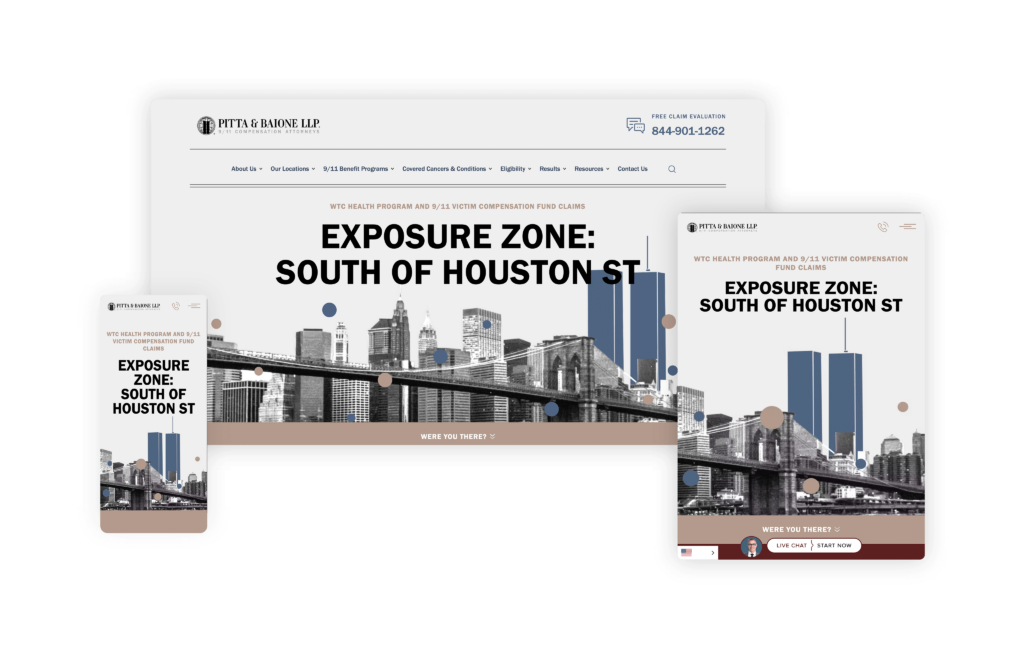
Building a niche legal website can be a challenge, but MeanPug did it with ease when they created the website for Pitta & Baione. How did they do it? In a nutshell, they focused on design and user experience. Many websites do an excellent job at one or two things, but this website does an excellent job at everything. From its custom header that moves polka-dots with your mouse and eye-catching, unique graphics to its scrolling phone number toward the bottom of the page, this website leaves little to be desired.
Those who need an attorney for 9/11-related injuries and illnesses will appreciate this professional, streamlined, user-friendly site. It’s easy for them to find the info they are looking for with drop-down menus on the main page. Each option from the drop-down menu features a picture or graphic when your mouse hovers over the option. The designers of this website know when and how to strike an effective balance of simplicity with boldness in fonts, graphics, and color. Muted colors contrasted with black and white pictures and graphics set this website apart. As if it couldn’t get any better, this website also loads lightning-fast, quickly providing valuable information to those who need it the most.
2. Aero Law Center
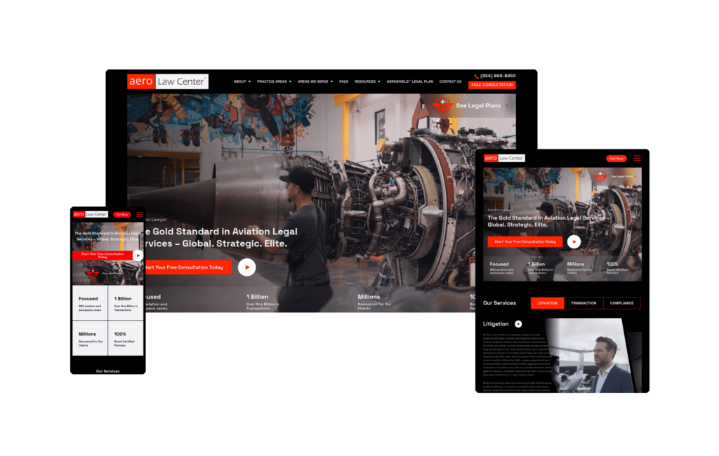
Aero Law Center built a site that communicates its niche within the first second. A full-screen video hero featuring aircraft and hangar environments makes clear immediately that this is a firm operating in aviation and aerospace law exclusively (99% of its caseload), a world most attorneys never enter. The headline, “The Gold Standard in Aviation Legal Services,” sets a tone the rest of the site consistently delivers on.
The dark, high-production aesthetic mirrors the premium industries the firm serves. Proof points are integrated directly into the design: over one billion dollars in transactions handled, millions recovered for clients, and 100% board-certified partners. A proprietary AeroShield Legal Plan featured prominently in the navigation signals a firm that has built purpose-built legal products beyond standard case intake.
For pilots, aviation operators, and aerospace companies seeking specialized counsel, the site answers the most important question immediately: this firm exists specifically for them. It is one of the most visually distinctive law firm websites online, and a clear example of what committed niche positioning looks like when executed well.
3. Leah Wise Law
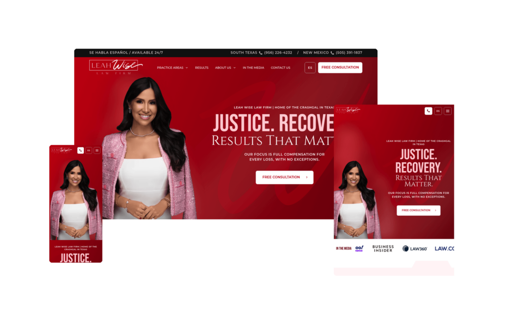
Leah Wise Law hits the nail on the head when it comes to branding and design. The homepage is, in a word, epic, and the custom design elements woven throughout the site give it a look that feels genuinely unique rather than pulled from a template. From the very first scroll, it’s clear a lot of thought went into making this site stand out in a crowded market.
What impresses us most is how completely the site is built around Leah herself. Her personal brand is front and center, and that consistency carries through every corner of the site. Even the interior practice area pages bring her directly into the experience, so no matter where a visitor navigates, they’re reminded exactly who they’d be working with. That kind of cohesion is hard to pull off, and it’s done exceptionally well here.
The details are what elevate this one. The homepage highlights the firm’s settlements using a creative paperclip motif, a small but memorable touch that makes the results feel distinctive instead of formulaic. The section transitions are another standout; rather than ending each block with a flat, straight line, the design uses shaped edges that give the whole page a smooth, flowing feel as you scroll. The backgrounds strike the right balance too, staying simple without ever defaulting to a plain solid color, and the recurring use of the #crashgal branding throughout those backgrounds is executed beautifully.
Honestly, this is one of our favorite websites we’ve reviewed so far. If we were starting a firm’s site completely fresh, this is exactly the kind of example we’d want to pull ideas from. The site was also recently redesigned, so while it’s competing in a very tough Texas market, the redesign gives it a strong platform to build its search presence on from here
Strong branding, thoughtful design, and a personality that shines on every page, Leah Wise Law is a fantastic example of how to build a site that’s as memorable as it is effective. Simply put, it’s a standout.
4. Bick Law LLP
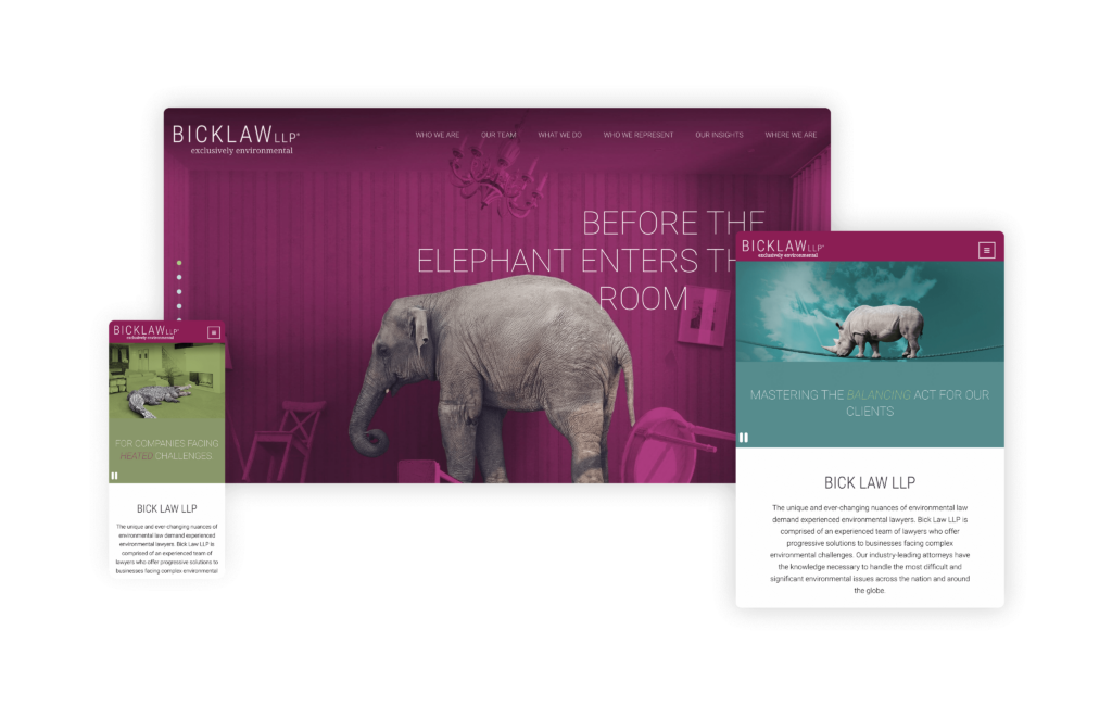
Bick Law has a premier legal website, providing an exceptional blend of skill, user-friendly features, and attention-grabbing graphics. The website is thoughtfully designed, making navigation intuitive and efficient for current clients and visitors alike.
Their site’s aesthetic is both modern and sophisticated, reflecting the firm’s high standards and dedication. Incorporating an animal theme for an environmental-related business was a wildly different and edgy idea for a law firm, and it paid off immensely.
Its unexpected usage of animals, paired with witty and thought-provoking statements, highlights the firm’s distinct approach and practice. To further enhance these concepts, the site features colors and animations that bring the images to life. Starting with a monotone palette and gradually fading into the actual color of the animals adds a dynamic and engaging element. This purposeful functionality, combined with the innovative design, helped Bick Law LLP’s website rack up several awards, including a prestigious Webby Award nomination.
Bick Law’s website stands out as a top legal resource, combining informative content with an elegant, user-centered design and creative, engaging elements. It’s an invaluable tool for anyone seeking sound legal advice in environmental law and a 5-star example of innovative legal website design.
5. Briskman, Briskman & Greenberg
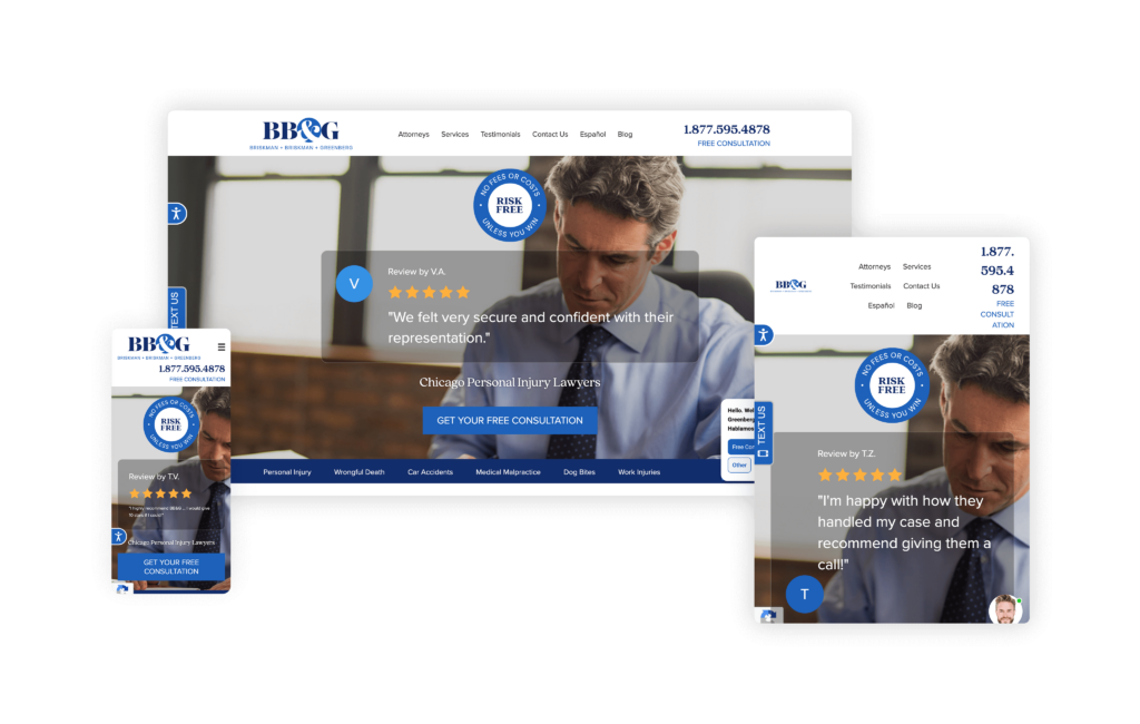
The Briskman Briskman & Greenberg website is an outstanding example of how a legal firm can effectively utilize interactive elements to engage and inform potential clients. Catering to personal injury and car accident victims in Chicago and throughout Illinois, the site offers a wealth of resources designed to educate and assist visitors in understanding their legal options.
A key feature of the site is its use of videos, infographics, and web stories, which provide valuable information in an engaging and easily digestible format. For instance, their Google Web Stories, such as How Do I Know Whether I Have a Car Accident Case?, offer quick, visual explanations of complex legal topics. The interactive presentation on “What Can I Expect During My Personal Injury Lawsuit?” further demystifies the legal process, making it accessible and less intimidating for visitors.
Each page on the site, such as the comprehensive Chicago Car & Truck Accident Lawyers section, is as deep, informative, and rich in graphics and interactive features as the homepage.
This uniformity ensures that no matter where a visitor navigates on the site, they receive the same high-quality information and user experience.
6. The Law Offices of Alyssa Whatley
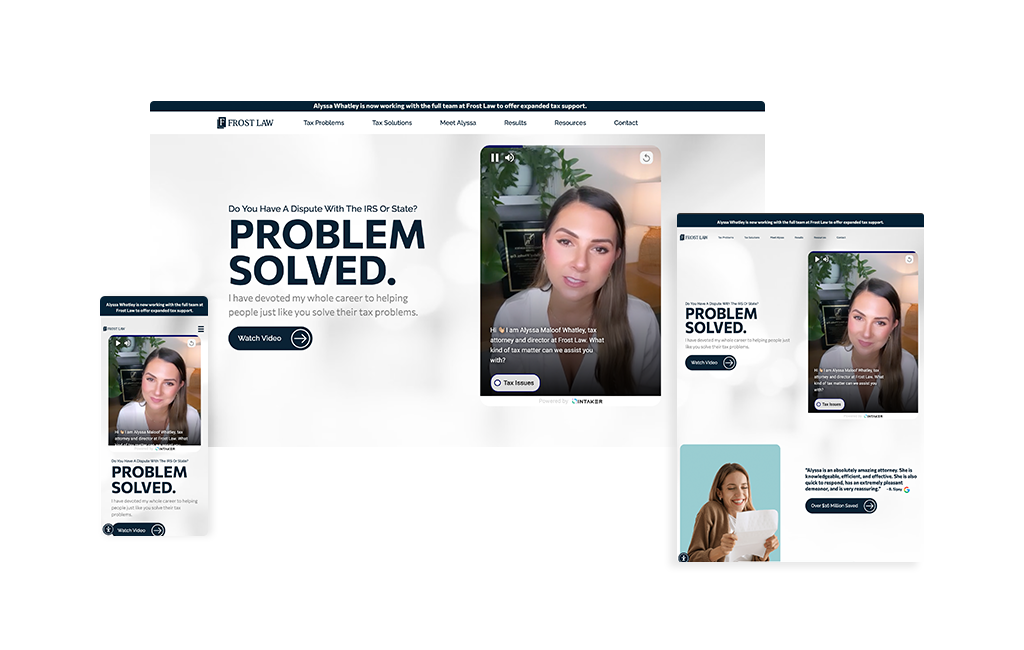
When TikTok’s most well-known tax attorney with 98K followers builds a website, the result breaks every convention of traditional tax law firm design. From the moment visitors land on Frost Law’s homepage, it’s clear this isn’t your typical buttoned-up tax attorney site. The modern, approachable design uses soft colors and contemporary typography that immediately puts stressed prospects at ease, a far cry from the intimidating corporate aesthetics most tax attorneys favor.
Video testimonials take center stage throughout the site, with real clients sharing their experiences in an authentic, unscripted format that builds instant trust. The layout feels more like a lifestyle brand than a law firm, with strategic use of white space, engaging photography of Alyssa that showcases her personality, and content organized in digestible sections that don’t overwhelm visitors who are already anxious about their IRS problems. An innovative video chat feature seamlessly integrates into the user journey, pre-qualifying prospects before they even book a consultation.
What makes this site particularly effective is how it bridges two audiences: the social media-savvy individuals who follow Alyssa on TikTok and the high-net-worth clients, business owners, and celebrities who need sophisticated tax representation. The design manages to feel both accessible and professional, personal yet credible. It perfectly captures Alyssa’s authentic brand while maintaining the gravitas required for serious tax disputes.
7. Helton Law Firm
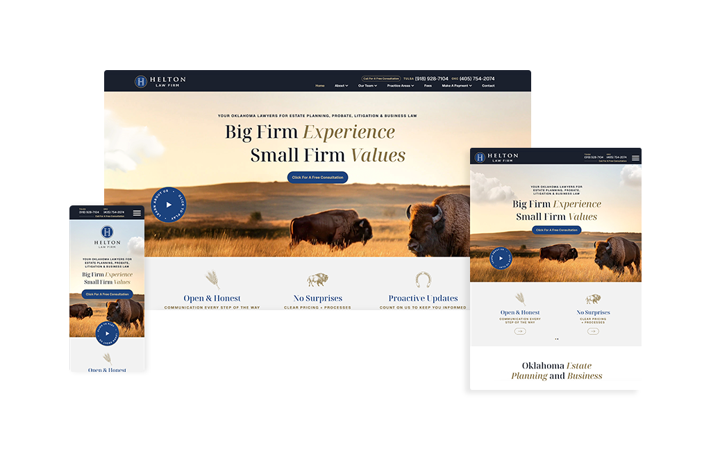
The Helton Law Firm website is a masterclass in keeping things simple, branded, and laser-focused on the audience. The hero header sets the tone immediately: a buffalo in open fields while clouds drift across the page, quietly transporting visitors to small-town Oklahoma the moment they land. It’s evocative without being overdone. The subtle “click to play” About Us call-to-action is equally thoughtful—inviting curiosity and instant rapport without forcing the video to the forefront.
Scroll down, and that same Oklahoma sensibility carries through every design choice. The color palette, imagery, and pacing reinforce the brand story from section to section, creating an experience that feels cohesive and intentional. Content blocks are trimmed to what matters so that prospective clients can find answers fast. Navigation is clean and intuitive, calls-to-action are clear, and the page flow nudges visitors toward contacting the firm without ever feeling pushy.
What really works here is the message-to-experience alignment. The design communicates care, quality, and steadiness—exactly what someone wants when choosing a lawyer. When a site makes you feel the level of service you can expect before you even call, that’s a win. Helton Law Firm’s website is one we’d point to as a blueprint: know your audience, honor your roots, and let design carry your story.
8. Paceline Law
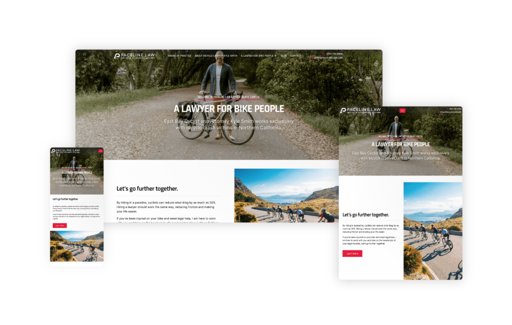
The Paceline Law website relies on focused branding and a unique niche to create a highly effective online presence. The simplicity of the site, combined with its powerful branding, makes it a standout in the legal field.
This law firm’s niche is bike accident cases. The fact that the attorney himself is a cyclist adds a layer of authenticity and experience that is hard to match. The concept of “Paceline” is instantly recognizable to cyclists, evoking images of drafting and aerodynamics, which immediately resonates with the target audience. The website’s performance is impressive, with a high click-through rate and superior conversion rates compared to many other legal sites.
This success is due primarily to the attorney’s ability to speak directly to his exact audience— cyclists who have been in accidents. This instant connection is a critical factor in converting visitors into clients.
The combination of the attorney’s cycling expertise, clear and relatable branding, and a user-friendly website design make it an ultimate conversion tool. This site not only attracts but also effectively engages and converts its target audience, making it a benchmark in niche legal marketing.
9. The Jones Firm, PLLC
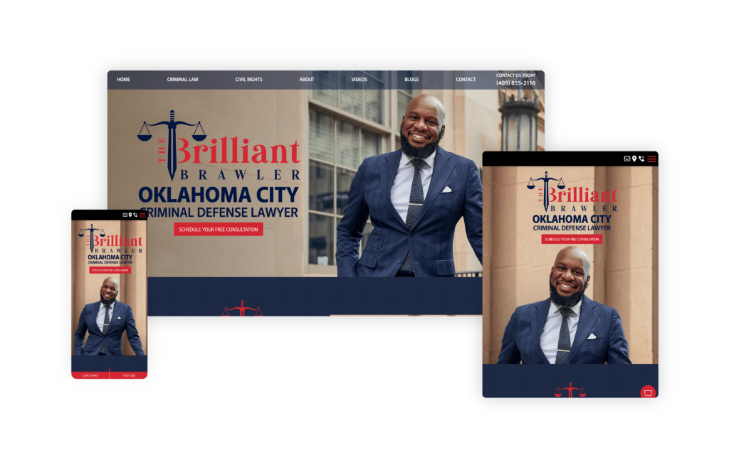
Many times, solo attorney websites fall short of serving their purpose. However, The Brilliant Brawler website is a remarkable example of how a solo attorney can effectively establish a robust online presence. Its design is impressively clean, with a flawless flow that guides visitors effortlessly through the content. The seamless integration of the logo throughout the homepage is a subtle yet impactful touch that reinforces the brand identity. This clarity and cohesiveness undoubtedly contribute to higher conversion rates, as potential clients can navigate the site without any confusion.
One of the most engaging features is the use of real photos and an introduction video centered on Ron himself. This personal touch allows visitors to feel as though they are meeting the attorney in person, creating a sense of familiarity and trust from the outset and likely increasing client conversions.
The Brilliant Brawler website excels in presenting a solo attorney in a professional, approachable, and highly effective manner. Its clean design, flawless navigation, and personal touches make it a standout site that is sure to resonate with visitors and convert them into clients.
10. Bloom Family Law, PC
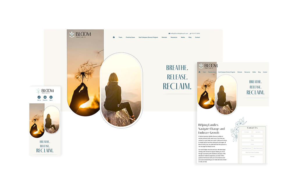
Bloom Family Law, PC has a website that immediately sets itself apart by understanding exactly whom it is speaking to and tailoring the entire experience to that audience. From the start, the design feels intentional and distinctive. One of the most unique touches is the repeated use of elongated oval elements, which begin near the top of the site and continue throughout the design. That consistency creates a visual rhythm that feels soft, polished, and thoughtfully branded.
What really makes the site stand out, however, is the messaging. Instead of leading with a list of practice areas or a more traditional law firm headline, the homepage opens with “Breathe, Release, RECLAIM.” That choice is powerful. It does not immediately push services at the visitor. Instead, it connects emotionally with the person likely landing on the site, someone who may be going through a divorce or facing a difficult family law matter and looking for clarity, support, and a sense of control. Paired with imagery that reinforces that message, the tagline speaks to its audience in a direct and meaningful way.
As you move through the site, it becomes even clearer that the design and copy were created with a very specific audience in mind. The site speaks especially well to women seeking family law guidance, and it does so without feeling forced or overly styled. The simplicity throughout the site works in its favor, making the experience feel calm, approachable, and easy to understand.
This is a great example of how a family law website can feel both strategic and deeply personal at the same time.
11. Craig Swapp & Associates
Designed By
Law Firm Sites
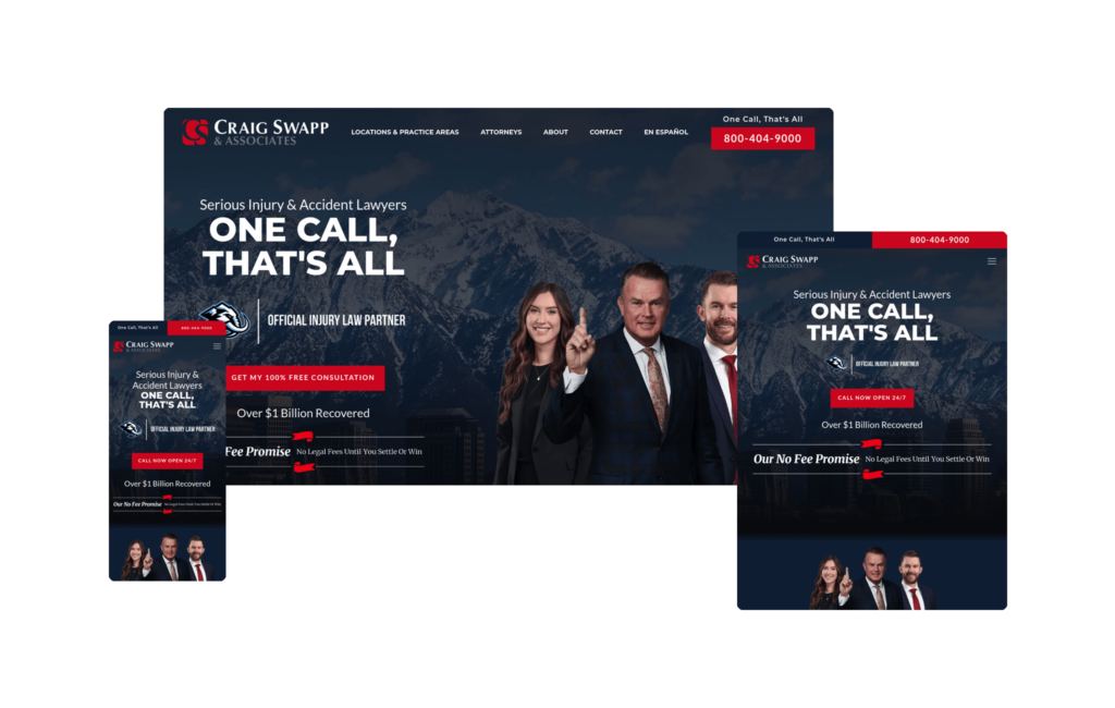
Craig Swapp & Associates opens with a polished, confident homepage that puts the firm’s managing partners and lead attorneys front and center, immediately giving visitors a face to connect with before they ever pick up the phone. Behind that introduction sits one of the site’s smartest touches: a background slider that cycles through imagery from the different regions the firm serves. It shifts subtly from scene to scene without disturbing a single element layered on top of it, quietly signaling the firm’s multi-location footprint while keeping the experience smooth and distraction-free.
What ties the whole thing together is branding. The firm’s look and feel carry through every section and every page, creating a unified experience that never feels disjointed as you move deeper into the site. The homepage keeps things refreshingly simple and purposeful, leading with the firm’s wins and a clear explanation of how they help, so visitors understand both the credibility and the value within seconds of landing.
Under the surface, the structure is built with intention. The site is architected to compete for high-value, high-intent search terms like “Spokane car accident lawyer,” and it extends that same disciplined approach across multiple markets, reaching into cities and states such as Boise, Idaho, and Utah. That kind of geographic scaffolding is exactly what a growing, multi-location firm needs to own its footprint in search.
Craig Swapp & Associates is also widening its reach in a way more firms should consider: a full Spanish-language version of the site, with several key pages translated to serve Spanish-speaking clients directly. It’s a strategic move that opens the door to an entirely new segment of potential clients who might otherwise bounce from an English-only experience.
Between the clean design, the location-aware slider, the cohesive branding, and the SEO-minded structure, this is a site that manages to be beautiful and functional at once. For any firm operating across multiple markets and looking to balance a strong brand with serious search performance, Craig Swapp & Associates is an excellent example to study and pull ideas from.
12. Dillman & Owen
Designed By
Nomos Marketing
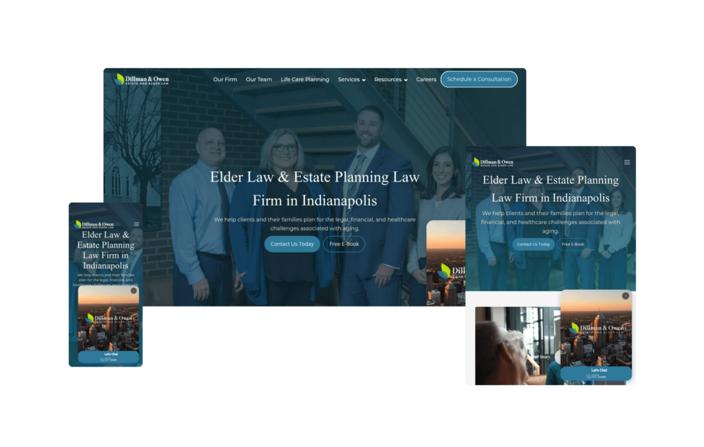
Plenty of law firm websites try to cram every possible detail onto the homepage, but Dillman & Owen takes the opposite, and far more effective, approach. Their homepage is clean, uncluttered, and never overwhelming, showcasing exactly what the firm focuses on: estate planning and elder law. That clarity does a lot of heavy lifting, immediately telling visitors they’re in the right place without burying them in information.
The firm’s video is a standout. It’s genuinely high-quality and touches on all the right notes, walking through their story and the “why” behind the work they do. That kind of storytelling builds trust quickly, especially in practice areas as personal and emotional as estate planning and elder law.
We really like the interactive component built into how they present their Practice Areas. Rather than dumping walls of text, each area is explained through an easy-to-digest explainer video that makes complex topics approachable. On top of that, the firm offers a free long-term care guide as a downloadable resource, which is a smart sales tool on two fronts: it provides real value to visitors, and it acts as a natural lead qualifier. Someone who takes the time to download that guide is signaling they’re far more serious than a casual browser, giving the firm a warmer, more intent-driven lead.
That same simplicity carries across every service page, keeping the experience consistent no matter where a visitor lands. The “Meet Gabbi” chat feature adds another interactive layer, giving potential clients an inviting, low-pressure way to engage and get their questions answered in the moment.
On the search side, Dillman & Owen isn’t operating in the most cutthroat SEO landscape, but that doesn’t mean the structure was treated as an afterthought. The site ranks for meaningful money keywords, and its clean architecture makes it highly readable to search engines, which is a big part of why it performs the way it does.
If you’re looking for a masterclass in “simple plus effective,” this is a fantastic site to draw inspiration from. Dillman & Owen shows that restraint, clear focus, and a few well-placed interactive tools can be far more powerful than trying to say everything at once.
13. GJEL Accident Attorneys
Designed By
Juris Digital
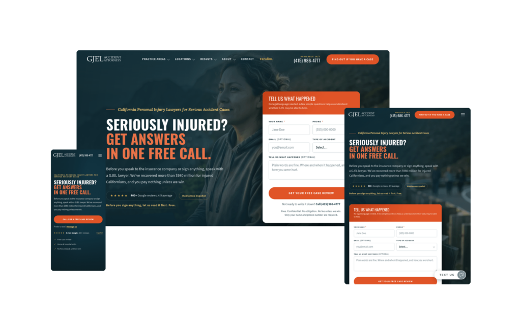
The GJEL Accident Attorneys website is a great-looking site with a very clear mission: get potential clients to convert quickly. Everything about the experience is engineered around the urgency someone feels immediately after an accident, when they need an attorney fast and don’t have the patience to hunt for contact information. The intake form sits right in the header, and a “Text Us” option lives in the bottom-right corner, giving stressed visitors multiple, frictionless ways to reach out the moment they land.
One element that stands out in particular is how the firm handles its stats and settlement figures. Instead of letting those numbers sit static on the page, they’re interactive and count up as you scroll into each section. It’s a simple animation, but it works, drawing the visitor’s eye and focusing their attention squarely on two of the most persuasive, credibility-building sections on the entire site. Reinforcing that trust further, GJEL features video testimonials from actual clients right on the homepage, giving prospects the chance to hear real experiences in real voices, which is one of the most powerful ways to convey what working with the firm is actually like.
The practice area pages deserve special mention. When you get into the more text-heavy sections, the site presents a navigational guide along the left-hand side that lets you jump straight to the exact information you’re looking for. It’s a thoughtful piece of UX that keeps visitors from feeling buried in copy, while still allowing the firm to publish the depth of content it needs. And that content is very much needed, because it’s a major driver of the rankings GJEL enjoys.
On the SEO front, the structure is executed extremely well. The site ranks for serious money keywords and holds high placements for terms like car accident, truck accident, and wrongful death across the many areas of California where the firm has offices. GJEL has also added Spanish-language versions of every page, which is helping them rank for Spanish terminology and opening the door to an entirely new group of potential clients who might otherwise never find them.
Between the conversion-first design, the interactive proof points, and the disciplined SEO execution, GJEL’s website is a strong model for any high-volume personal injury firm looking to turn urgent visitors into signed clients.
14. Nicolet Law
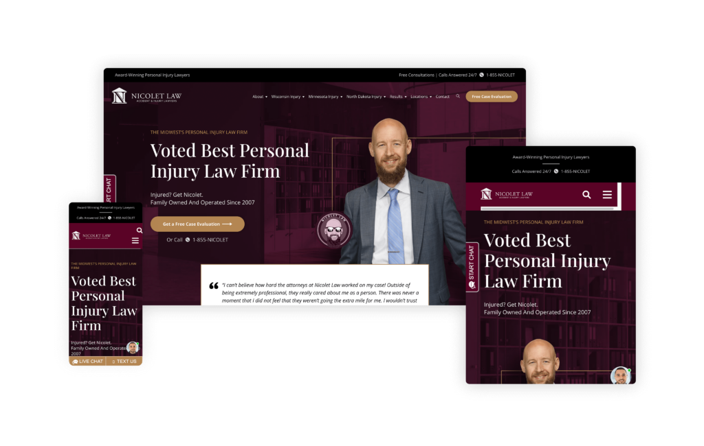
The Nicolet Law website models how a law firm can effectively build trust and engage with the community through thoughtful design and high-quality content. From the moment you visit the site, it’s clear that Nicolet Law is deeply embedded in the local fabric, showcasing their work in the community as a central feature.
The firm’s strategic growth, starting in Wisconsin and expanding into Minnesota, is a testament to its effective SEO process. This careful expansion is reflected in the site’s comprehensive and rich content, which stands out as some of the highest quality we have encountered. The site’s content is informative, well-organized, and tailored to meet the needs of potential clients.
Perhaps the most compelling feature of the Nicolet Law website is the video testimonials from multiple clients. These eight videos do more than provide reviews; they offer personal stories and experiences that resonate deeply with future potential clients. Such an extensive collection of testimonials underscores the firm’s success and reliability, significantly enhancing its credibility.
The impact of these efforts is evident in the law firm’s traffic, which has exploded since 2023. This surge in visitors is a clear indication of the site’s effectiveness in attracting and converting potential clients.
15. AF Family Law
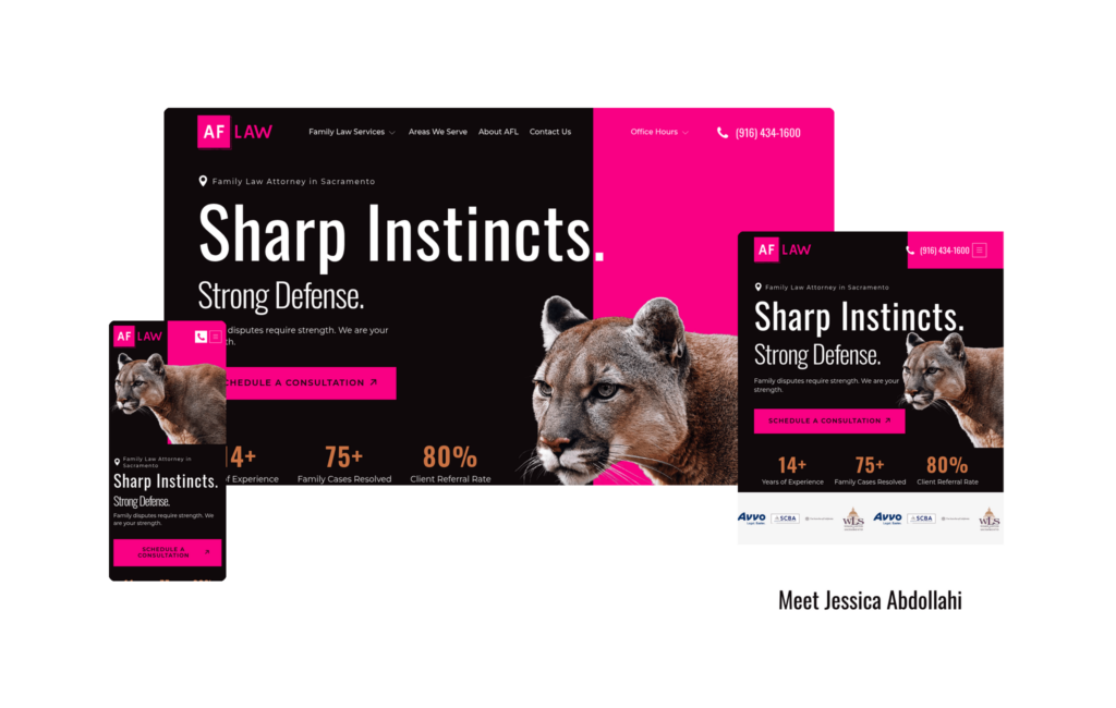
Building an entire brand around the color pink is always a bold choice, but AF Family Law pulls it off masterfully, leaning into the color enough to make it a signature without ever overdoing it. The result is a site that feels confident and distinctive from the moment it loads.
The main header sets the tone perfectly. It pairs a striking big-cat image with the tagline “Sharp Instincts, Strong Defense,” and that combination is branding done right. The predator imagery and the words reinforce each other, so the message sticks in a way that’s far more memorable than either element would be on its own. It immediately communicates the kind of fierce, strategic advocacy clients can expect.
From there, the site strikes a smart balance between the personal and the practical. It’s clearly focused on helping visitors get to know Jessica, the attorney they’ll actually be working with, while also giving them a clear understanding of the firm and the specific areas she concentrates on. That dual focus builds trust and sets expectations at the same time.
A particularly clever detail is the “Serving Northern California” section, where the map is rendered with a subtle pink outline. It’s a perfect example of weaving brand identity into a functional element ever so slightly, adding personality without hitting visitors over the head with it. The site also nails consistency: the transition from the homepage into any individual practice area is flawless, carrying the key design elements that make the homepage work straight through to each interior page so nothing ever feels disconnected.
The content strategy is every bit as strong as the design. AF Family Law ranks for some very powerful keywords, thanks in large part to a blog strategy that directly answers the real questions potential clients are asking, like “How much is it to file for divorce?” and “Is cheating illegal in California?” This FAQ-driven SEO approach is exactly what today’s search landscape rewards, and the firm is executing it perfectly.
A bold, cohesive brand, thoughtful design details, and a content strategy built around genuine client questions, all wrapped in a beautiful site. AF Family Law is a great example of how personality and performance can work hand in hand.
16. Abrams Fensterman, LLP
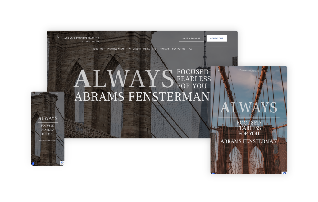
The Abrams Fensterman website showcases how a large law firm with diverse practice areas and numerous attorneys can present a cohesive, user-friendly online presence. Their site excels at balancing simplicity with comprehensive information, ensuring that visitors are neither overwhelmed nor lost.
The homepage immediately sets the tone with a slideshow of images that clearly establishes the firm’s New York roots, providing a solid sense of place and identity. The searchable element is a notable feature, allowing users who know exactly what they are looking for to locate the info they need by keyword quickly. It’s a necessary functionality for a site of this size and complexity, making navigation straightforward and efficient.
One of the most impressive aspects of the site is the practice leader section on each practice area page. This feature highlights specific lawyers and their specialties, effectively personalizing the firm and making it feel more approachable despite its large size.
The Abrams Fensterman website is a masterclass in managing and presenting a large, multifaceted law firm online. It combines clean design, user-friendly navigation, and strategic content organization to create a site that is both informative and engaging.
17. Shulman & Hill
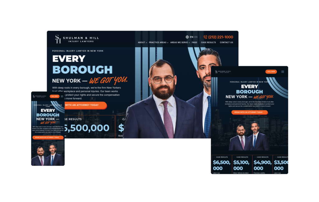
The Shulman & Hill website makes its positioning clear from the first second. The homepage opens with a dark NYC skyline hero and oversized display type declaring “EVERY BOROUGH NEW YORK, WE GOT YOU,” a headline that roots the firm in the fabric of the city rather than positioning it as a generic national practice. Case results are embedded directly in the hero: a $6.5 million Labor Law result and a $5.1 million Motor Vehicle Accident result, both visible before a visitor scrolls anywhere.
The design system is high-contrast and deliberate. Bold orange accent CTAs against a deep navy layout create clear visual anchors throughout the site. Bilingual English and Spanish functionality reflects the firm’s commitment to serving all New Yorkers, and the navigation stays lean, directing visitors straight to practice areas, results, and contact.
What distinguishes this site is how completely the brand claim and the design system are aligned. “Every Borough” shapes the geographic coverage, the language choices, and the proof points rather than sitting as a tagline on top of a generic template. The result is a firm identity that feels earned.
18. Hendler Flores Law
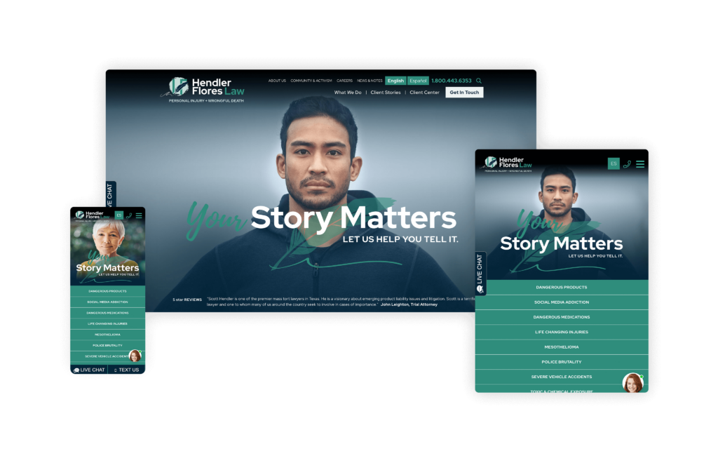
The Hendler Flores Law website is a remarkable representation of the firm’s dedication to handling highly emotional cases involving social injustice and severe injuries. As soon as your web browser arrives on the homepage, it’s evident that immense attention has been given to both the design and the message conveyed.
Specializing in cases that require a deep level of empathy and justice, Hendler Flores has successfully communicated their mission through their website. The use of the quill in the logo symbolizes the unfolding of a powerful story, while the homepage prominently features faces that convey empowerment and resilience. This visual approach not only tells the story of their clients but also assures visitors that their own stories will be given the justice they deserve.
Personal touches such as a hand-written font and powerful case studies add a layer of intimacy and connection, making it clear that many of their clients become like family. The site’s design is not only emotionally resonant but also award-winning, having proudly secured a Gold dotCOMM award. This accolade underscores the site’s excellence in both form and function.
19. Newlin Law Offices, P.C.
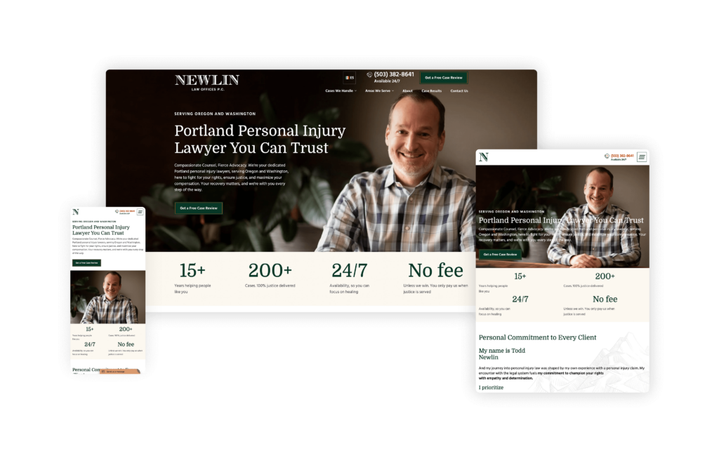
The Newlin Law Offices website is a prime example of effective legal web design, offering a perfect blend of personal touch, user convenience, and professional validation. Visitors to the site are greeted with a prominent and welcoming photo of the attorney, immediately establishing a personal connection.
Key call-to-actions (CTAs) are strategically placed at the top of the page, inviting users to call or request a free case review. The inclusion of a bilingual option caters to a broader audience, ensuring that the site is accessible and user-friendly for all visitors. This thoughtful design choice provides consumers with almost everything they need right from the start.
The homepage effortlessly flows into sections that showcase the attorney’s skill and experience, reinforcing trust and credibility. The flawless design ensures that all necessary elements, such as credentials, client testimonials, and case results, are prominently displayed throughout the page.
Adding to the overall appeal, the website features subtle graphics that bring a dynamic and engaging element to each section without overwhelming the user. These design elements contribute to a very personable and approachable feel, making potential clients feel comfortable and confident in reaching out.
20. Steinberg Law Firm
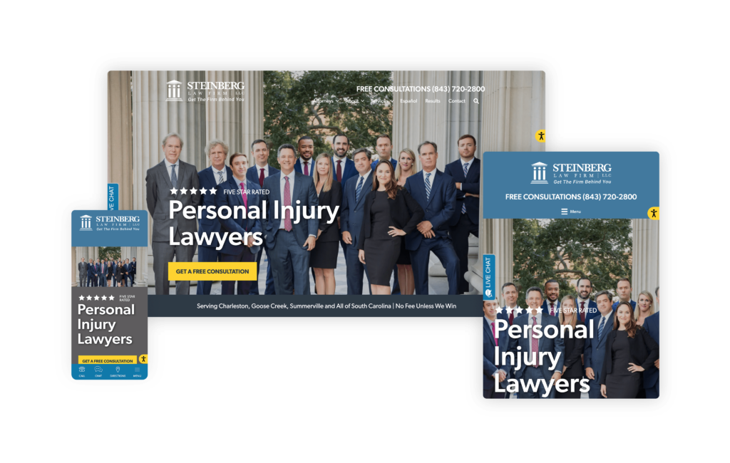
The Steinberg Law Firm website is a shining example of how a long-established firm can seamlessly blend tradition with modernity to serve today’s clients effectively. Nearly a century old, the Steinberg Law Firm demonstrates its forward-thinking approach with a website designed for the modern client, brimming with interactive and engaging features.
With its extensive use of videos and web stories, this website gives visitors an immersive experience that helps convey complex legal information in an easily digestible format. The inclusion of Q&A sections further enhances the user experience by addressing common concerns and queries directly, making it easier for potential clients to find the information they need.
Interactive elements on the site make navigation intuitive and engaging. The firm’s dedication to community engagement is evident in its comprehensive blog and over 1,000 pages of helpful content, including in-depth reports, such as the detailed analysis of truck accidents in South Carolina.
Several awards, like the W3 and the Vega Award, reflect the high standards of design, content, and user experience that the Steinberg Law Firm website upholds.
21. Bryan Brown Law
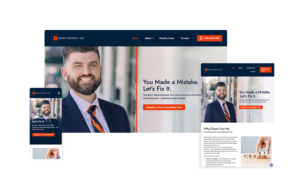
The bold Auburn orange and blue color scheme immediately signals that this criminal defense site is different. Rather than leading with intimidating credentials, Bryan Brown’s homepage opens with a raw confession: “I was arrested at 19.” This vulnerability-first approach sets the tone for a site that feels more like an honest conversation with a friend than a typical attorney pitch. The design is deliberately simple and uncluttered, a strategic choice for people in crisis who need answers fast, not fancy animations or complex navigation.
Clear practice area icons with straightforward labels guide stressed visitors exactly where they need to go, while a prominent 3-step process (“Fill Out the Form,” “I’ll Call You Back,” “Meet Face-to-Face”) removes ambiguity from what happens next. Photos of Bryan throughout the site show him as approachable and real, not posed in the typical lawyer power stance. The messaging reads like straight talk: “You don’t need a lecture” appears prominently, reinforcing that this is a judgment-free zone.
The site’s greatest strength is how the design supports Bryan’s unique positioning. As both a former prosecutor and someone who’s been arrested himself, he bridges both worlds, and the site visually communicates this balance. Professional enough to reflect his legal expertise and relationships with judges and DAs, yet warm enough to comfort someone terrified about their criminal charges. Every element reinforces the same message: you can get a second chance.
22. FVF Law Injury & Wrongful Death
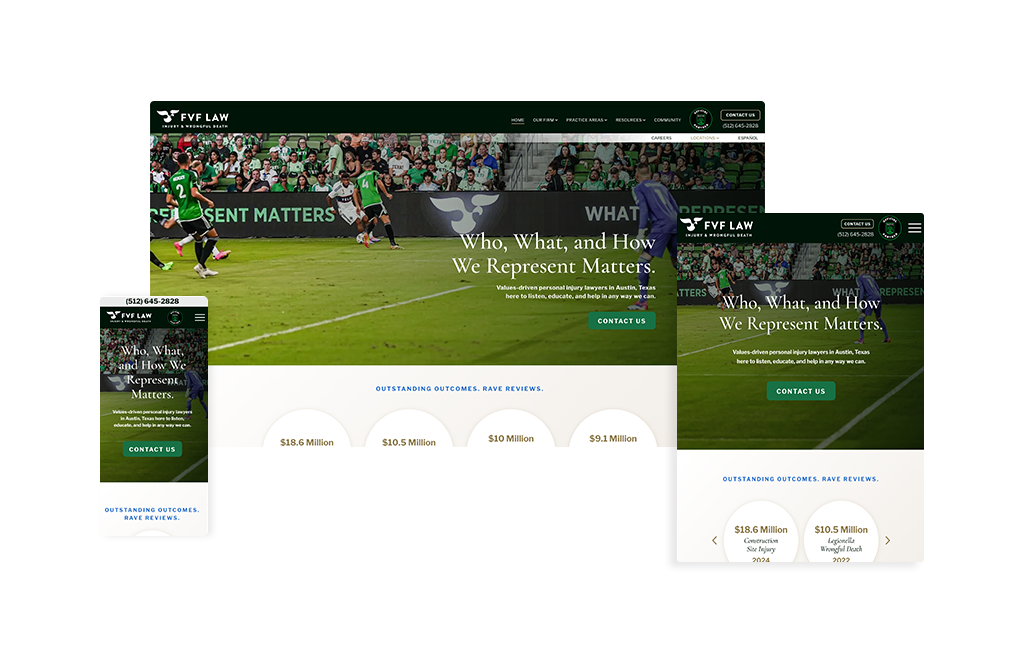
FVF Law Injury & Wrongful Death smartly taps into the firm’s official partnership with the Austin FC soccer team and lets that identity drive the brand system. The green-forward palette threads through headlines, buttons, and accents, giving every page a cohesive rhythm that feels unmistakably Austin. The headline “Who, What, and How We Represent Matters.” does heavy lifting—clear, memorable messaging that sets expectations and values in a single stroke. Paired with values-driven positioning, the site communicates something rare in personal injury: if your case matters to you, it will matter to them just as much.
The UX is purpose-built for momentum. From the hero, users flow right into case results, an elegant pivot from promise to proof that makes outcomes feel tangible. Calls-to-action remain visible without getting in the way, while content blocks are streamlined to essentials, allowing visitors to scan, understand, and act quickly.
Under the hood, the structure shines. The information architecture keeps practice areas intuitive, with clean pathways that meet users where they are —such as Austin personal injury, car accidents, truck accidents, and wrongful death —and then guides them deeper without friction. The SEO framework is equally disciplined, built to compete and win on high-intent terms across those niches in the Austin market.
Visually confident, message-led, and conversion-focused, FVF’s website strikes a balance between brand, clarity, and credibility that feels effortless. It’s a playbook for modern PI firms: anchor your brand in what your audience already loves, lead with values, prove it with results, and keep every click purposeful.
23. James Newman, P.C.
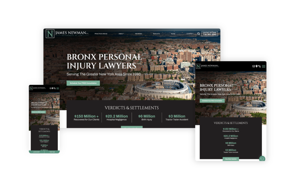
Subtle yet impactful branding creates an engaging and effective online presence for the James Newman Law website. As soon as you land on the homepage, the design stands out with its noteworthy yet understated branding. The consistent use of the main colors throughout the site makes each section pop, creating a visually cohesive and attractive experience.
Overall, the James Newman Law website combines simple, practical design with powerful branding to create a user-friendly and inviting online experience. The strategic use of color, clear calls to action, and personal touches make this website a model of how a law firm can present itself as both professional and approachable.
24. The Law Office of Poorvi B. Parkhie
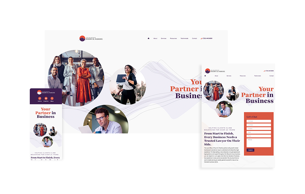
The website published by the Law Office of Poorvi B. Parkhie does an exceptional job of blending strong branding with a clear sense of place. From the moment you land on the homepage, the Colorado influence is unmistakable. The logo, the mountain imagery in the header, and the beautifully crafted footer work together to create an immediate sense of regional identity. Even the testimonial section carries that same theme, featuring a striking mountain-and-trees image that reinforces the site’s connection to the local audience. It instantly feels rooted in its market, which is exactly what many law firm websites strive for but do not always achieve.
What makes this site especially effective is how polished and intentional every section feels. Rather than relying on generic breaks or repetitive layouts, the design uses unique transitions and visual elements throughout the page. It’s engaging without becoming distracting. Each section has its own look while still fitting naturally into the overall design, which is not always easy to pull off.
Their site clearly establishes Poorvi B. Parkhie as a business law attorney, but it does so without ever feeling heavy-handed or overwhelming. Visitors are naturally guided toward that understanding through the design, structure, and flow of the content. That balance is one of the strongest parts of the site.
Overall, this is a beautifully designed legal website that captures local identity, highlights the attorney’s focus, and delivers everything in a calm, sophisticated, and user-friendly way.
25. Kyle Law Firm
Designed By
Law Firm Sites
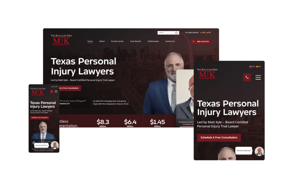
From the first scroll, the Kyle Law Firm website makes a strong design impression. The header is the standout: a soft, understated video plays quietly in the background, giving the top of the page a subtle sense of motion and depth while still reading like a clean, fixed header. It’s an elegant way to add life to the hero section without pulling attention away from the messaging or feeling gimmicky.
The real strength here is the structure of the homepage, which reads almost like a checklist of everything a prospective client wants to see before deciding to reach out. It opens by communicating the firm’s beliefs and values, then moves into case results that establish credibility early. A well-produced video highlights the firm and Kyle’s background, giving visitors a genuine sense of who they’d be working with. From there, the page layers in clear highlight points that showcase the firm’s expertise, real attorney photos that keep the experience personal, client reviews that build trust, and a dedicated section for awards and accolades.
The site rounds things out with a smart content approach, presenting FAQs and blog content in an easy-to-digest FAQ format. This is a subtle but effective decision. It answers the exact questions clients are already asking, keeps the information approachable, and does double duty by supporting the firm’s search visibility. By the time a visitor reaches the bottom of the homepage, they feel like they actually got to know the firm rather than just skimming a brochure.
On the SEO front, the site is already showing real traction, ranking for several strong, competitive keyword phrases. That combination of thoughtful design, trust-building content, and search performance is a promising foundation, and it will be worth watching where those rankings land as the site matures.
Overall, Kyle Law Firm strikes a great balance between polish and substance, giving prospective clients both the emotional reassurance and the hard proof they need to take the next step.
26. Connor Law, PC
Designed By
Nomos Marketing
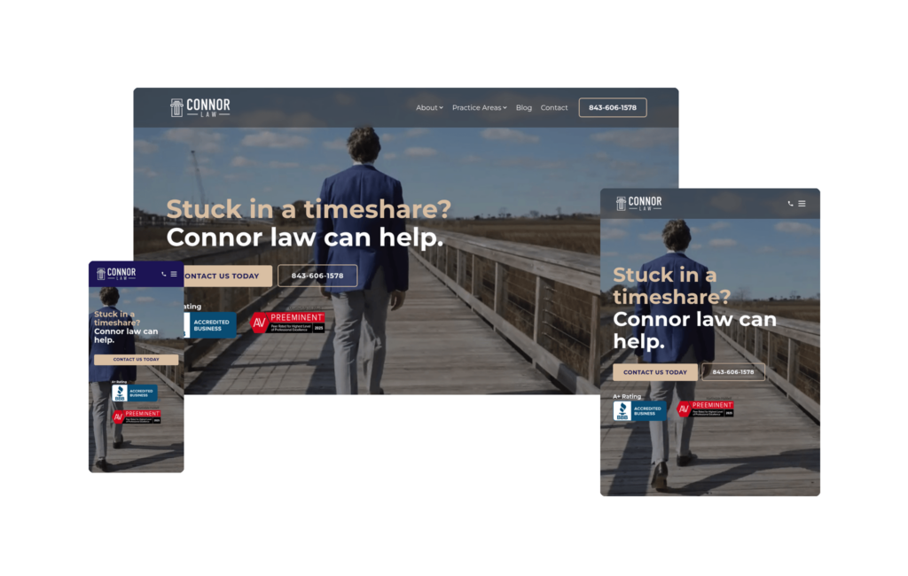
Connor Law, PC is a great example of what happens when a website speaks directly to one very specific client. The firm focuses on a genuinely niche area of law, helping people escape timeshare contracts they never should have been talked into. It’s almost hard to believe the industry is so predatory that attorneys can build an entire practice around freeing people from these agreements, but that’s exactly the problem Connor Law solves, and the site makes that crystal clear from the start.
Because the firm is so focused, the website never feels overwhelming. It does an excellent job highlighting attorney Andrew Connor and the specific practice areas he concentrates on, and every section walks potential clients through the exact journey they can expect when they hire the firm. There’s a natural, reassuring flow to it. The firm’s video goes a step further than most, showcasing not just what Connor can do, but his reason why, complete with a warm, approachable family-man feel that makes him instantly relatable to stressed prospects.
For attorneys operating in any niche practice area, the structure of this homepage is well worth studying. It’s a template for how to communicate a specialized service clearly and confidently without diluting the message.
The SEO strategy is just as smart. Because the niche is so specific, the competitive landscape isn’t nearly as brutal as, say, personal injury, but the site’s structure is still executed well enough to rank for the terms this audience is actually searching, like “timeshare cancellation attorney.” Where the approach really shines, though, is the blog. Rather than chasing broad traffic, the content targets the precise, high-intent questions real people are typing into Google, such as how to get out of a Westgate timeshare, a Marriott timeshare, and other brand-specific problems.
That’s exactly how firms should be blogging today. Connor Law isn’t writing for vanity metrics or raw traffic numbers; they’re writing to answer the money questions they know their potential clients are desperately asking. It’s a focused, problem-first content strategy paired with a clean, purpose-built site, and together they make Connor Law a standout example of how to dominate a niche both on the page and in search.
27. Lance D. Youd, Attorney at Law
Designed By
Nifty Marketing
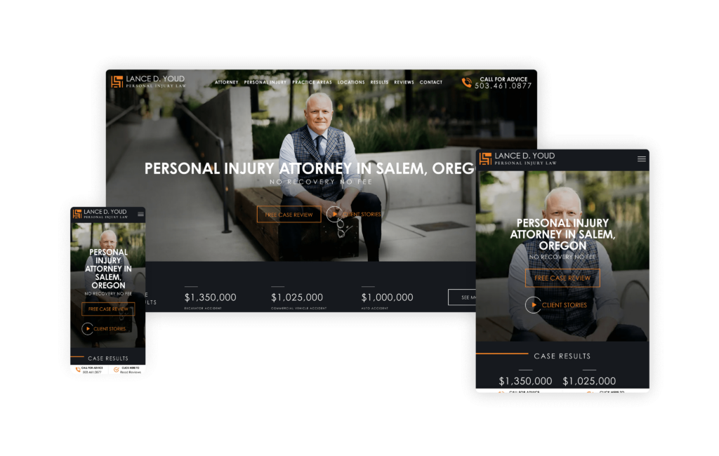
Lance D. Youd’s website is an outstanding example of how to build a law firm website for a single attorney, perfectly showcasing the attorney’s personality and expertise throughout the homepage. From the very beginning, the attorney is the focal point, and the image of him with his bulldog is a memorable touch that adds relatability.
Visitors are instantly engaged with the client stories section and can easily connect with the offer for free case reviews right at the top of the page. The strategic placement of case results at the bottom of the “above the fold” section creates a seamless flow that furthers engagement.
Readers are also drawn in by the visuals, providing them with a sense of who the attorney is, not just professionally but personally. The “It’s Free to Ask” section is a standout feature, presenting the concept of a free case review in a fresh and approachable way. This creative touch reinforces the attorney’s accessibility and willingness to help. Overall, the site establishes a high level of attorney credibility, making potential clients feel like they know him before they even hire him—exactly the kind of connection that can drive conversions and build trust.
28. Razumich & Associates, PLLC
Designed By
Advantage Attorney
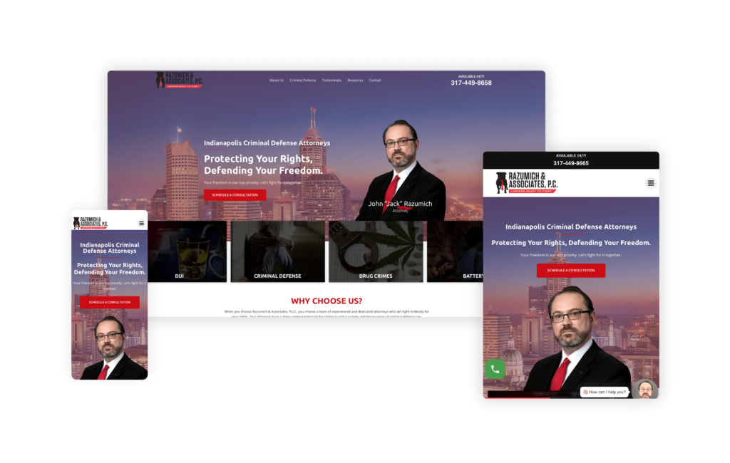
When it comes to aggressive criminal defense legal representation, the Razumich & Associates website is a robust advertisement. The focused messaging makes it easy for visitors to understand who the firm is for and what it offers. The firm’s strong slogan, “Lawyers Ready to Fight,” is prominently featured, immediately revealing their commitment to providing vigorous and dedicated legal advocacy.
Its inclusion of genuine client reviews and testimonials builds trust and establishes credibility.
The website’s emphasis on client feedback reassures potential clients that they are in capable hands. It also relies on clear calls to action with multiple prominent buttons for scheduling consultations. Additionally, the sticky menu ensures that contact options are always accessible, offering several easy pathways for potential clients to connect with the firm.
By offering a free guide on “Understanding the Criminal Justice System” on their website, they not only provide value upfront but also position themselves as a knowledgeable and client-focused law firm. The content of the website is particularly effective in highlighting the severe, life-changing consequences of criminal convictions. By tapping into the anxieties of potential clients, the firm motivates them to seek help and underscores the importance of having strong legal representation.
29. Knapp Accident & Injury Law
Designed By
Site Social SEO
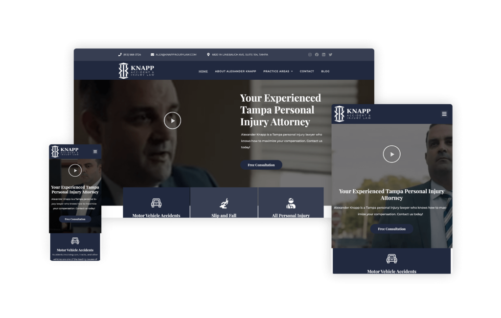
The Knapp Accident & Injury Law website is a perfect example of how functionality and aesthetics can be perfectly balanced to create a user-friendly and visually appealing online presence. When visitors land on the site, they are immediately greeted with a clean layout that utilizes ample white space and organized sections, enhancing readability and ease of navigation.
One of the best features is its effective use of headers, paragraphs, and bullet points. These elements are prominently displayed, ensuring that information is clearly presented and easy to digest. The use of large, clear fonts and icons further enhances clarity and accessibility, making the website readable across all different devices.
Its predominantly blue and white color scheme fosters a sense of professionalism and trustworthiness. High-quality images and videos of the attorney, starting with the hero section, are strategically incorporated to establish trust and familiarity with the audience right from the start.
Since the client preferred a smaller homepage, it’s effectively utilized to provide comprehensive information about the lawyer, the firm, and their practice areas. Recent reviews are also highlighted here, as well as detailed content about personal injury law to help visitors understand their legal options.
30. Porter Simon Sierra Injury Lawyers
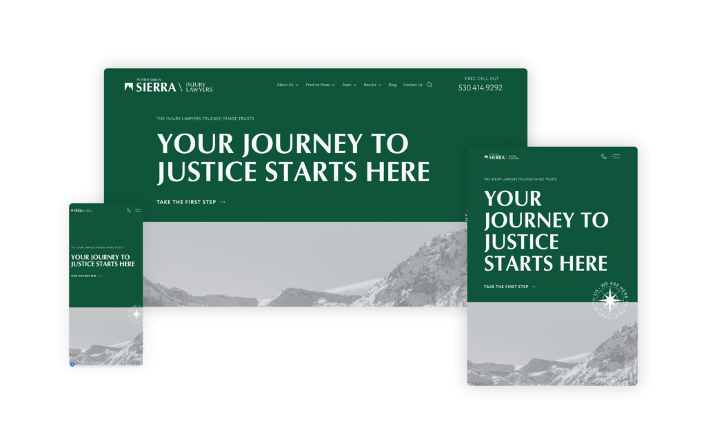
This website combines a robust geographical focus with simplicity and custom design to create a powerful online presence. Visitors are drawn in by the site’s clean and practical layout, which emphasizes its dedication to the Tahoe area.
One of the most unique and engaging features is the section under “Take the First Step to Justice,” which cleverly uses the metaphor of taking steps up a mountain. This approach not only reinforces the mountain branding in a visually appealing way but also makes the legal process feel more relatable and understandable for potential clients.
The site is a prime example of how niching down can significantly enhance connection with future clients. By tailoring the content and design to reflect the local environment and community, this website effectively speaks directly to its audience, building trust and establishing a solid presence in the Tahoe area.
31. Shore Injury Law
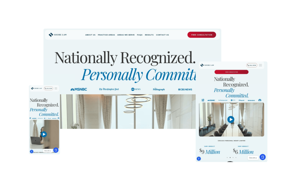
The Shore Injury Law website brings an editorial sensibility to personal injury law that stands apart from the category. Built around large-scale serif typography and a restrained, light palette, the Chicago-based firm’s homepage reads more like a respected regional publication than a law firm, projecting calm authority from the first scroll.
Founder Megan Shore’s credentials are woven throughout the design: featured by CBS, NBC, ABC, The Washington Post, and the Chicago Tribune, and recognized by the National Academy of Personal Injury Attorneys and The National Trial Lawyers. The results page leads with a record $9 million nursing home jury verdict alongside several additional multi-million dollar outcomes, presented as facts integrated into the design rather than a separate trophy case.
The attorney profiles go beyond credentials to explain what drew each lawyer to plaintiff-side work. For a firm handling nursing home abuse, medical malpractice, sexual assault, and birth injury cases, that level of personal narrative builds genuine trust. Shore Injury Law’s site earns its positioning at every level.
32. Abels & Annes, PC
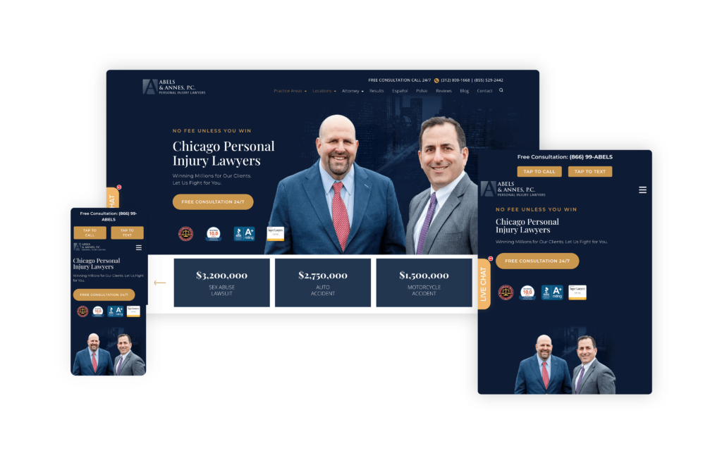
This website showcases a straightforward design that is highly effective, particularly when optimized for SEO like it is. The structure is meticulously dialed in to maximize search engine visibility, ensuring that potential clients can easily find the firm online. As such, this website sees impressive traffic and high rankings for key practice areas in the competitive Chicago market.
Engaging visitors immediately, the firm’s main call-to-action is prominently displayed, encouraging users to take the next step right away. This is complemented by an exhibit of impressive verdicts, establishing the firm’s credibility from the outset. It also features a large attorney headshot to add a personal touch and make the site feel welcoming and trustworthy.
By following this with a highlight of their frequent media appearances, the website further solidifies their credibility and authority in the field.
Harnessing the power of basic design, the site’s effectiveness lies in its brilliant structure. It seamlessly manages to balance personal connection with professional credibility. The clear layout and user-friendly navigation ensure that visitors can easily find the information they need, while the focused SEO strategy drives significant traffic to the site.
33. Stacey-Ann Taylor Law
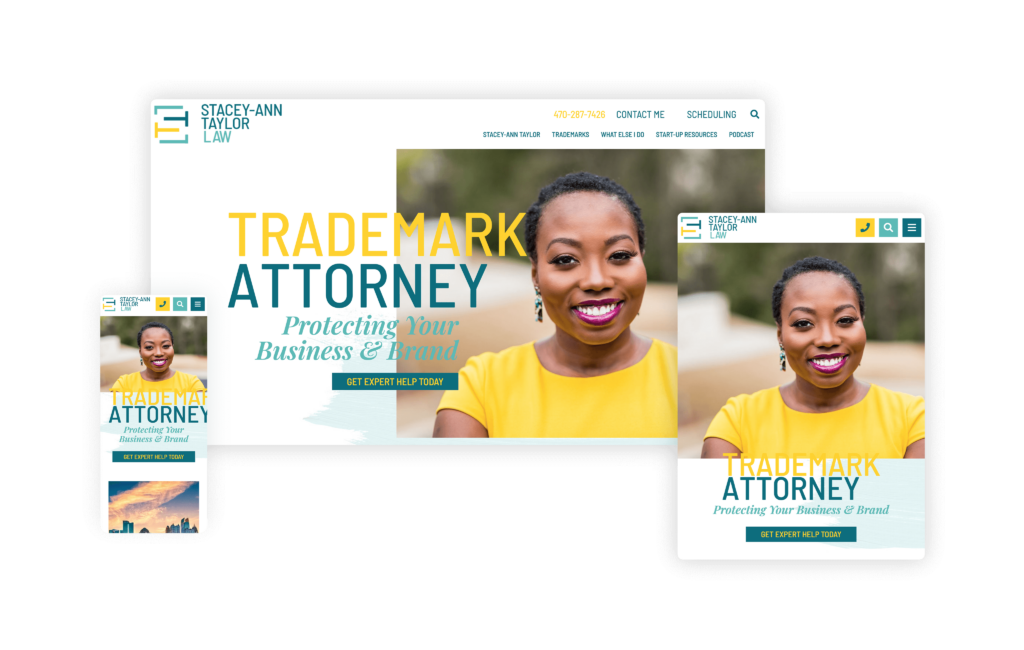
The website for Stacey-Ann Taylor Law truly defies the outdated stereotype that law firm websites must be old-fashioned and overly serious. From the outset, it’s clear that this site is something special. Stacey-Ann had long admired the work of PaperStreet, and when she opened her own firm, she knew exactly who to trust with her vision. The result is a fresh, playful, and energetic online presence that perfectly mirrors Stacey-Ann’s dynamic legal practice.
The logo cleverly utilizes the letters in her name to create a negative space, “S,” while incorporating a bright, atypical yellow. This pop of color immediately sets the tone for the entire site, signaling that this is a law firm with a unique and vibrant personality.
Great imagery is critical to any successful website, and Stacey-Ann’s lifestyle photoshoot brings this site to another level. The professional, color-coordinated shots highlight her ties to the
Atlanta community and her radiant personality. These images, combined with thoughtful design elements like thought bubbles, brush stroke textures, slick loading animations, and stylish typography, create a visually engaging and cohesive experience.
The site’s harmonious yet accessible design earned it a spot on the Top 10 List by Lawyerist.
34. Omar Ochoa Law Firm
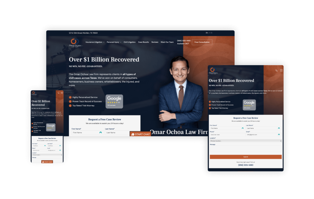
Omar Ochoa Law’s website is visually appealing and intuitively organized, engaging visitors from the get-go. As soon as they land on the homepage, they are greeted with impressive metrics, such as the substantial amounts recovered for clients and an impressive Google rating, which immediately instills confidence.
The readily accessible case review form encourages potential clients to engage with the firm right away. This proactive approach is complemented by a comprehensive overview of the firm’s awards, practice areas, client testimonials, team information, media mentions, community participation, recent blog articles, and contact details— all conveniently located on the homepage.
Its design ensures that everything a prospective client might need is at their fingertips. The incorporation of a chat box facilitates quick and easy access to information, enhancing user experience. Additionally, the well-organized burger menu provides expanded information about the firm, including a localization button that caters to Spanish-speaking clients—an essential feature for their Texas-based clientele.
35. Sommers Schwartz
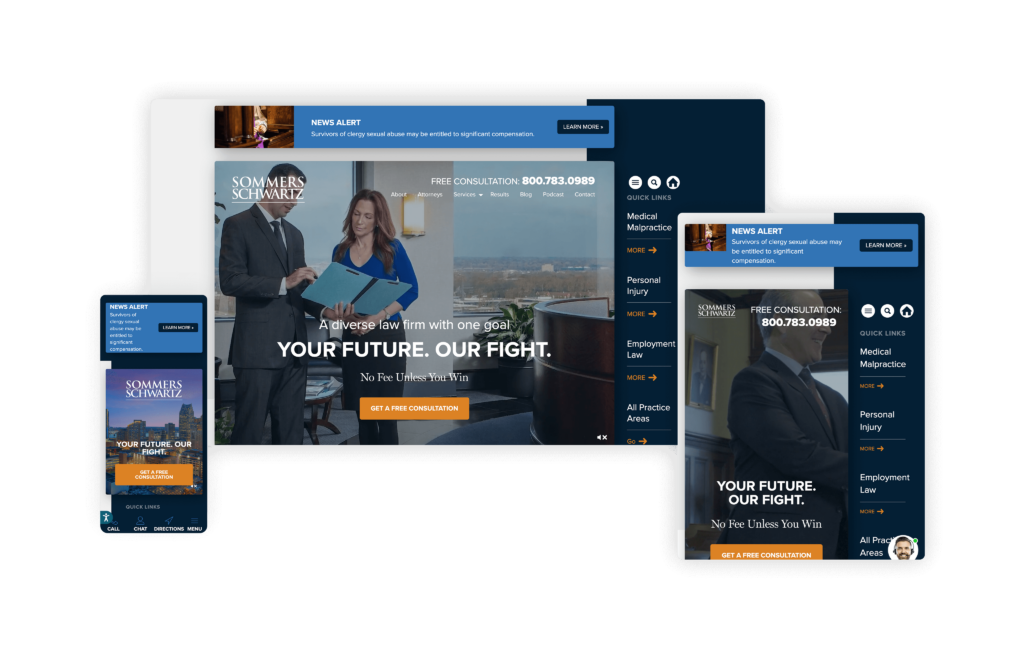
The website for Sommers Schwartz masterfully balances informativeness and approachability, a crucial feat for a $1 billion law firm. As a Michigan-based personal injury and employee rights firm, Sommers Schwartz has created an online presence that speaks volumes about their commitment to their clients while maintaining a professional demeanor.
The website offers detailed and informative pages on sensitive topics like medical malpractice and birth injuries. These pages are thoughtfully constructed to provide comprehensive information, helping potential clients understand complex legal issues and the firm’s vast experience in handling them.
Navigating through the site is a breeze, thanks to the innovative attorney search engine in the attorney section. This feature allows clients to quickly find any of the 40+ attorneys at Sommers Schwartz, making the process of finding the proper legal representation both efficient and straightforward.
The attorney bio pages are particularly impressive, featuring videos of many lawyers alongside personal quotes that convey their dedication to fighting for their clients. This adds a personal touch and helps build a connection with potential clients, showing the human side of the firm.
Informative videos, infographics, web stories, a podcast, and interactive elements also add to its robust content to enhance user engagement and make complex legal information more digestible.
36. MacGregor Lyon
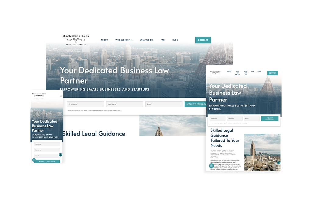
Atlanta skyline photography dominates this business law site, immediately establishing MacGregor Lyon’s deep local roots. From the Midtown skyline to highway views and park perspectives, every image reinforces one message: this is an Atlanta firm serving the Atlanta startup and small business community. The design is clean and sophisticated without feeling corporate, a delicate balance that positions them as the accessible alternative to intimidating big law firms that dominate the market.
The site’s structure brilliantly supports their “on-call general counsel” positioning through clear, well-organized service sections that span the entire business lifecycle. Each practice area is presented with professional icons and concise descriptions that small business owners can actually understand. There’s no dense legal jargon or overwhelming walls of text. Glenn M. Lyon’s professional headshot and personal touches (guitar playing, Lake Sinclair time with family) humanize the firm while his impressive credentials (AV-rated Preeminent, Georgia’s Top Rated Lawyer, President of the Lawyers Club of Atlanta) establish credibility.
What sets this site apart is its ability to feel both professional and personal. The Atlanta imagery creates immediate local connection, while the straightforward navigation and plain-language content make complex business law concepts accessible. For startups and small businesses intimidated by big law firms where they’d never speak directly to an attorney, this site offers a visual promise: personal service, local expertise, and someone who will actually answer the phone.
37. Meyers & Flowers
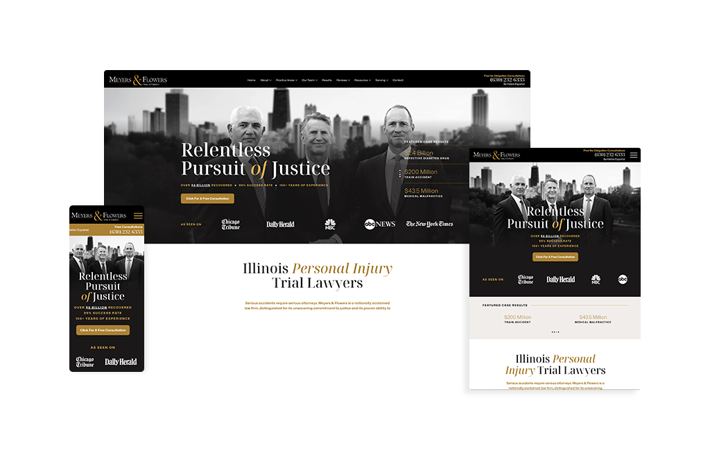
If you’re looking for a homepage that nails the above-the-fold experience, look no further than the Meyers & Flowers. Within seconds, visitors see exactly what they came for: trusted faces, clear location cues, and hard proof. The partners’ portrait set against the Chicago skyline is a confident, place-based opener that establishes credibility and connection. From there, the page slides seamlessly into outcomes, including experience, success rate, and total recoveries, while a featured-cases panel keeps tangible results in view. Credibility badges and media/association logos stack at the bottom of the section, reinforcing trust just as the primary “Free Consultation” CTA invites action. It’s a tight loop from first impression to first click.
The rest of the homepage keeps that momentum without overwhelming. Content modules are purposeful and evenly paced, surfacing what matters—practice areas, results, testimonials, team—without burying users in walls of copy. Navigation is frictionless, with clear paths into complex offerings and an ever-present route back to contact. It’s a savvy balance for a firm with deep benches and broad capabilities: the design reads “bespoke and attentive,” yet the scope reads “battle-tested and resourced.”
Visually, the system stays clean and assertive. The typographic hierarchy anchors the design; the imagery feels editorial rather than stock; spacing and rhythm make scanning effortless. The net effect is a “small firm feel” layered over big-firm horsepower; a combination that reassures anxious prospects and drives conversions.
In short, Meyers & Flowers’ site checks every box: immediate trust signals, proof where it counts, effortless UX, and CTAs that meet visitors at the right moment. Clean, confident, and conversion-minded from top to bottom.
38. The Finizio Law Group
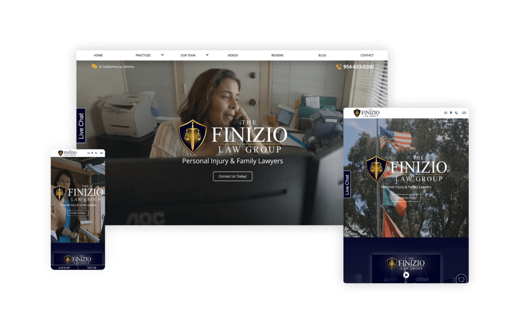
The Finizio Law Group website, designed by Accel Marketing Solutions, is an excellent example of how a legal firm’s online presence can be both visually appealing and highly functional. As soon as the website loads, the video background in the main header immediately draws you in, making you feel like you are meeting the team right away.
The overall flow of the site is exceptional, with a clean and coherent design that guides users effortlessly through the content. The color scheme is well-chosen, enhancing the site’s aesthetic appeal while maintaining a professional look. The tagline, “We Will Treat You Like Family, BECAUSE WE ARE FAMILY!” adds a warm, inviting touch.
Particularly impressive are the sections dedicated to their two primary practice areas: personal injury and family law. These sections are not only informative but also highly user-friendly, with all the niches within these categories being easily digestible and clickable. This thoughtful organization ensures that potential clients can quickly find the information they need.
The intuitive navigation, combined with engaging visuals and straightforward information, makes the Finizio Law Group’s site a standout in the legal web design space. It’s a perfect blend of warmth, clarity, and functionality.
39. Stilley Law
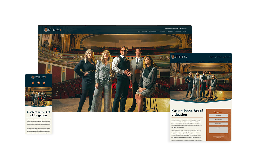
Stilley Law has a website that immediately separates itself from the crowd by leaning into a bold, cinematic feel. Rather than presenting the firm in a typical law firm format, the design gives the impression that the attorneys are the stars of their own feature film. It is a unique creative direction, and it works. The main image at the top of the site sets that tone right away, creating an instant sense of professionalism, confidence, and polish.
That same visual approach carries throughout the homepage. The attorney photos feel styled and intentional, and the backgrounds used in each section help reinforce the firm’s elevated brand identity. Everything feels coordinated, giving the site a strong, memorable personality without sacrificing its credibility. It is a great example of how a firm can make a bold first impression while still looking refined and trustworthy.
What keeps the site effective is its simplicity. Even with a more distinctive visual concept, the layout remains clean and easy to follow. The design does not try to do too much at once. Instead, it allows the imagery, spacing, and branding to do the heavy lifting while keeping the user experience smooth and approachable.
Overall, this is a unique legal website that demonstrates how strong branding and simplicity can work hand in hand. It feels polished, memorable, and confident from the moment you arrive.
40. Epstein Family Law
Designed By
Law Firm Sites
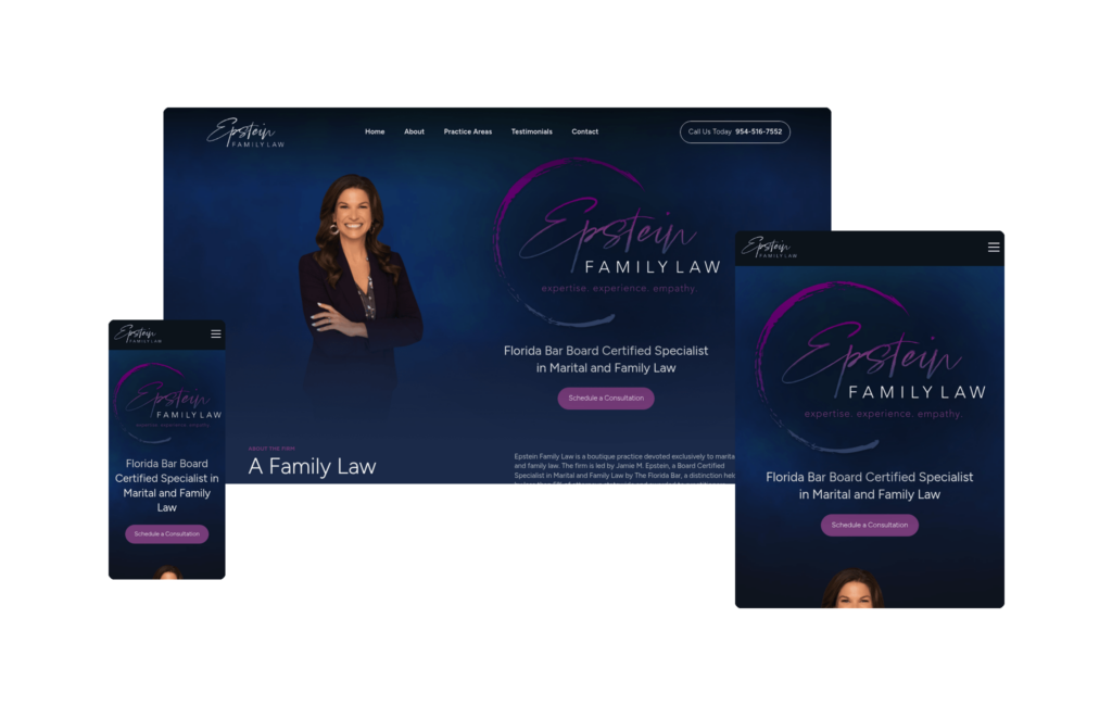
The Epstein Family Law website proves that simple and effective are not mutually exclusive. At first glance, the header appears plain and understated, but give it a moment, and you’ll notice the background moving ever so slightly, a gentle motion that quietly holds your attention and draws you into the page. It’s a restrained, sophisticated choice that sets the tone for everything that follows.
Branding is where this site really shines. Jamie Epstein’s personal brand and a consistent, thoughtfully chosen color palette flow seamlessly throughout the entire site, creating an elegant, cohesive feel as you scroll. Nothing feels out of place or bolted on. That consistency carries onto every interior page as well; each tab shares the exact look and feel of the homepage, so navigating from one section to the next is effortless and never jarring. Visitors always know where they are and what to expect.
More than anything, the site does an outstanding job of putting the attorney herself at the center of the experience. When you spend time on this website, it becomes immediately clear that working with Epstein Family Law means working directly with Jamie. That’s a powerful message in family law, where clients are often navigating some of the most difficult moments of their lives and want to feel genuinely cared for. This is a textbook example of how to brand a site around the attorney as an individual, creating the sense that the person behind the firm truly cares and is ready to help.
If there’s one enhancement we’d love to see, it would be a branded video built around Jamie’s own story and her passion for helping others, in place of the more general video currently featured. Given how personal and attorney-focused the rest of the experience already is, a story-driven video would be the finishing touch that completes the emotional connection the site works so hard to create.
Even so, Epstein Family Law stands as a beautiful, elegant example of personal branding done right, and it’s a great blueprint for any solo or boutique attorney looking to build a site that feels as personal as the service they provide.
41. Atlantic Coast Title & Escrow
Designed By
Nomos Marketing
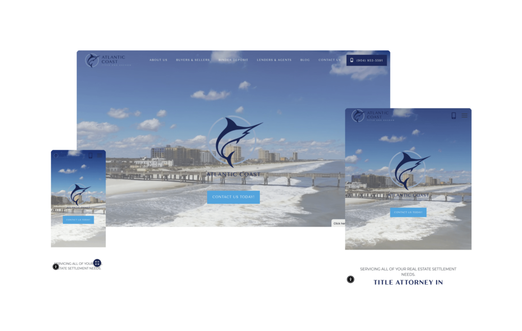
Video headers can be hit or miss, but Atlantic Coast Title & Escrow uses one exceptionally well, weaving the footage directly into a strong sense of location so the header feels rooted in place rather than generic. Paired with the firm’s niche focus, the top of the site does exactly what a great header should: it tells potential clients precisely what the firm does, who specifically they can help, and which areas they serve, all within seconds of arriving.
Led by a female founding partner, the firm leans into that authenticity beautifully. Rather than relying on stock imagery, real photos of the main partners and their teams are spread throughout the site, keeping the experience personal and reinforcing that clients will be working with actual, approachable people.
The branding details are where this one really wins. The logo, a marlin, is a fantastic choice that ties directly into the firm’s coastal location and gives the brand an instantly memorable, of-the-region identity. The main navigation at the top of the site is another powerful element, with dedicated pages built around each specific audience the firm can help. That structure makes it effortless for the right visitor to self-select and land exactly where they need to be.
A detail we can’t get enough of is tucked into the “Our Happy Clients” section, where the firm features a bottle of Veuve champagne alongside a cup branded to them. It’s a small but brilliant detail that centers the celebration clients feel once a transaction is successfully closed, turning what could be a dry, transactional moment into something joyful and on-brand.
From the location-driven header to the marlin logo to the celebratory client section, Atlantic Coast Title & Escrow is branded remarkably well from top to bottom. And given how specialized their industry is, they likely don’t have to pour much effort into SEO to reach their audience, which makes the strength of the brand experience all the more valuable. For any firm in a niche or location-specific practice, this site is a great reminder that memorable branding and a clear sense of place can do a tremendous amount of the marketing work on their own.
42. Noakes Law Group
Designed By
Nifty Marketing
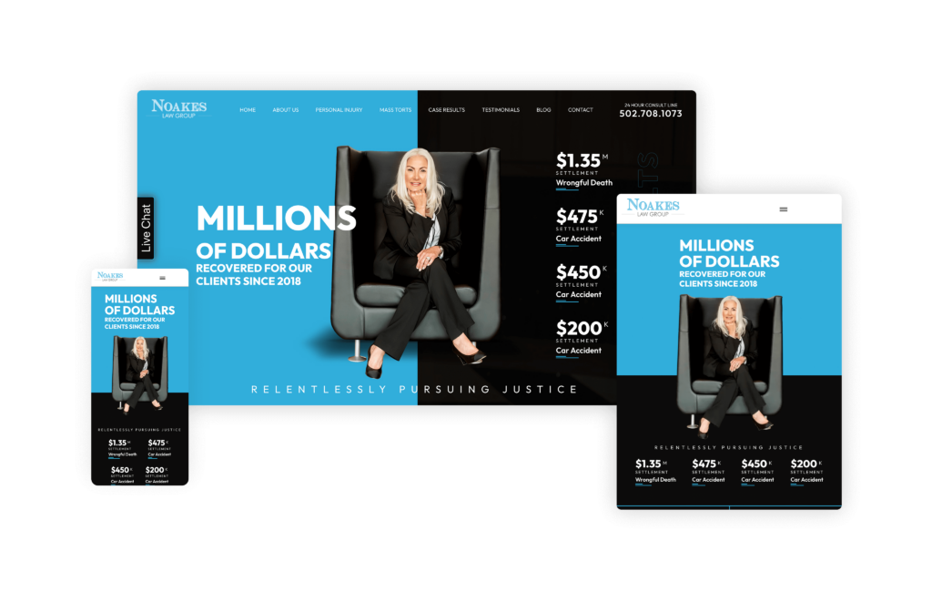
The Noakes Law Group website’s color scheme immediately grabs attention with its unique and engaging design. The half-and-half layout at the top, focusing on the managing attorney, flawlessly highlights case results, further highlighting the firm. The mix of smiling and serious attorney images reflects the diverse personalities of the team, creating a necessary balance of approachability and professionalism.
The term “elite team” instead of just a team instills confidence in potential clients. The clear presentation of practice areas, combined with client reviews, provides visitors with a comprehensive understanding of the firm’s capabilities. With a seamless blend of visuals, credibility, and expertise, potential clients feel assured in Noakes Law Firm before even reaching out.
43. Pérez-Calhoun Law Firm
Designed By
Advantage Attorney
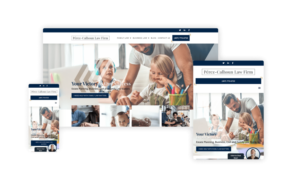
This website is an outstanding example of how a law firm can create an inviting and informative online presence. The site excels in presenting a compassionate and supportive approach, particularly in the “LET US BE YOUR FAMILY’S LAW FIRM” section. This section emphasizes the firm’s dedication to family law and immediately creates a sense of connection and care.
While having a blog is a common feature, Pérez-Calhoun Law Firm’s blog addresses frequently asked questions and everyday concerns that potential clients might have about family or business law. Furthermore, by clearly establishing the firm’s areas of focus, potential clients can quickly understand how Pérez-Calhoun Law Firm can assist them, eliminating any confusion as to whether the visitor has come to the right site or not.
Contact information is prominently displayed at the top of every page, making it easy for potential clients to reach out. This, coupled with the site’s simple and intuitive navigation, ensures that visitors can easily find the information they need, whether it’s details on practice areas or how to contact the firm.
While brief, the attorney profile for Gina R. Pérez-Calhoun provides a personal touch and introduces potential clients to the primary attorney, fostering a sense of trust and familiarity.
44. Dolman Russo LLP
Designed By
Site Social SEO
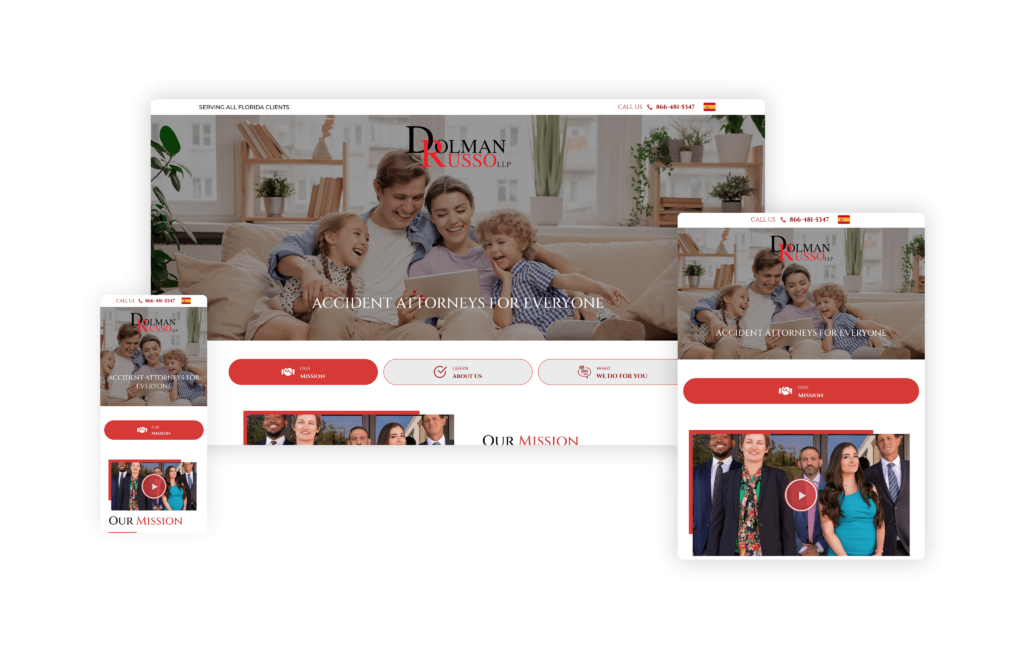
This website blends classic design with modern elements to create a compelling and engaging online presence. Its bright and contemporary design immediately captures your attention with a simple yet joyful image, easy-to-read text, and a sense of trust that is palpable above the fold.
Its ability to balance credibility, minimalism, and approachability seamlessly is noteworthy. By highlighting recognizable publications and large past settlements and sharing client testimonials prominently, Dolman Russo establishes its credibility early on, assuring potential clients that they are dealing with a firm with a proven track record.
The site’s design also exudes a sense of minimalism, utilizing ample white space and significant, roomy elements to create a clean and uncluttered look. The three tabs at the top of the page feel modern and serve a crucial role in efficiently organizing content while maintaining a minimalist aesthetic. The accordion feature further enhances this theme of simplicity and ease of navigation.
Professional headshots, a captivating video, and bright, engaging photos throughout the site make the law firm feel approachable. With its subtle yet impactful design choices, the site incorporates captivating background animations, a harmonious mix of bold and subdued colors, and subtle decorations.
45. Edwards Henderson
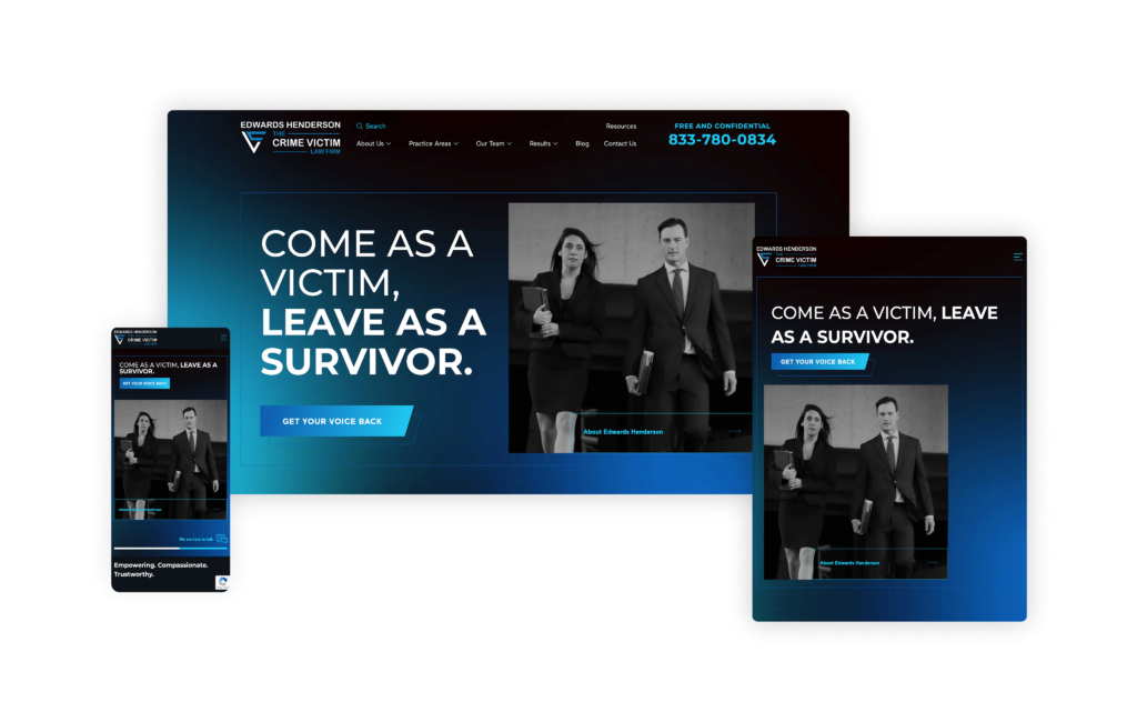
This website deserves high praise for conveying empathy and support to a highly vulnerable audience. The impactful message, “COME AS A VICTIM, LEAVE AS A SURVIVOR,” immediately resonates with their target audience, establishing an emotional connection right from the start. This is particularly crucial for a practice area as sensitive as sex abuse, where survivors need to feel understood and supported.
The website excels in building a trust element with its visitors. It clearly outlines how the firm can assist victims, which is essential for those seeking help in such delicate situations. The inclusion of their published book and the “Featured On” section further bolsters the firm’s credibility, showcasing their expertise and commitment to advocating for victims.
Aesthetically, the site is both sophisticated and inviting. The subtle use of blue throughout the design conveys a sense of calm and reliability, which is comforting for visitors. The branding is tasteful and consistent, contributing to a high-class feel that reassures potential clients of the firm’s professionalism.
The custom elements integrated into the homepage enhance the user experience, making navigation intuitive and engaging. Each section is thoughtfully designed to provide information without overwhelming the visitor, striking the perfect balance between detailed content and ease of use.
46. Dellino Family Law Group
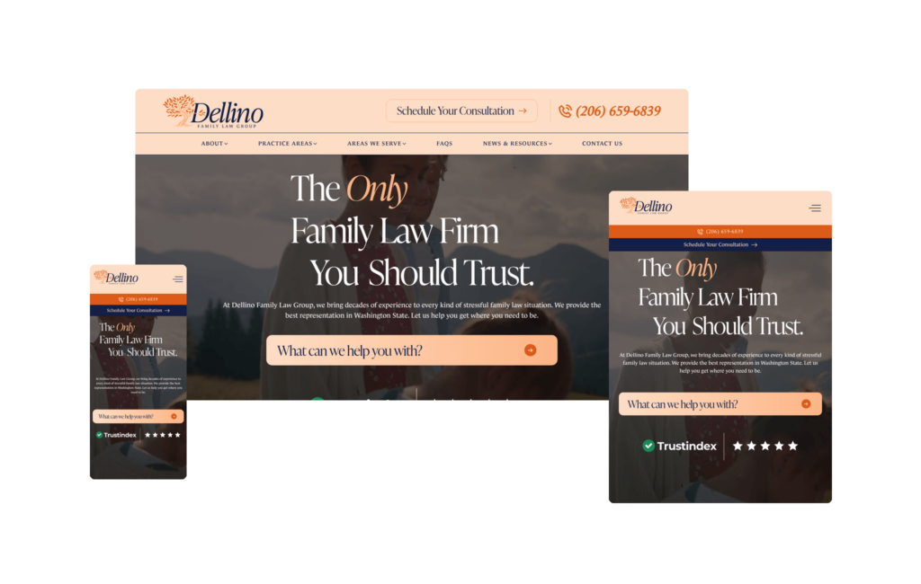
The Holliday Karatinos Law Firm website shows how modern web design can effectively serve the needs of a personal injury law firm. Designed by Rankings.io, this site combines visual appeal with user-friendly functionality to create an outstanding online presence.
The layout is clean and professional, immediately identifying what the sight is for and instilling a sense of trust and reliability. The use of high-quality images and a cohesive color scheme enhances the overall aesthetic, making the site visually engaging without overwhelming the visitor.
Blending easy navigation and intuitive structure, the site is well-organized, allowing users to find the information they need quickly. This is crucial for potential clients who are likely already under stress and need clear, straightforward information.
The prominent calls to action, such as “Get a Free Consultation” and “Contact Us,” are strategically placed to encourage user engagement and make it simple for potential clients to take the next step. Additionally, the site does an excellent job of highlighting the firm’s expertise through detailed practice area pages and success stories, providing visitors with a comprehensive understanding of what Holliday Karatinos Law Firm can offer. Visitors can also access their blog and resource section, which contains valuable information and tips related to personal injury law.
47. Holliday Karatinos Law Firm
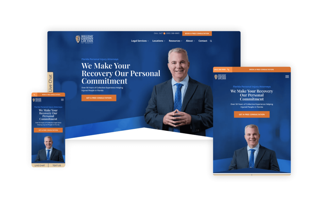
The Holliday Karatinos Law Firm website shows how modern web design can effectively serve the needs of a personal injury law firm. Designed by Rankings.io, this site combines visual appeal with user-friendly functionality to create an outstanding online presence.
The layout is clean and professional, immediately identifying what the sight is for and instilling a sense of trust and reliability. The use of high-quality images and a cohesive color scheme enhances the overall aesthetic, making the site visually engaging without overwhelming the visitor.
Blending easy navigation and intuitive structure, the site is well-organized, allowing users to find the information they need quickly. This is crucial for potential clients who are likely already under stress and need clear, straightforward information.
The prominent calls to action, such as “Get a Free Consultation” and “Contact Us,” are strategically placed to encourage user engagement and make it simple for potential clients to take the next step. Additionally, the site does an excellent job of highlighting the firm’s expertise through detailed practice area pages and success stories, providing visitors with a comprehensive understanding of what Holliday Karatinos Law Firm can offer. Visitors can also access their blog and resource section, which contains valuable information and tips related to personal injury law.
48. Velkei Law
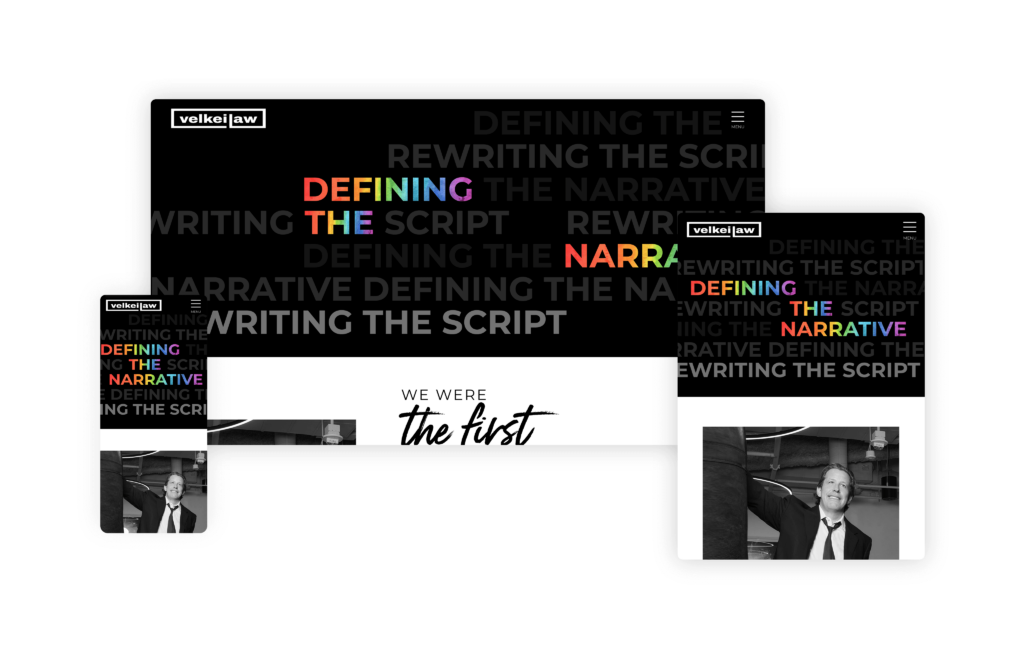
The Velkei Law website is a brilliant reflection of Steve Velkei’s unique and dynamic legal practice. When one of the most interesting lawyers in America, known for high-profile landmark cases and advocacy for women’s healthcare and the LGBTQ community, seeks a distinctive online presence, the result is something truly exceptional.
With bold messages and a striking contrast of black and white accented by pops of painted rainbow, this site packs an unexpected punch. The web designer added a layer of creativity and personality and set the site apart from the more traditional law firm websites with playful font and brush stroke textures. The personalized imagery and tailored content effectively convey the firm’s experience and passion for championing the rights of underrepresented communities.
Its design and structure are user-friendly, ensuring that visitors can easily navigate through the various sections and find relevant information about practice areas, case history, and advocacy efforts. The bold visual elements are balanced with clear, concise text, making the site both informative and engaging.
Notably, the Velkei Law website has been recognized with a Vega Silver award, a testament to its innovative design and impactful messaging.
49. Jacob D. Fuchsberg Law Firm
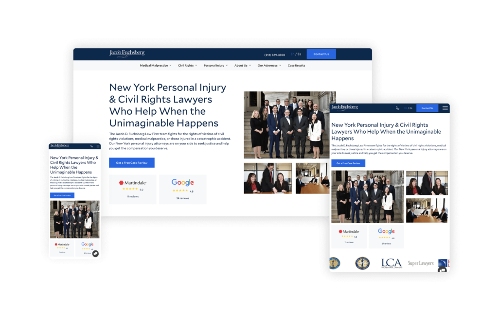
The website for Fuchsberg & Fuchsberg website features effective design and compelling content, despite a relatively modest initial impression. The minimalist above-the-fold section, featuring a clean white background and smaller images, may seem understated at first glance.
Still, this simplicity contributes to a user-friendly and approachable feel.
A highlight of the site is the “Success Stories” page, which is a masterclass in showcasing client testimonials and case results. This page is thoughtfully designed with both video and written formats, allowing visitors to truly appreciate the firm’s level of skill and the impact of their legal work. This dual approach caters to different preferences, ensuring that all potential clients can easily gauge the firm’s effectiveness and dedication.
Another notable strength of the site is its robust SEO structure. Over the past year, the site has seen exponential growth in traffic, a testament to the strategic optimization and valuable content that draws in visitors.
Despite having multiple attorneys, the homepage cleverly highlights the leading attorneys in a way that conveys a sense of a smaller, more personal firm. This approach can be particularly appealing to clients who prefer the idea of a close-knit team handling their cases with personalized attention and care.
50. Littman Krooks
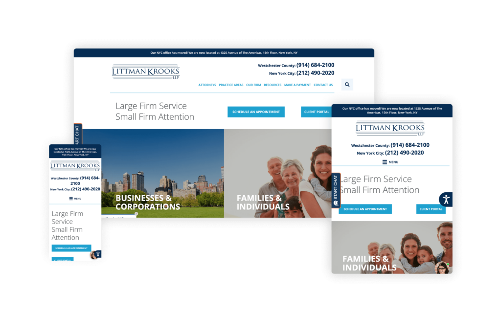
This is a coveted online resource for elder law, estate planning, special needs, and business law. Serving a diverse client base ranging from families to major corporations can make for a problematic website design. However, the site skillfully bridges this gap with a clean, easy-to navigate interface and richly detailed content.
Its extensive use of multimedia educates and engages visitors with videos, infographics, web stories, and podcasts. For instance, their mobile Google Web Stories on estate planning in New York offer a quick and engaging way to understand complex topics. Additionally, the site provides detailed libraries on special needs planning and other related subjects, making it a valuable resource for clients seeking specialized legal information.
The Littman Krooks website also features interactive elements, including Q&As and webinars, allowing real-time engagement and learning. Their innovative search engine is particularly noteworthy, enabling users to explore their vast repository of ebooks, newsletters, and other educational materials effortlessly.
The site’s design is user-friendly and aesthetically pleasing, ensuring that visitors can navigate through different sections seamlessly. Whether someone is looking for information on elder law, estate planning, or business law, the clear breakdown of services and intuitive interface makes it easy to access relevant information quickly.
51. Sammy Kim, Esq
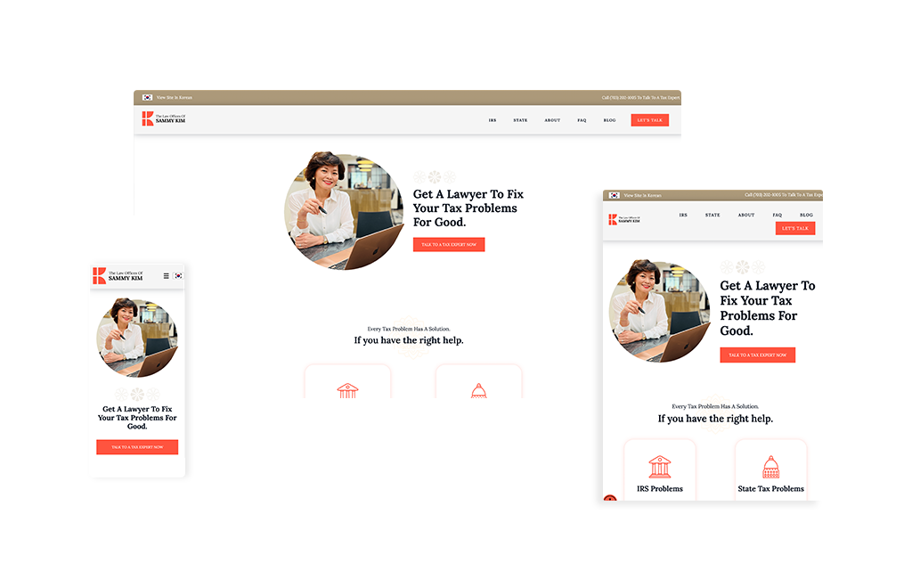
Delicate Korean flower motifs woven throughout the design of Sammy Kim’s website immediately signal that this tax attorney site serves a unique dual market. Paired with warm orange accents that soften what could otherwise feel intimidating, the visual design creates a welcoming atmosphere for stressed prospects who are losing sleep over IRS letters. The site’s color palette and cultural design elements thoughtfully bridge both English and Korean-speaking audiences, with a completely separate Korean-language site supporting the 75% of the practice that comes from the Korean community.
The messaging hierarchy is strategic and empathetic. “Losing Sleep About Letters That Say You Owe Taxes?” appears prominently above the fold, immediately validating the anxiety visitors feel, followed quickly by reassurance: “Every tax problem has a solution.” Social proof is woven throughout with prominent client reviews and detailed testimonial blogs that help isolated prospects feel less alone. The three-step process (Diagnose, Analyze, Resolve) uses clear visual design to break down complex tax resolution into digestible stages that don’t overwhelm.
Professional photos of Sammy in both formal and approachable settings strike the right balance. She appears credible enough to represent clients nationwide, yet warm enough to comfort someone terrified of the IRS. Video chat functionality integrates seamlessly into the user experience, while an extensive FAQ section addresses common fears upfront. The result is a site that serves everyone from Korean-speaking immigrants to English-speaking clients across the country, all without the intimidation factor of big law firms.
52. Contreras Law Firm
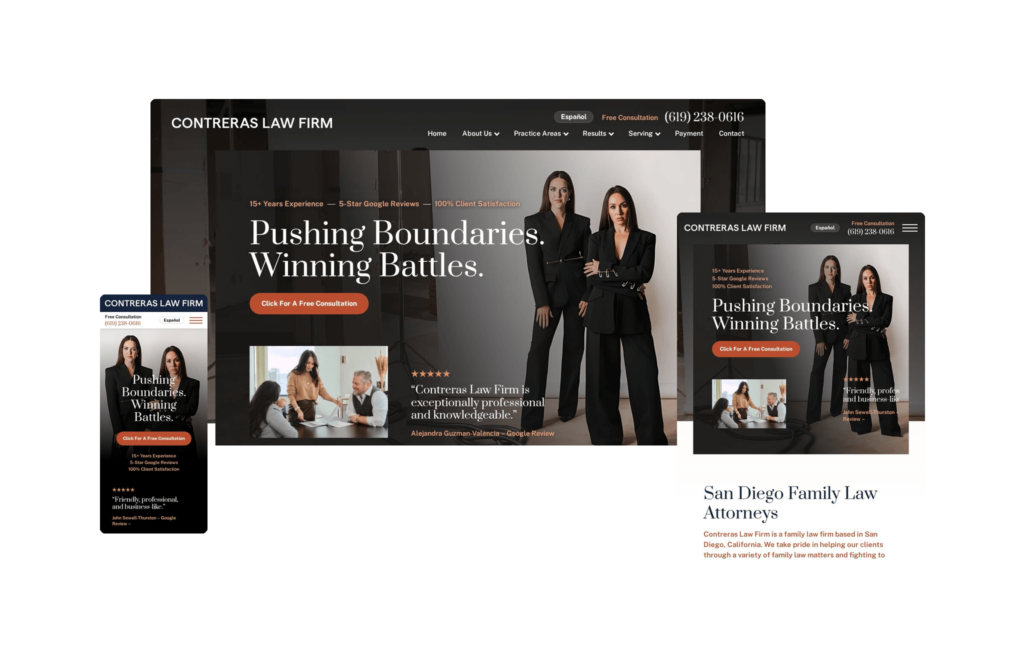
We’re big fans of interactive websites, and Contreras Law Firm delivers exactly that. As you scroll, subtle animated elements bring the page to life, creating the sense that the site is moving right along with you. It’s an engaging, modern experience that keeps visitors interested from section to section rather than simply pushing static content in front of them.
The branding of the firm’s partners is a real highlight. They’re presented as fierce and formidable, yet still warm and approachable, a balance that’s especially important in family law, where clients need to believe their attorney will fight for them while also feeling safe and understood. That duality comes through clearly in the imagery and messaging.
Contreras goes a step beyond woman-founded: every member of the team is female. In the family law space, that identity is a genuine strength. It speaks directly to a target audience that often includes women navigating incredibly difficult situations and looking for a team that will help them find a way out. The site leans into that connection without ever feeling forced.
From a design standpoint, the firm keeps things clean and cohesive by building the entire experience around three main colors. That restrained palette gives every section a uniform, polished feel while keeping the overall look approachable rather than loud or overwhelming. It’s a smart way to maintain visual consistency across the whole site.
The firm’s geographic focus is unmistakable. Everything points to San Diego and the surrounding cities, and the SEO strategy is built squarely around owning that market. That local-first approach is exactly the right move for a firm looking to become the go-to name in its region.
Contreras Law Firm is clearly on an upward trajectory, combining an interactive, well-branded experience with a focused local strategy. With that foundation in place, the firm looks well-positioned to keep climbing in its market.
53. Marricks Law Group
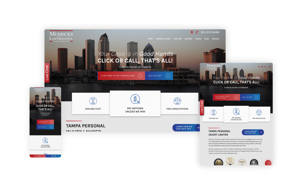
This website brilliantly integrates modern digital elements into the firm’s branding with the tagline, “Your Case is in Good Hands, CLICK OR CALL, THAT’S ALL!” This clever update of the well-known phrase “One Call, That’s All” brings the firm’s approach into the digital era, emphasizing its accessibility and client-first approach. By incorporating “Click” into their tagline, they effectively appeal to today’s tech-savvy audience.
The website’s design follows through with this modern touch by prominently featuring clear and compelling calls to action for potential clients to either click or call. This dual approach ensures that no matter how clients prefer to initiate contact, the process is simple and inviting. The main
CTAs are supported by three easily digestible points, emphasizing their availability and the assurance that there is no upfront cost for consultations.
Additionally, by explicitly listing the types of accidents they handle, such as sidewalk, restaurant, supermarket, parking lot, stairway, and airport accidents, the firm demonstrates a focused skill set that potential clients can easily identify with. This level of detail helps clients quickly understand whether their particular situation falls within the firm’s specialty areas, making the site not only user-friendly but also highly relevant.
54. Chomat Whitt Injury Law
Designed By
Law Firm Sites
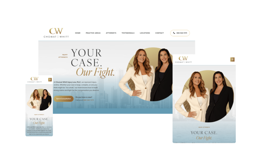
Chomat Whitt Injury Law is, simply put, a beautiful website. It’s a perfect example of how blending a single accent color with plenty of white space can create a site that flows seamlessly from top to bottom. Nothing competes for attention or clutters the experience; instead, the restrained palette lets the content and the people behind the firm take center stage.
And it’s those people who make this site memorable. Founding partners Sally Chomat and Rebecca Whitt are highlighted throughout the entire site, with nearly every photo featuring both of them together. That consistency reinforces exactly who clients will be working with and puts a strong, unified face on the firm. As a practice built and led by two female founding partners that has come to own its markets across Florida and Texas. The messaging works hand in hand with the imagery, leaving no doubt that this team is ready to fight, and that they’ll be fierce and relentless in taking on the insurance companies to secure the highest possible settlement for their clients.
A genuine standout is a unique section on the homepage that pairs a client testimonial with a bubble chart highlighting some of the firm’s biggest victories. So many law firm websites present their results the same way, either a rotating slider or four figures lined up in a bar, so seeing case results displayed in a fresh, visual format is a welcome change that makes the accomplishments feel more tangible and engaging.
We also love the design transition into a beach scene toward the bottom of the site. It brings in a distinctly Florida feel that plays beautifully against the bigger-city energy of the main header, giving the site a sense of place that spans both the coastal and metropolitan sides of the firm’s identity.
If there’s an opportunity ahead, it’s search. The design and conversion elements are already firing on all cylinders, so if Chomat Whitt begins investing more heavily into SEO to build out their organic footprint, this site has every ingredient to become an absolute conversion powerhouse. It’s a striking, well-branded example of how personality and polish can coexist on a personal injury website.
55. Mangan Law
Designed By
Nifty Marketing
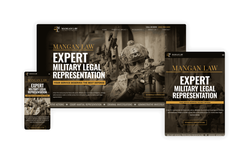
Mangan Law’s website is a perfect example of on-brand design, especially for military legal services. Military legal websites stand out by niching down and being run by an ex-military veteran like Sean Mangan, which makes them even more compelling. From top to bottom, the site ensures any potential client feels at home, with the tagline “A law firm exclusively for those who serve,” instantly connecting with its target audience.
The photos of Sean Mangan throughout speak directly to the user, and the strong branding is evident. The Call-To-Action phrases, such as “Master Military Justice Practitioner” and “I am ready to fight for you!” are impactful and resonate with the firm’s mission. The case results page is incredibly unique, listing each result by service branch, offering a personalized touch. Any military law firm looking to refine its branding should take notes from this impressive example, as this website converts into its client niche.
56. Tejes Law, PLLC
Designed By
Advantage Attorney
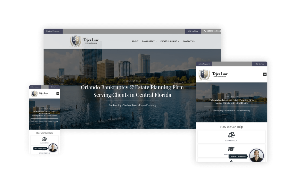
The website for Tejes Law excels in creating a solid local presence while offering a clear and compassionate user experience. Focused on serving clients in the Central Florida area, the site effectively communicates the firm’s regional experience, making it an invaluable resource for clients facing legal issues in this specific area.
The slogan “Guiding You to a New Beginning” is prominently displayed on the homepage and immediately conveys empathy and hope. This message is powerful for potential clients who are likely in challenging situations, such as bankruptcy or debt defense. It reassures visitors that
Tejes Law is there to provide solutions and support through difficult times.
The website’s design is clean and user-friendly, with a straightforward navigation menu that breaks down their services clearly. Visitors can easily find detailed information on the firm’s practice areas, including bankruptcy, probate, and debt defense. This clear service breakdown ensures that clients can quickly identify the specific help they need without any confusion.
Overall, the Tejes Law website combines a strong local focus with an empathetic approach and a clear presentation of services.
57. Jones Law Group
Designed By
Site Social SEO
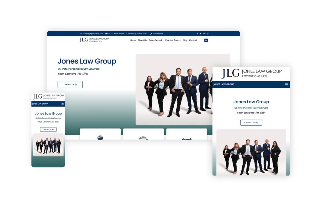
The website for Jones Law Group is a unique and inviting online presence that effectively balances professionalism with a warm, family-oriented atmosphere. Visitors to the site are immediately greeted with an engaging live stream of the firm’s saltwater fish tank, providing a relaxing and visually appealing break that reflects the firm’s approachable and client-friendly ethos. This 24-hour live camera not only offers a soothing visual experience but also cleverly increases on-site time as visitors linger to watch the exotic fish.
The navigation on the Jones Law Group website is straightforward and user-friendly, with a clean and intuitive layout that allows users to easily find details about the firm’s services, team, and contact information.
The site also features numerous images of the team in both professional and casual settings, highlighting the firm’s ethos of fun and family. These visuals effectively convey the welcoming and supportive environment that Jones Law Group fosters for both staff and clients.
Incorporating elements that are both engaging and informative, the Jones Law Group website successfully creates a personal touch that sets it apart in the legal industry.
58. Wallace Law
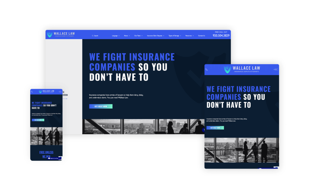
The Wallace Law website, designed by MeanPug, is a niche-focused web design that was done right. It’s clear as soon as the user arrives on the site that it’s thoughtfully created to address the specific needs of clients dealing with insurance companies.
One of the most striking features of the site is its branding. The color scheme is both professional and inviting, creating an immediate sense of trust and reliability. The design is clean and easily digestible, making it simple for visitors to navigate and find the information they need without feeling overwhelmed.
With intricately tailored content, the site provides detailed and relevant information that directly speaks to its target audience. Such a level of specificity not only enhances the user experience but also establishes the firm as an authority in its field.
The catchy tagline, “WE FIGHT INSURANCE COMPANIES SO YOU DON’T HAVE TO,” is prominently displayed and perfectly encapsulates the firm’s mission. It resonates deeply with anyone who has ever faced the daunting task of battling a large corporate insurance company, offering a sense of relief and reassurance that Wallace Law is on their side.
59. Sieglock Law
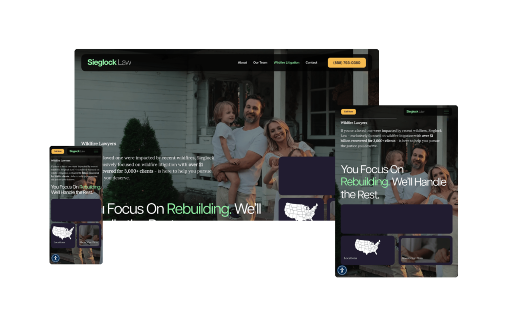
The Sieglock Law website is built around a single, clear purpose: helping families and property owners recover after devastating wildfire losses. The homepage hero pairs family-centered photography with a grounded headline (“You Focus On Rebuilding. We’ll Handle the Rest.”) and an interactive floating card displaying a $40 million Timber Loss result, establishing both compassion and credibility at a glance.
The color palette is deliberately muted, avoiding the aggressive visual competition typical of personal injury design in favor of something that feels steady at a moment when potential clients are under real stress. A national locations map communicates the firm’s reach without overwhelming the personal tone maintained throughout.
Over $1 billion recovered for more than 3,000 clients. The numbers are significant, but what makes the site work is how it carries those credentials without letting them overpower the emotional register of the page. Sieglock handles exclusively wildfire litigation, and for anyone dealing with that specific loss, there is no ambiguity about whether this firm handles their situation. That clarity is the site’s greatest strength.
60. Rawlins Law, APC
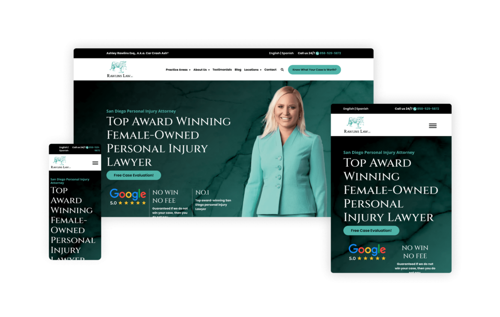
The website for The Rawlins Firm does a fantastic job of showing how a solo attorney site can be both personal and highly professional. Built to perfectly highlight Ashley Rae Rawlins, the design immediately captures the viewer’s attention with its unique logo and spot-on branding.
The cartoon image of Ashley in a cape is a brilliant touch, adding a playful yet empowering element that makes the site memorable and engaging.
One of the most impressive features of the site is the “Types of Personal Injury” section. This section is exceptionally well-organized, making it easy for visitors to understand the full scope of
Ashley’s practice areas at a glance. The inclusion of injury statistics further enhances the site, demonstrating Ashley’s experience and providing valuable information to potential clients.
The user experience is seamless, with a flawless flow between all the elements and text.
Careful attention to detail ensures that visitors can navigate the site effortlessly and find the information they need quickly. The website’s SEO structure is also top-notch, resulting in high traffic and excellent ranking in the competitive San Diego market.
61. Kauff McGuire Margolis
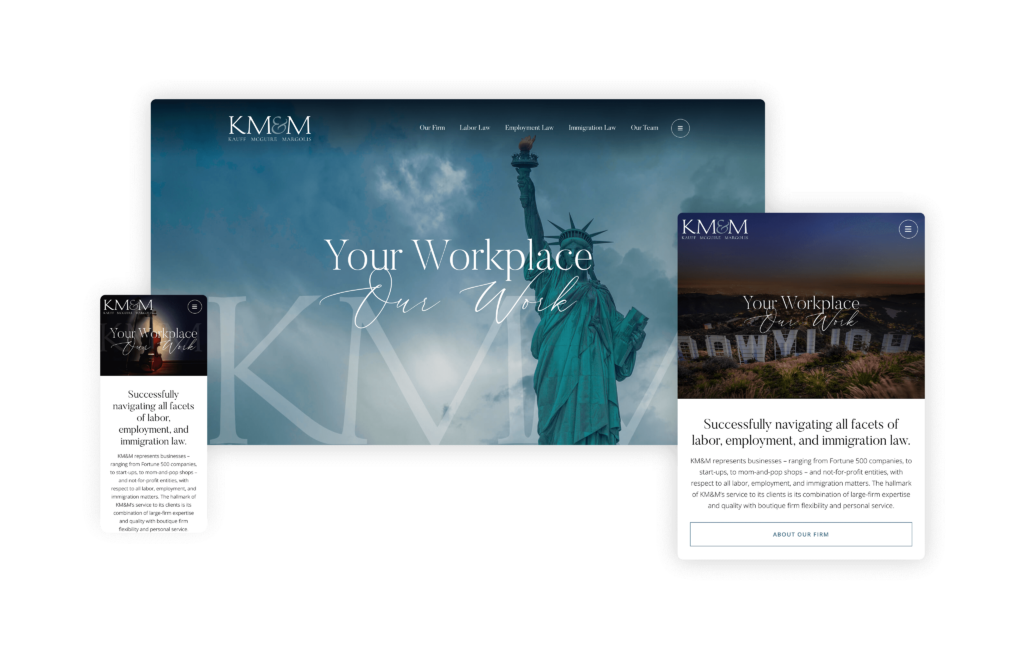
Kauff McGuire Margolis, LLP, has truly mastered the art of captivating visitors with their website. When you first land on the page, you’re greeted with stunning photography and elegant typefaces that immediately draw you in. This visual allure sets the tone for a sophisticated and professional experience throughout the site.
On the About page, Kauff McGuire Margolis pays homage to its NYC heritage while highlighting its unique offering: the blend of a large-firm experience with the personalized service of a boutique firm. This combination is expertly showcased through the design, which elegantly balances class and sophistication with a personalized touch.
The website’s design excellence hasn’t gone unnoticed, as it has earned an AVA Digital Gold Award. Such recognition is well-deserved, as the site serves as a prime example of how to create an online presence that seamlessly combines visual appeal with informative content and an artful approach. It’s no wonder the site has received accolades, as it truly sets the standard for law firm websites that are both visually stunning and highly functional.
62. The Levoritz Law Firm
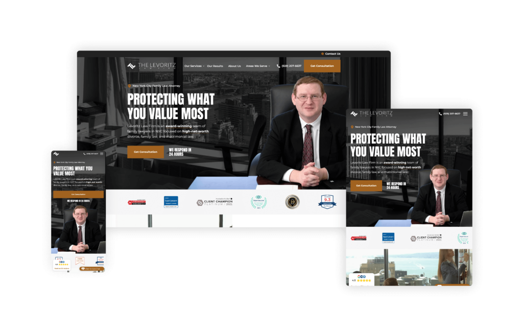
The Levoritz Law Firm’s website offers an exceptional user experience with a professional design that immediately stands out, perfectly aligning with the firm’s brand image, especially for high-net-worth individuals.
Its impressive header above the fold is one of the first things that catches the eye. It exudes professionalism and reassures visitors of the firm’s credibility and high standards.
The high-rise buildings featured prominently evoke the essence of New York City, reinforcing the firm’s deep roots in the area. This New York vibe is not only visually appealing but also reinforces the firm’s connection to the city and its culture.
Its “Serving New York City & The Suburbs” section is exceptionally well-organized, making it easy to identify the specific suburbs they service. Such a feature ensures that clients who prefer to stay within a reasonable distance can quickly determine if the firm covers their area. The “Cases Featured in the Media” section is brilliantly executed. It projects a sense of professionalism and underscores that they are well-regarded and experienced in their field.
The Levoritz Law Firm’s website is clear, professional, and user-friendly, making it easy for potential clients to find the information they need and feel confident in the firm’s capabilities.
63. McCormack Law Firm
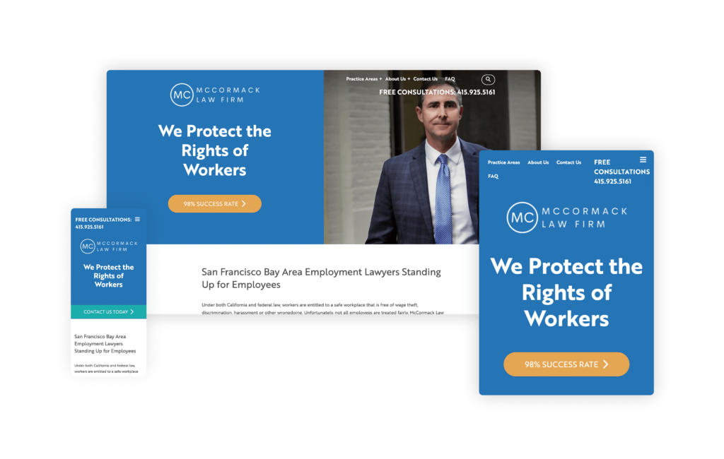
The McCormack Law Firm’s website, designed by Custom Legal Marketing, offers an outstanding user experience that is both informative and engaging. It’s a powerful tool for employees seeking to understand their rights. Here, the firm’s dedication to fighting for employee rights and commitment to making legal information accessible and straightforward for everyone is evident.
Specializing in fighting for employee rights in San Francisco, the firm has created a site that effectively uses interactive features to help employees understand their rights regarding wage abuses, sexual harassment, and discrimination. It features an extensive use of infographics and interactive elements, with each practice area page meticulously designed with the same attention to detail as the homepage.
Users can easily understand their rights through visually appealing infographics and interactive slides consistent throughout the site. The information on the site empowers employees in the region by transforming complicated and often uncomfortable topics into straightforward, understandable content. Web stories and Q&A sections further enhance the site’s educational value as they provide real-life scenarios and answers to common questions, making it easier for users to relate and find solutions to their own issues.
64. Sowerby & Moustakis Law PLLC
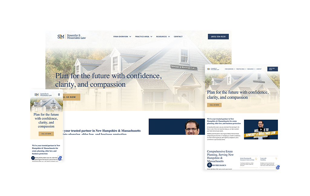
Professional photography of the actual Amherst office building and team creates immediate authenticity when entering the Sowerby & Moustakis Law website. There are no generic stock photos here. The clean, well-organized layout uses custom icons for each service area, creating visual consistency throughout the site while making complex estate planning concepts easy to digest. Soft, professional colors and ample white space give the design a sophisticated yet approachable feel, perfect for an audience that needs clarity during emotionally difficult planning conversations.
The visual hierarchy guides visitors through the firm’s comprehensive approach with clear section divisions. “Full family meetings” receive prominent visual emphasis, with icons and descriptions that explain this unique offering. Each practice area, from estate planning with flexibility for special needs and substance abuse concerns to business succession planning, gets its own visually distinct section with thoughtful iconography. Team photos show real people in their actual office, reinforcing the promise that when you call, you’ll speak to the same person who will know and remember your name.
What makes this site effective against big Massachusetts firms invading the New Hampshire market is how the design reinforces local, personal service. The Amherst location is showcased proudly, and the visual presentation emphasizes “confidence, clarity, and compassion” through design choices that feel trustworthy without being intimidating. The layout is intuitive for an estate planning audience that needs straightforward navigation, not complexity. It’s a digital presence that perfectly mirrors the firm’s philosophy: personalized service for real people, not just legal documents.
65. Porter Firm
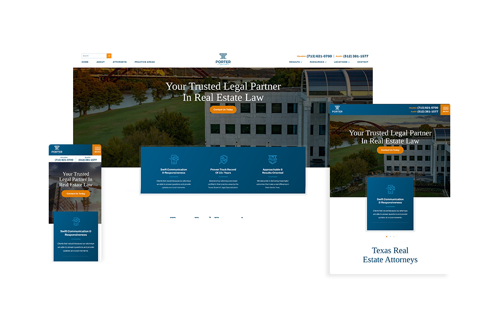
You don’t see many sites open with a slider anymore, but the Porter Firm one reminds you why the format can work when it’s intentional. The auto-advancing hero cycles through curated visuals without inviting manual clicks, keeping attention on the narrative the firm wants to tell. Up top, a centered, full-width menu creates a strong axis of symmetry. The effect is calm and orderly, making everything feel that it’s precisely where it should be.
Color is used with restraint and purpose. Accents thread through headings, buttons, and key lines of copy, giving even text-heavy sections a lighter, more approachable feel. Smart typographic hierarchy and generous spacing do the heavy lifting, allowing visitors to scan quickly, grasp the message, and proceed to the next step without friction. Calls-to-action are present, visible, and never pushy.
Strategically, the site understands its category. Not every practice area requires the encyclopedic content approach commonly found in personal injury. Porter Firm opts for clarity over volume with concise pages that answer core questions, establish credibility, and guide contact. That discipline is also a solid SEO foundation, highlighting clean architecture, focused topics, and room to scale content methodically as the strategy matures.
The result is a modern professional-services website that projects confidence without going overboard. Thoughtful visuals, symmetric navigation, and values-led messaging come together in a format that’s easy to understand and easy to convert. For smaller firms outside the PI space or teams that want a streamlined, effective site without overwhelming visitors, this is a playbook worth following.
66. LawBike Motorcycle Injury Lawyers
Designed By
Nifty Marketing
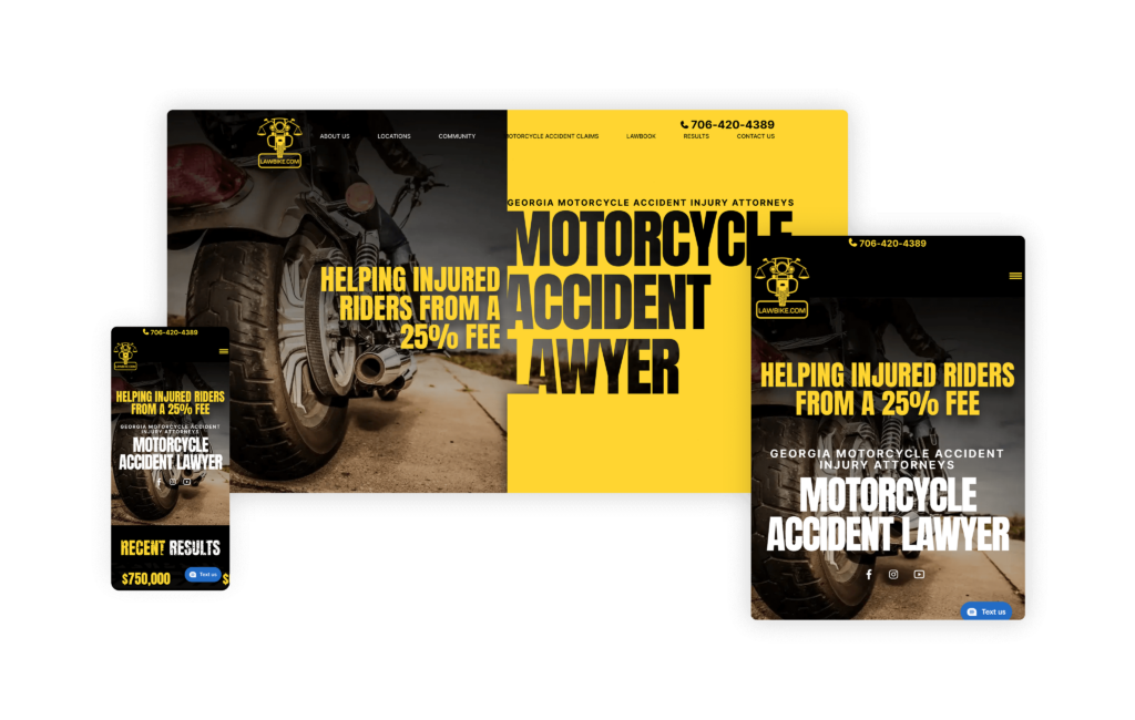
Lawbike.com is another stellar example of how to niche down effectively in the legal industry. From the name to the design, the website is tailored perfectly for the motorcycle community. The attorneys are shown on motorcycles instead of the traditional suit-and-tie headshots, and the team photo on various bikes emphasizes the firm’s brand identity.
Their unique expertise is highlighted by showcasing their Georgia Motorcycle Lawbook, which adds credibility and sets them apart from other firms. The bold use of yellow enhances alertness while browsing and the transparent fee display at the top eliminates any confusion about costs for potential clients.
The site’s on-brand focus helps it rank high for motorcycle injury lawyer searches in local areas, ensuring a consistent flow of clients. Lawbike.com is a perfect model for firms wanting to focus on a niche market.
67. Farmer & Wright, PPLC
Designed By
Advantage Attorney
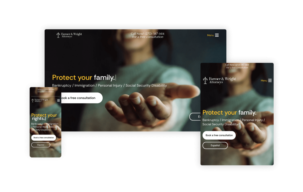
The Farmer & Wright PLLC website immediately emphasizes the firm’s core values, like honesty, advocacy, and responsiveness. This focus on values creates a strong initial impression with potential clients, setting the tone for a trustworthy and client-centered legal practice.
There’s client-centric messaging throughout the site, something that many other law firm websites could benefit from. By addressing the struggles and hardships faced by people dealing with legal issues, the website demonstrates empathy and understanding. Such an approach helps to build trust and reassures potential clients that Farmer & Wright is committed to helping them navigate their legal challenges.
Featuring real questions answered by their lawyers, the “Videos” section provides valuable information while also establishing the firm’s experience in an engaging and accessible way.
Clients seeking answers and a personal connection with the attorneys will appreciate this feature.
Highlighting their multiple locations in Paducah and Elizabethtown further expands their potential client base. With clearly presented information, they make it easy for clients to find and contact the office nearest to them.
68. Modern Injury Lawyers
Designed By
Site Social SEO
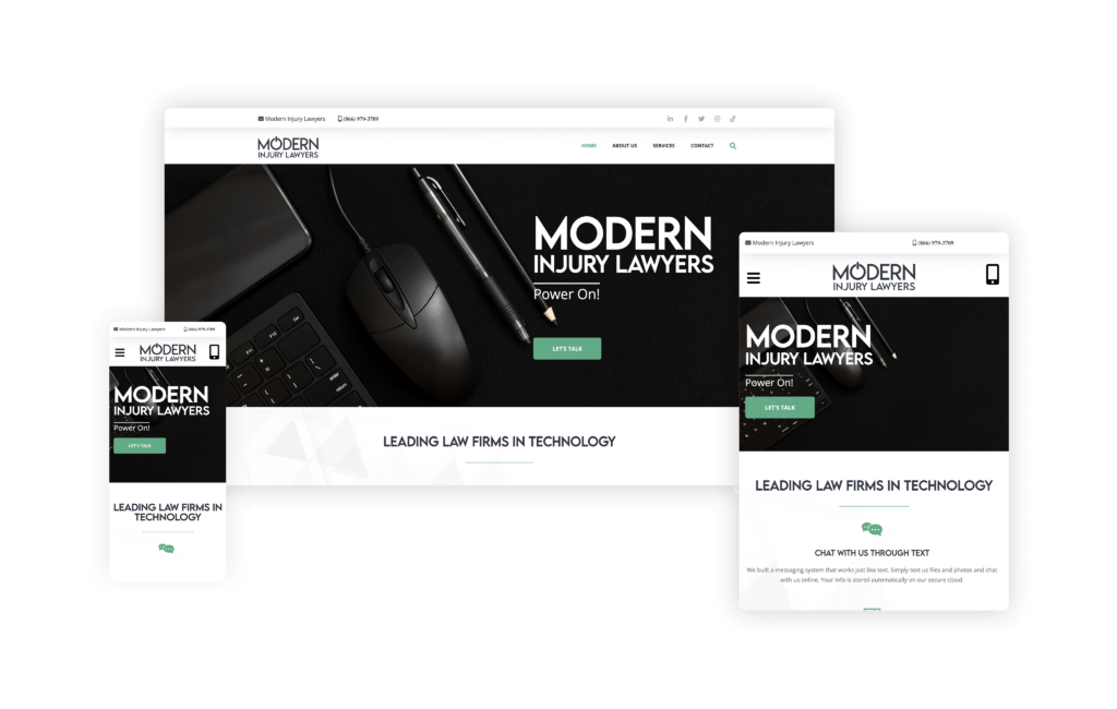
This website is perfectly aligned with the client’s vision for a sleek and modern aesthetic to reflect the uniqueness of the firm and its technological focus. A striking black monotone hero image with bold white text and a vibrant green button immediately grabs your attention, setting the tone for the rest of the site.
Each icon and background image is carefully crafted to create a cohesive and engaging visual experience. The lawyer photos are expertly photoshopped to match the green color palette, reinforcing the firm’s brand identity. The lawyer’s actual signature under his quote, the colorful logos of corporations he has sued, and the live Instagram feed all contribute to the bold and modern feel of the site.
The firm’s innovative logo incorporates an “On” symbol in place of the “O” in “Modern,” cleverly highlighting the firm’s technological focus. This, along with the black, white, and green color palette, differentiates Modern Injury Lawyers from the typical bland blue and red themes commonly seen in the legal industry.
As if this isn’t enough already, the site’s layout is simple yet sophisticated, with the same modern design elements extending to the About, Services, and Contact pages. These pages are not only visually appealing but also user-friendly.
69. Lemler IP
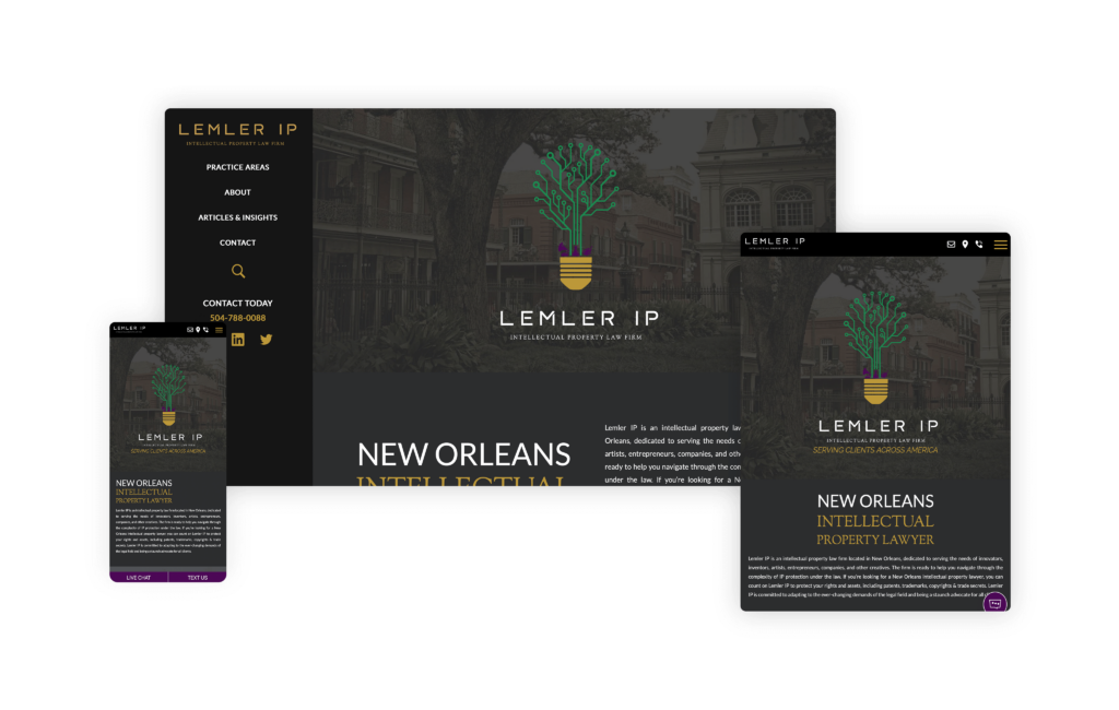
Its unique and simplistic design offers an exceptional user experience that makes this website stand out. One of its most distinctive features is the sidebar on the desktop view. This clever design choice ensures that all essential information is right in front of the user, making navigation seamless and efficient.
The mobile view of the site is equally impressive, with a strategic use of call-to-action (CTA) buttons that enhance usability and engagement. Whether on a desktop or mobile device, visitors can easily find what they need and act, thanks to the intuitive layout.
The Lemler IP logo is another highlight of this website. Incorporating a light bulb element adds a creative and innovative touch to the brand. The consistent use of this logo throughout the design is visually appealing and reinforces the firm’s identity memorably.
In addition, the color palette is both professional and inviting, creating a pleasing aesthetic that is easy on the eyes. Combined with the thoughtful design elements, navigating the site is a pleasant and straightforward experience.
70. Yarborough Law Group, LLC
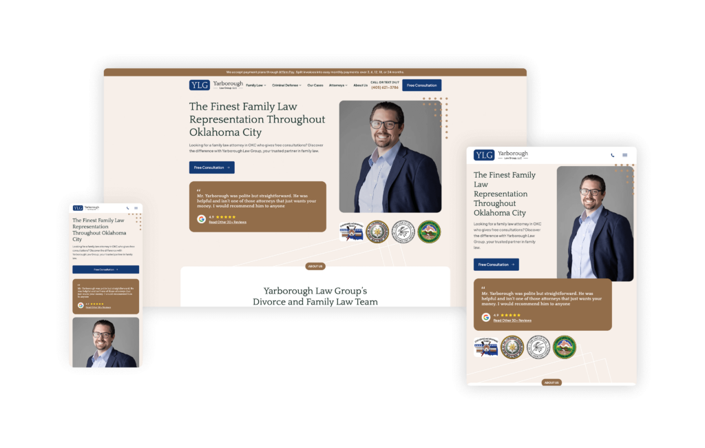
The website for Yarborough Law Group, LLC highlights how thoughtful design and user-friendly functionality can elevate a family-owned law firm’s online presence. As a family law firm that is family-owned, Yarborough Law Group immediately sets itself apart with a personal and trustworthy brand identity. This unique selling point is effectively communicated throughout the site.
From a design perspective, the site is a pleasure to navigate. The rounded elements and cohesive design create a visually appealing and harmonious experience. This consistency in design not only pleases the eye but also enhances readability and user-friendliness. The subtle background designs further improve the flow of each page, guiding visitors effortlessly through the content. The practice area section ensures that visitors can quickly and easily find the information they need without feeling overwhelmed, something that many law firm websites need help with.
The site skillfully reflects the family-owned nature of the firm, reinforcing its commitment to providing personalized and compassionate legal services.
71. Stewart Miller Simmons Trial Attorneys
Designed By
Nifty Marketing
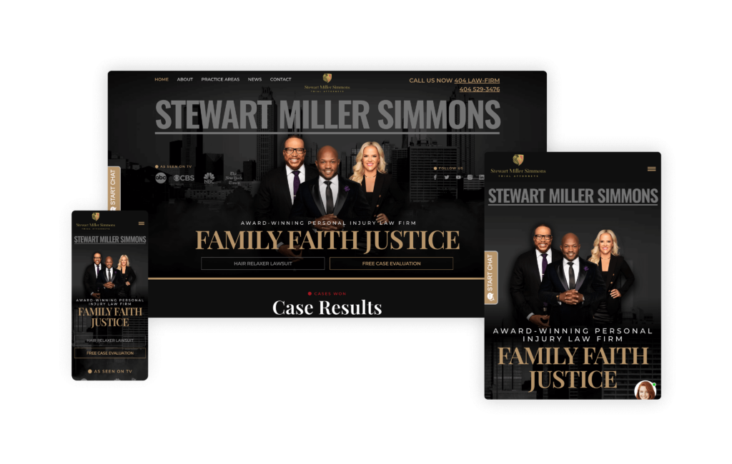
With exceptional structure and seamless design that immediately captures attention and builds trust, the Stewart Miller Simmons Trial Attorneys website is sure to convert. Right from the homepage, users are met with a well-placed highlight of the firm’s partners, establishing instant credibility. Nearby, its “As Seen on TV” section reinforces the firm’s authority and public presence.
Two main calls-to-action (CTAs)—for a case evaluation and the firm’s prominent Mass Tort cases—strategically ensure that readers know exactly how to take the next step. These CTAs are followed by a preview of the firm’s impressive case results, further piquing visitor interest. The scrolling feature of key highlights adds a dynamic touch, engaging users while subtly displaying the firm’s success.
Further down, a media section offers additional credibility, showcasing the firm’s exposure and accomplishments. The blend of functionality and design is amplified with powerful testimonials, which reinforce the firm’s expertise and results.
One of the most striking elements is the large landscape photos of the firm’s entire team, first in black and then in white. This cohesive use of imagery blends beautifully with the website’s background, creating a sleek and sophisticated aesthetic. The overall effect is captivating and polished, making this website more likely to convert when readers land on it.
72. The SRB Law
Designed By
Advantage Attorney
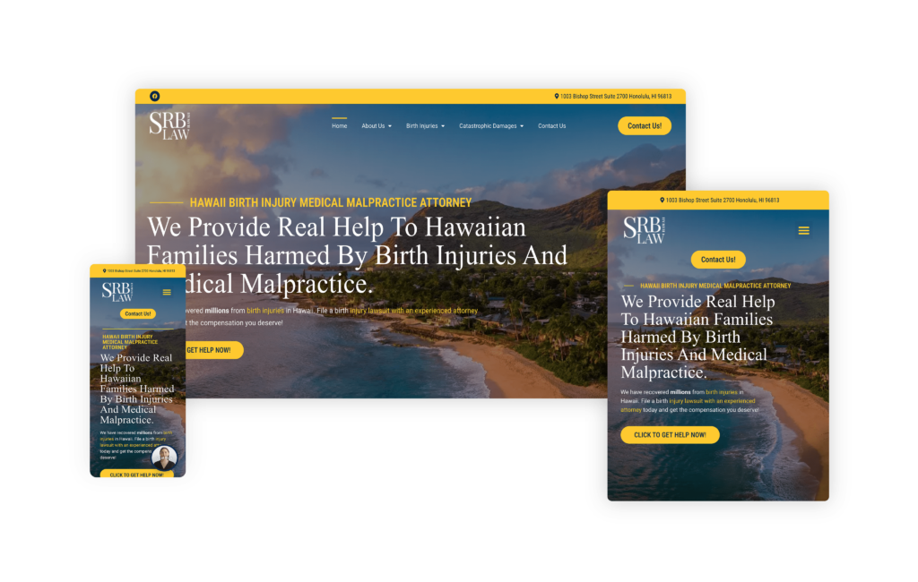
The SRB Law homepage immediately establishes the firm as Hawaii’s medical malpractice and birth injury specialist. Their commitment to securing compensation for families and preventing future birth injuries is clearly outlined, resonating deeply with those affected by such traumatic events.
The site also strongly emphasizes the firm’s “Early Resolution” concept, promising a focus on fast resolution and collaboration for improvement. Such an approach is particularly appealing to families in urgent need of help, offering hope for swift justice and support.
Strong calls to action, such as “CLICK TO GET HELP NOW!” buttons and prominently displayed phone numbers, effectively drive users to reach out. This is crucial for a law firm, as it simplifies the process for potential clients to seek assistance during a stressful time.
The site is meticulously organized, with a clean layout that guides visitors through various sections effortlessly. The navigation bar provides easy access to detailed information about the firm’s practice areas, attorney profiles, and client testimonials.
Incorporating emotional language throughout the website connects with the potential pain and worry a family might feel after a birth injury, building rapport with possible future clients.
73. The Eberst Law Firm
Designed By
Site Social SEO
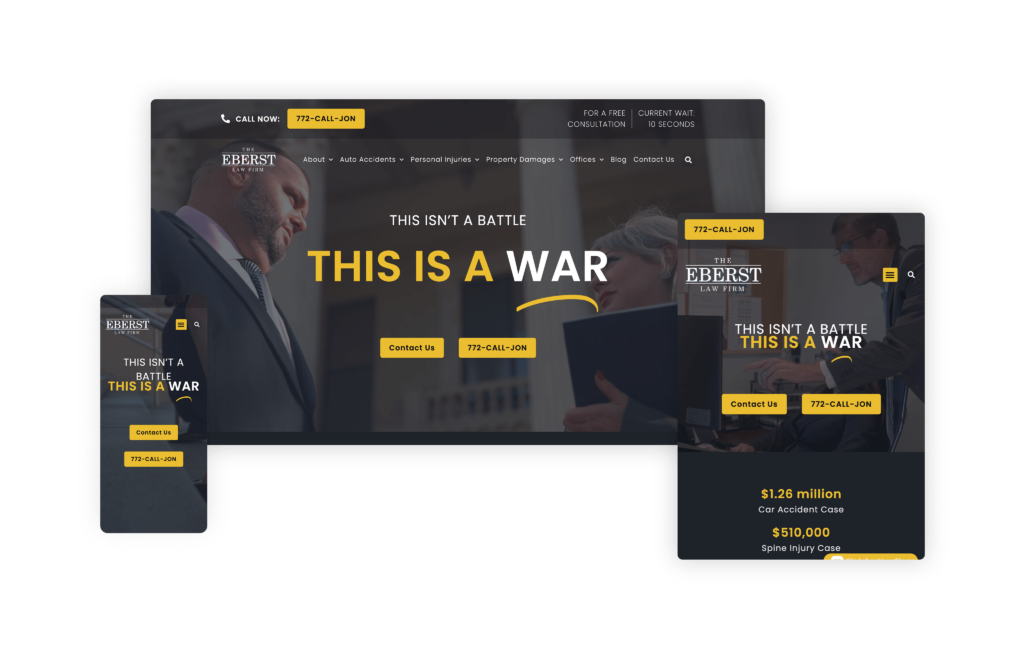
The Eberst Law Firm website is a standout in the crowded personal injury industry, instantly setting itself apart with its bold and memorable design. From the moment the site loads, visitors are greeted with striking features that differentiate it from the pack.
The use of bold fonts, a distinctive black and yellow color scheme, and significant elements immediately capture the attention of potential clients. As you scroll down the homepage, each section is clearly divided with eye-catching animations and bold images that demand notice.
Despite these bold design choices, the informative content remains front and center, ensuring that the site’s message is never overshadowed.
The website is designed for a smooth user experience, featuring a straightforward navigation menu and multiple contact opportunities. This ensures that potential clients can easily reach out to the firm without any hassle. The inner pages maintain the use of large text, easy-to-read fonts, and prominent elements, ensuring consistency and keeping users engaged.
The Eberst Law Firm wanted a website that was unique, bold, and unforgettable, and they have certainly achieved that with their site. The combination of innovative design and user-friendly functionality makes this site not only visually appealing but also highly effective in communicating the firm’s services and experience.
Attorney at Law Magazine is a national legal publication, publishing content for and about private practice attorneys as well as resources for legal consumers. The staff at Attorney at Law Magazine interview attorneys as well as other industry professionals to provide educational content as well as to highlight the individuals and firms driving success in the legal industry.
Related Posts

The post Best Law Firm Websites in 2026 (Top 73) appeared first on Attorney at Law Magazine.
Aero Law Center built a site that communicates its niche within the first second. A full-screen video hero featuring aircraft and hangar environments makes clear immediately that this is a firm operating in aviation and aerospace law exclusively (99% of its caseload), a world most attorneys never enter. The headline, “The Gold Standard in Aviation Legal Services,” sets a tone the rest of the site consistently delivers on.
The dark, high-production aesthetic mirrors the premium industries the firm serves. Proof points are integrated directly into the design: over one billion dollars in transactions handled, millions recovered for clients, and 100% board-certified partners. A proprietary AeroShield™ Legal Plan featured prominently in the navigation signals a firm that has built purpose-built legal products beyond standard case intake.
For pilots, aviation operators, and aerospace companies seeking specialized counsel, the site answers the most important question immediately: this firm exists specifically for them. It is one of the most visually distinctive law firm websites online, and a clear example of what committed niche positioning looks like when executed well.
Leah Wise Law hits the nail on the head when it comes to branding and design. The homepage is, in a word, epic, and the custom design elements woven throughout the site give it a look that feels genuinely unique rather than pulled from a template. From the very first scroll, it’s clear a lot of thought went into making this site stand out in a crowded market.
What impresses us most is how completely the site is built around Leah herself. Her personal brand is front and center, and that consistency carries through every corner of the site. Even the interior practice area pages bring her directly into the experience, so no matter where a visitor navigates, they’re reminded exactly who they’d be working with. That kind of cohesion is hard to pull off, and it’s done exceptionally well here.
The details are what elevate this one. The homepage highlights the firm’s settlements using a creative paperclip motif, a small but memorable touch that makes the results feel distinctive instead of formulaic. The section transitions are another standout; rather than ending each block with a flat, straight line, the design uses shaped edges that give the whole page a smooth, flowing feel as you scroll. The backgrounds strike the right balance too, staying simple without ever defaulting to a plain solid color, and the recurring use of the #crashgal branding throughout those backgrounds is executed beautifully.
Honestly, this is one of our favorite websites we’ve reviewed so far. If we were starting a firm’s site completely fresh, this is exactly the kind of example we’d want to pull ideas from. The site was also recently redesigned, so while it’s competing in a very tough Texas market, the redesign gives it a strong platform to build its search presence on from here
Strong branding, thoughtful design, and a personality that shines on every page, Leah Wise Law is a fantastic example of how to build a site that’s as memorable as it is effective. Simply put, it’s a standout.
Bick Law has a premier legal website, providing an exceptional blend of skill, user-friendly features, and attention-grabbing graphics. The website is thoughtfully designed, making navigation intuitive and efficient for current clients and visitors alike.
Their site’s aesthetic is both modern and sophisticated, reflecting the firm’s high standards and dedication. Incorporating an animal theme for an environmental-related business was a wildly different and edgy idea for a law firm, and it paid off immensely.
Its unexpected usage of animals, paired with witty and thought-provoking statements, highlights the firm’s distinct approach and practice. To further enhance these concepts, the site features colors and animations that bring the images to life. Starting with a monotone palette and gradually fading into the actual color of the animals adds a dynamic and engaging element. This purposeful functionality, combined with the innovative design, helped Bick Law LLP’s website rack up several awards, including a prestigious Webby Award nomination.
Bick Law’s website stands out as a top legal resource, combining informative content with an elegant, user-centered design and creative, engaging elements. It’s an invaluable tool for anyone seeking sound legal advice in environmental law and a 5-star example of innovative legal website design.
The Briskman Briskman & Greenberg website is an outstanding example of how a legal firm can effectively utilize interactive elements to engage and inform potential clients. Catering to personal injury and car accident victims in Chicago and throughout Illinois, the site offers a wealth of resources designed to educate and assist visitors in understanding their legal options.
A key feature of the site is its use of videos, infographics, and web stories, which provide valuable information in an engaging and easily digestible format. For instance, their Google Web Stories, such as How Do I Know Whether I Have a Car Accident Case?, offer quick, visual explanations of complex legal topics. The interactive presentation on “What Can I Expect During My Personal Injury Lawsuit?” further demystifies the legal process, making it accessible and less intimidating for visitors.
Each page on the site, such as the comprehensive Chicago Car & Truck Accident Lawyers section, is as deep, informative, and rich in graphics and interactive features as the homepage.
This uniformity ensures that no matter where a visitor navigates on the site, they receive the same high-quality information and user experience.
When TikTok’s most well-known tax attorney with 98K followers builds a website, the result breaks every convention of traditional tax law firm design. From the moment visitors land on Frost Law’s homepage, it’s clear this isn’t your typical buttoned-up tax attorney site. The modern, approachable design uses soft colors and contemporary typography that immediately puts stressed prospects at ease, a far cry from the intimidating corporate aesthetics most tax attorneys favor.
Video testimonials take center stage throughout the site, with real clients sharing their experiences in an authentic, unscripted format that builds instant trust. The layout feels more like a lifestyle brand than a law firm, with strategic use of white space, engaging photography of Alyssa that showcases her personality, and content organized in digestible sections that don’t overwhelm visitors who are already anxious about their IRS problems. An innovative video chat feature seamlessly integrates into the user journey, pre-qualifying prospects before they even book a consultation.
What makes this site particularly effective is how it bridges two audiences: the social media-savvy individuals who follow Alyssa on TikTok and the high-net-worth clients, business owners, and celebrities who need sophisticated tax representation. The design manages to feel both accessible and professional, personal yet credible. It perfectly captures Alyssa’s authentic brand while maintaining the gravitas required for serious tax disputes.
The Helton Law Firm website is a masterclass in keeping things simple, branded, and laser-focused on the audience. The hero header sets the tone immediately: a buffalo in open fields while clouds drift across the page, quietly transporting visitors to small-town Oklahoma the moment they land. It’s evocative without being overdone. The subtle “click to play” About Us call-to-action is equally thoughtful—inviting curiosity and instant rapport without forcing the video to the forefront.
Scroll down, and that same Oklahoma sensibility carries through every design choice. The color palette, imagery, and pacing reinforce the brand story from section to section, creating an experience that feels cohesive and intentional. Content blocks are trimmed to what matters so that prospective clients can find answers fast. Navigation is clean and intuitive, calls-to-action are clear, and the page flow nudges visitors toward contacting the firm without ever feeling pushy.
What really works here is the message-to-experience alignment. The design communicates care, quality, and steadiness—exactly what someone wants when choosing a lawyer. When a site makes you feel the level of service you can expect before you even call, that’s a win. Helton Law Firm’s website is one we’d point to as a blueprint: know your audience, honor your roots, and let design carry your story.
Many times, solo attorney websites fall short of serving their purpose. However, The Brilliant Brawler website is a remarkable example of how a solo attorney can effectively establish a robust online presence. Its design is impressively clean, with a flawless flow that guides visitors effortlessly through the content. The seamless integration of the logo throughout the homepage is a subtle yet impactful touch that reinforces the brand identity. This clarity and cohesiveness undoubtedly contribute to higher conversion rates, as potential clients can navigate the site without any confusion.
One of the most engaging features is the use of real photos and an introduction video centered on Ron himself. This personal touch allows visitors to feel as though they are meeting the attorney in person, creating a sense of familiarity and trust from the outset and likely increasing client conversions.
The Brilliant Brawler website excels in presenting a solo attorney in a professional, approachable, and highly effective manner. Its clean design, flawless navigation, and personal touches make it a standout site that is sure to resonate with visitors and convert them into clients.
Bloom Family Law, PC has a website that immediately sets itself apart by understanding exactly whom it is speaking to and tailoring the entire experience to that audience. From the start, the design feels intentional and distinctive. One of the most unique touches is the repeated use of elongated oval elements, which begin near the top of the site and continue throughout the design. That consistency creates a visual rhythm that feels soft, polished, and thoughtfully branded.
What really makes the site stand out, however, is the messaging. Instead of leading with a list of practice areas or a more traditional law firm headline, the homepage opens with “Breathe, Release, RECLAIM.” That choice is powerful. It does not immediately push services at the visitor. Instead, it connects emotionally with the person likely landing on the site, someone who may be going through a divorce or facing a difficult family law matter and looking for clarity, support, and a sense of control. Paired with imagery that reinforces that message, the tagline speaks to its audience in a direct and meaningful way.
As you move through the site, it becomes even clearer that the design and copy were created with a very specific audience in mind. The site speaks especially well to women seeking family law guidance, and it does so without feeling forced or overly styled. The simplicity throughout the site works in its favor, making the experience feel calm, approachable, and easy to understand.
This is a great example of how a family law website can feel both strategic and deeply personal at the same time.
Craig Swapp & Associates opens with a polished, confident homepage that puts the firm’s managing partners and lead attorneys front and center, immediately giving visitors a face to connect with before they ever pick up the phone. Behind that introduction sits one of the site’s smartest touches: a background slider that cycles through imagery from the different regions the firm serves. It shifts subtly from scene to scene without disturbing a single element layered on top of it, quietly signaling the firm’s multi-location footprint while keeping the experience smooth and distraction-free.
What ties the whole thing together is branding. The firm’s look and feel carry through every section and every page, creating a unified experience that never feels disjointed as you move deeper into the site. The homepage keeps things refreshingly simple and purposeful, leading with the firm’s wins and a clear explanation of how they help, so visitors understand both the credibility and the value within seconds of landing.
Under the surface, the structure is built with intention. The site is architected to compete for high-value, high-intent search terms like “Spokane car accident lawyer,” and it extends that same disciplined approach across multiple markets, reaching into cities and states such as Boise, Idaho, and Utah. That kind of geographic scaffolding is exactly what a growing, multi-location firm needs to own its footprint in search.
Craig Swapp & Associates is also widening its reach in a way more firms should consider: a full Spanish-language version of the site, with several key pages translated to serve Spanish-speaking clients directly. It’s a strategic move that opens the door to an entirely new segment of potential clients who might otherwise bounce from an English-only experience.
Between the clean design, the location-aware slider, the cohesive branding, and the SEO-minded structure, this is a site that manages to be beautiful and functional at once. For any firm operating across multiple markets and looking to balance a strong brand with serious search performance, Craig Swapp & Associates is an excellent example to study and pull ideas from.
Plenty of law firm websites try to cram every possible detail onto the homepage, but Dillman & Owen takes the opposite, and far more effective, approach. Their homepage is clean, uncluttered, and never overwhelming, showcasing exactly what the firm focuses on: estate planning and elder law. That clarity does a lot of heavy lifting, immediately telling visitors they’re in the right place without burying them in information.
The firm’s video is a standout. It’s genuinely high-quality and touches on all the right notes, walking through their story and the “why” behind the work they do. That kind of storytelling builds trust quickly, especially in practice areas as personal and emotional as estate planning and elder law.
We really like the interactive component built into how they present their Practice Areas. Rather than dumping walls of text, each area is explained through an easy-to-digest explainer video that makes complex topics approachable. On top of that, the firm offers a free long-term care guide as a downloadable resource, which is a smart sales tool on two fronts: it provides real value to visitors, and it acts as a natural lead qualifier. Someone who takes the time to download that guide is signaling they’re far more serious than a casual browser, giving the firm a warmer, more intent-driven lead.
That same simplicity carries across every service page, keeping the experience consistent no matter where a visitor lands. The “Meet Gabbi” chat feature adds another interactive layer, giving potential clients an inviting, low-pressure way to engage and get their questions answered in the moment.
On the search side, Dillman & Owen isn’t operating in the most cutthroat SEO landscape, but that doesn’t mean the structure was treated as an afterthought. The site ranks for meaningful money keywords, and its clean architecture makes it highly readable to search engines, which is a big part of why it performs the way it does.
If you’re looking for a masterclass in “simple plus effective,” this is a fantastic site to draw inspiration from. Dillman & Owen shows that restraint, clear focus, and a few well-placed interactive tools can be far more powerful than trying to say everything at once.
The GJEL Accident Attorneys website is a great-looking site with a very clear mission: get potential clients to convert quickly. Everything about the experience is engineered around the urgency someone feels immediately after an accident, when they need an attorney fast and don’t have the patience to hunt for contact information. The intake form sits right in the header, and a “Text Us” option lives in the bottom-right corner, giving stressed visitors multiple, frictionless ways to reach out the moment they land.
One element that stands out in particular is how the firm handles its stats and settlement figures. Instead of letting those numbers sit static on the page, they’re interactive and count up as you scroll into each section. It’s a simple animation, but it works, drawing the visitor’s eye and focusing their attention squarely on two of the most persuasive, credibility-building sections on the entire site. Reinforcing that trust further, GJEL features video testimonials from actual clients right on the homepage, giving prospects the chance to hear real experiences in real voices, which is one of the most powerful ways to convey what working with the firm is actually like.
The practice area pages deserve special mention. When you get into the more text-heavy sections, the site presents a navigational guide along the left-hand side that lets you jump straight to the exact information you’re looking for. It’s a thoughtful piece of UX that keeps visitors from feeling buried in copy, while still allowing the firm to publish the depth of content it needs. And that content is very much needed, because it’s a major driver of the rankings GJEL enjoys.
On the SEO front, the structure is executed extremely well. The site ranks for serious money keywords and holds high placements for terms like car accident, truck accident, and wrongful death across the many areas of California where the firm has offices. GJEL has also added Spanish-language versions of every page, which is helping them rank for Spanish terminology and opening the door to an entirely new group of potential clients who might otherwise never find them.
Between the conversion-first design, the interactive proof points, and the disciplined SEO execution, GJEL’s website is a strong model for any high-volume personal injury firm looking to turn urgent visitors into signed clients.
The Nicolet Law website models how a law firm can effectively build trust and engage with the community through thoughtful design and high-quality content. From the moment you visit the site, it’s clear that Nicolet Law is deeply embedded in the local fabric, showcasing their work in the community as a central feature.
The firm’s strategic growth, starting in Wisconsin and expanding into Minnesota, is a testament to its effective SEO process. This careful expansion is reflected in the site’s comprehensive and rich content, which stands out as some of the highest quality we have encountered. The site’s content is informative, well-organized, and tailored to meet the needs of potential clients.
Perhaps the most compelling feature of the Nicolet Law website is the video testimonials from multiple clients. These eight videos do more than provide reviews; they offer personal stories and experiences that resonate deeply with future potential clients. Such an extensive collection of testimonials underscores the firm’s success and reliability, significantly enhancing its credibility.
The impact of these efforts is evident in the law firm’s traffic, which has exploded since 2023. This surge in visitors is a clear indication of the site’s effectiveness in attracting and converting potential clients.
Building an entire brand around the color pink is always a bold choice, but AF Family Law pulls it off masterfully, leaning into the color enough to make it a signature without ever overdoing it. The result is a site that feels confident and distinctive from the moment it loads.
The main header sets the tone perfectly. It pairs a striking big-cat image with the tagline “Sharp Instincts, Strong Defense,” and that combination is branding done right. The predator imagery and the words reinforce each other, so the message sticks in a way that’s far more memorable than either element would be on its own. It immediately communicates the kind of fierce, strategic advocacy clients can expect.
From there, the site strikes a smart balance between the personal and the practical. It’s clearly focused on helping visitors get to know Jessica, the attorney they’ll actually be working with, while also giving them a clear understanding of the firm and the specific areas she concentrates on. That dual focus builds trust and sets expectations at the same time.
A particularly clever detail is the “Serving Northern California” section, where the map is rendered with a subtle pink outline. It’s a perfect example of weaving brand identity into a functional element ever so slightly, adding personality without hitting visitors over the head with it. The site also nails consistency: the transition from the homepage into any individual practice area is flawless, carrying the key design elements that make the homepage work straight through to each interior page so nothing ever feels disconnected.
The content strategy is every bit as strong as the design. AF Family Law ranks for some very powerful keywords, thanks in large part to a blog strategy that directly answers the real questions potential clients are asking, like “How much is it to file for divorce?” and “Is cheating illegal in California?” This FAQ-driven SEO approach is exactly what today’s search landscape rewards, and the firm is executing it perfectly.
A bold, cohesive brand, thoughtful design details, and a content strategy built around genuine client questions, all wrapped in a beautiful site. AF Family Law is a great example of how personality and performance can work hand in hand.
The Abrams Fensterman website showcases how a large law firm with diverse practice areas and numerous attorneys can present a cohesive, user-friendly online presence. Their site excels at balancing simplicity with comprehensive information, ensuring that visitors are neither overwhelmed nor lost.
The homepage immediately sets the tone with a slideshow of images that clearly establishes the firm’s New York roots, providing a solid sense of place and identity. The searchable element is a notable feature, allowing users who know exactly what they are looking for to locate the info they need by keyword quickly. It’s a necessary functionality for a site of this size and complexity, making navigation straightforward and efficient.
One of the most impressive aspects of the site is the practice leader section on each practice area page. This feature highlights specific lawyers and their specialties, effectively personalizing the firm and making it feel more approachable despite its large size.
The Abrams Fensterman website is a masterclass in managing and presenting a large, multifaceted law firm online. It combines clean design, user-friendly navigation, and strategic content organization to create a site that is both informative and engaging.
The Newlin Law Offices website is a prime example of effective legal web design, offering a perfect blend of personal touch, user convenience, and professional validation. Visitors to the site are greeted with a prominent and welcoming photo of the attorney, immediately establishing a personal connection.
Key call-to-actions (CTAs) are strategically placed at the top of the page, inviting users to call or request a free case review. The inclusion of a bilingual option caters to a broader audience, ensuring that the site is accessible and user-friendly for all visitors. This thoughtful design choice provides consumers with almost everything they need right from the start.
The homepage effortlessly flows into sections that showcase the attorney’s skill and experience, reinforcing trust and credibility. The flawless design ensures that all necessary elements, such as credentials, client testimonials, and case results, are prominently displayed throughout the page.
Adding to the overall appeal, the website features subtle graphics that bring a dynamic and engaging element to each section without overwhelming the user. These design elements contribute to a very personable and approachable feel, making potential clients feel comfortable and confident in reaching out.
The Steinberg Law Firm website is a shining example of how a long-established firm can seamlessly blend tradition with modernity to serve today’s clients effectively. Nearly a century old, the Steinberg Law Firm demonstrates its forward-thinking approach with a website designed for the modern client, brimming with interactive and engaging features.
With its extensive use of videos and web stories, this website gives visitors an immersive experience that helps convey complex legal information in an easily digestible format. The inclusion of Q&A sections further enhances the user experience by addressing common concerns and queries directly, making it easier for potential clients to find the information they need.
Interactive elements on the site make navigation intuitive and engaging. The firm’s dedication to community engagement is evident in its comprehensive blog and over 1,000 pages of helpful content, including in-depth reports, such as the detailed analysis of truck accidents in South Carolina.
Several awards, like the W3 and the Vega Award, reflect the high standards of design, content, and user experience that the Steinberg Law Firm website upholds.
The bold Auburn orange and blue color scheme immediately signals that this criminal defense site is different. Rather than leading with intimidating credentials, Bryan Brown’s homepage opens with a raw confession: “I was arrested at 19.” This vulnerability-first approach sets the tone for a site that feels more like an honest conversation with a friend than a typical attorney pitch. The design is deliberately simple and uncluttered, a strategic choice for people in crisis who need answers fast, not fancy animations or complex navigation.
Clear practice area icons with straightforward labels guide stressed visitors exactly where they need to go, while a prominent 3-step process (“Fill Out the Form,” “I’ll Call You Back,” “Meet Face-to-Face”) removes ambiguity from what happens next. Photos of Bryan throughout the site show him as approachable and real, not posed in the typical lawyer power stance. The messaging reads like straight talk: “You don’t need a lecture” appears prominently, reinforcing that this is a judgment-free zone.
The site’s greatest strength is how the design supports Bryan’s unique positioning. As both a former prosecutor and someone who’s been arrested himself, he bridges both worlds, and the site visually communicates this balance. Professional enough to reflect his legal expertise and relationships with judges and DAs, yet warm enough to comfort someone terrified about their criminal charges. Every element reinforces the same message: you can get a second chance.
FVF Law Injury & Wrongful Death smartly taps into the firm’s official partnership with the Austin FC soccer team and lets that identity drive the brand system. The green-forward palette threads through headlines, buttons, and accents, giving every page a cohesive rhythm that feels unmistakably Austin. The headline “Who, What, and How We Represent Matters.” does heavy lifting—clear, memorable messaging that sets expectations and values in a single stroke. Paired with values-driven positioning, the site communicates something rare in personal injury: if your case matters to you, it will matter to them just as much.
The UX is purpose-built for momentum. From the hero, users flow right into case results, an elegant pivot from promise to proof that makes outcomes feel tangible. Calls-to-action remain visible without getting in the way, while content blocks are streamlined to essentials, allowing visitors to scan, understand, and act quickly.
Under the hood, the structure shines. The information architecture keeps practice areas intuitive, with clean pathways that meet users where they are —such as Austin personal injury, car accidents, truck accidents, and wrongful death —and then guides them deeper without friction. The SEO framework is equally disciplined, built to compete and win on high-intent terms across those niches in the Austin market.
Visually confident, message-led, and conversion-focused, FVF’s website strikes a balance between brand, clarity, and credibility that feels effortless. It’s a playbook for modern PI firms: anchor your brand in what your audience already loves, lead with values, prove it with results, and keep every click purposeful.
The website published by the Law Office of Poorvi B. Parkhie does an exceptional job of blending strong branding with a clear sense of place. From the moment you land on the homepage, the Colorado influence is unmistakable. The logo, the mountain imagery in the header, and the beautifully crafted footer work together to create an immediate sense of regional identity. Even the testimonial section carries that same theme, featuring a striking mountain-and-trees image that reinforces the site’s connection to the local audience. It instantly feels rooted in its market, which is exactly what many law firm websites strive for but do not always achieve.
What makes this site especially effective is how polished and intentional every section feels. Rather than relying on generic breaks or repetitive layouts, the design uses unique transitions and visual elements throughout the page. It’s engaging without becoming distracting. Each section has its own look while still fitting naturally into the overall design, which is not always easy to pull off.
Their site clearly establishes Poorvi B. Parkhie as a business law attorney, but it does so without ever feeling heavy-handed or overwhelming. Visitors are naturally guided toward that understanding through the design, structure, and flow of the content. That balance is one of the strongest parts of the site.
Overall, this is a beautifully designed legal website that captures local identity, highlights the attorney’s focus, and delivers everything in a calm, sophisticated, and user-friendly way.
From the first scroll, the Kyle Law Firm website makes a strong design impression. The header is the standout: a soft, understated video plays quietly in the background, giving the top of the page a subtle sense of motion and depth while still reading like a clean, fixed header. It’s an elegant way to add life to the hero section without pulling attention away from the messaging or feeling gimmicky.
The real strength here is the structure of the homepage, which reads almost like a checklist of everything a prospective client wants to see before deciding to reach out. It opens by communicating the firm’s beliefs and values, then moves into case results that establish credibility early. A well-produced video highlights the firm and Kyle’s background, giving visitors a genuine sense of who they’d be working with. From there, the page layers in clear highlight points that showcase the firm’s expertise, real attorney photos that keep the experience personal, client reviews that build trust, and a dedicated section for awards and accolades.
The site rounds things out with a smart content approach, presenting FAQs and blog content in an easy-to-digest FAQ format. This is a subtle but effective decision. It answers the exact questions clients are already asking, keeps the information approachable, and does double duty by supporting the firm’s search visibility. By the time a visitor reaches the bottom of the homepage, they feel like they actually got to know the firm rather than just skimming a brochure.
On the SEO front, the site is already showing real traction, ranking for several strong, competitive keyword phrases. That combination of thoughtful design, trust-building content, and search performance is a promising foundation, and it will be worth watching where those rankings land as the site matures.
Overall, Kyle Law Firm strikes a great balance between polish and substance, giving prospective clients both the emotional reassurance and the hard proof they need to take the next step.
Connor Law, PC is a great example of what happens when a website speaks directly to one very specific client. The firm focuses on a genuinely niche area of law, helping people escape timeshare contracts they never should have been talked into. It’s almost hard to believe the industry is so predatory that attorneys can build an entire practice around freeing people from these agreements, but that’s exactly the problem Connor Law solves, and the site makes that crystal clear from the start.
Because the firm is so focused, the website never feels overwhelming. It does an excellent job highlighting attorney Andrew Connor and the specific practice areas he concentrates on, and every section walks potential clients through the exact journey they can expect when they hire the firm. There’s a natural, reassuring flow to it. The firm’s video goes a step further than most, showcasing not just what Connor can do, but his reason why, complete with a warm, approachable family-man feel that makes him instantly relatable to stressed prospects.
For attorneys operating in any niche practice area, the structure of this homepage is well worth studying. It’s a template for how to communicate a specialized service clearly and confidently without diluting the message.
The SEO strategy is just as smart. Because the niche is so specific, the competitive landscape isn’t nearly as brutal as, say, personal injury, but the site’s structure is still executed well enough to rank for the terms this audience is actually searching, like “timeshare cancellation attorney.” Where the approach really shines, though, is the blog. Rather than chasing broad traffic, the content targets the precise, high-intent questions real people are typing into Google, such as how to get out of a Westgate timeshare, a Marriott timeshare, and other brand-specific problems.
That’s exactly how firms should be blogging today. Connor Law isn’t writing for vanity metrics or raw traffic numbers; they’re writing to answer the money questions they know their potential clients are desperately asking. It’s a focused, problem-first content strategy paired with a clean, purpose-built site, and together they make Connor Law a standout example of how to dominate a niche both on the page and in search.
When it comes to aggressive criminal defense legal representation, the Razumich & Associates website is a robust advertisement. The focused messaging makes it easy for visitors to understand who the firm is for and what it offers. The firm’s strong slogan, “Lawyers Ready to Fight,” is prominently featured, immediately revealing their commitment to providing vigorous and dedicated legal advocacy.
Its inclusion of genuine client reviews and testimonials builds trust and establishes credibility.
The website’s emphasis on client feedback reassures potential clients that they are in capable hands. It also relies on clear calls to action with multiple prominent buttons for scheduling consultations. Additionally, the sticky menu ensures that contact options are always accessible, offering several easy pathways for potential clients to connect with the firm.
By offering a free guide on “Understanding the Criminal Justice System” on their website, they not only provide value upfront but also position themselves as a knowledgeable and client-focused law firm. The content of the website is particularly effective in highlighting the severe, life-changing consequences of criminal convictions. By tapping into the anxieties of potential clients, the firm motivates them to seek help and underscores the importance of having strong legal representation.
The Knapp Accident & Injury Law website is a perfect example of how functionality and aesthetics can be perfectly balanced to create a user-friendly and visually appealing online presence. When visitors land on the site, they are immediately greeted with a clean layout that utilizes ample white space and organized sections, enhancing readability and ease of navigation.
One of the best features is its effective use of headers, paragraphs, and bullet points. These elements are prominently displayed, ensuring that information is clearly presented and easy to digest. The use of large, clear fonts and icons further enhances clarity and accessibility, making the website readable across all different devices.
Its predominantly blue and white color scheme fosters a sense of professionalism and trustworthiness. High-quality images and videos of the attorney, starting with the hero section, are strategically incorporated to establish trust and familiarity with the audience right from the start.
Since the client preferred a smaller homepage, it’s effectively utilized to provide comprehensive information about the lawyer, the firm, and their practice areas. Recent reviews are also highlighted here, as well as detailed content about personal injury law to help visitors understand their legal options.
The Shore Injury Law website brings an editorial sensibility to personal injury law that stands apart from the category. Built around large-scale serif typography and a restrained, light palette, the Chicago-based firm’s homepage reads more like a respected regional publication than a law firm, projecting calm authority from the first scroll.
Founder Megan Shore’s credentials are woven throughout the design: featured by CBS, NBC, ABC, The Washington Post, and the Chicago Tribune, and recognized by the National Academy of Personal Injury Attorneys and The National Trial Lawyers. The results page leads with a record $9 million nursing home jury verdict alongside several additional multi-million dollar outcomes, presented as facts integrated into the design rather than a separate trophy case.
The attorney profiles go beyond credentials to explain what drew each lawyer to plaintiff-side work. For a firm handling nursing home abuse, medical malpractice, sexual assault, and birth injury cases, that level of personal narrative builds genuine trust. Shore Injury Law’s site earns its positioning at every level.
This website showcases a straightforward design that is highly effective, particularly when optimized for SEO like it is. The structure is meticulously dialed in to maximize search engine visibility, ensuring that potential clients can easily find the firm online. As such, this website sees impressive traffic and high rankings for key practice areas in the competitive Chicago market.
Engaging visitors immediately, the firm’s main call-to-action is prominently displayed, encouraging users to take the next step right away. This is complemented by an exhibit of impressive verdicts, establishing the firm’s credibility from the outset. It also features a large attorney headshot to add a personal touch and make the site feel welcoming and trustworthy.
By following this with a highlight of their frequent media appearances, the website further solidifies their credibility and authority in the field.
Harnessing the power of basic design, the site’s effectiveness lies in its brilliant structure. It seamlessly manages to balance personal connection with professional credibility. The clear layout and user-friendly navigation ensure that visitors can easily find the information they need, while the focused SEO strategy drives significant traffic to the site.
The website for Stacey-Ann Taylor Law truly defies the outdated stereotype that law firm websites must be old-fashioned and overly serious. From the outset, it’s clear that this site is something special. Stacey-Ann had long admired the work of PaperStreet, and when she opened her own firm, she knew exactly who to trust with her vision. The result is a fresh, playful, and energetic online presence that perfectly mirrors Stacey-Ann’s dynamic legal practice.
The logo cleverly utilizes the letters in her name to create a negative space, “S,” while incorporating a bright, atypical yellow. This pop of color immediately sets the tone for the entire site, signaling that this is a law firm with a unique and vibrant personality.
Great imagery is critical to any successful website, and Stacey-Ann’s lifestyle photoshoot brings this site to another level. The professional, color-coordinated shots highlight her ties to the
Atlanta community and her radiant personality. These images, combined with thoughtful design elements like thought bubbles, brush stroke textures, slick loading animations, and stylish typography, create a visually engaging and cohesive experience.
The site’s harmonious yet accessible design earned it a spot on the Top 10 List by Lawyerist.
Omar Ochoa Law’s website is visually appealing and intuitively organized, engaging visitors from the get-go. As soon as they land on the homepage, they are greeted with impressive metrics, such as the substantial amounts recovered for clients and an impressive Google rating, which immediately instills confidence.
The readily accessible case review form encourages potential clients to engage with the firm right away. This proactive approach is complemented by a comprehensive overview of the firm’s awards, practice areas, client testimonials, team information, media mentions, community participation, recent blog articles, and contact details— all conveniently located on the homepage.
Its design ensures that everything a prospective client might need is at their fingertips. The incorporation of a chat box facilitates quick and easy access to information, enhancing user experience. Additionally, the well-organized burger menu provides expanded information about the firm, including a localization button that caters to Spanish-speaking clients—an essential feature for their Texas-based clientele.
The website for Sommers Schwartz masterfully balances informativeness and approachability, a crucial feat for a $1 billion law firm. As a Michigan-based personal injury and employee rights firm, Sommers Schwartz has created an online presence that speaks volumes about their commitment to their clients while maintaining a professional demeanor.
The website offers detailed and informative pages on sensitive topics like medical malpractice and birth injuries. These pages are thoughtfully constructed to provide comprehensive information, helping potential clients understand complex legal issues and the firm’s vast experience in handling them.
Navigating through the site is a breeze, thanks to the innovative attorney search engine in the attorney section. This feature allows clients to quickly find any of the 40+ attorneys at Sommers Schwartz, making the process of finding the proper legal representation both efficient and straightforward.
The attorney bio pages are particularly impressive, featuring videos of many lawyers alongside personal quotes that convey their dedication to fighting for their clients. This adds a personal touch and helps build a connection with potential clients, showing the human side of the firm.
Informative videos, infographics, web stories, a podcast, and interactive elements also add to its robust content to enhance user engagement and make complex legal information more digestible.
Atlanta skyline photography dominates this business law site, immediately establishing MacGregor Lyon’s deep local roots. From the Midtown skyline to highway views and park perspectives, every image reinforces one message: this is an Atlanta firm serving the Atlanta startup and small business community. The design is clean and sophisticated without feeling corporate, a delicate balance that positions them as the accessible alternative to intimidating big law firms that dominate the market.
The site’s structure brilliantly supports their “on-call general counsel” positioning through clear, well-organized service sections that span the entire business lifecycle. Each practice area is presented with professional icons and concise descriptions that small business owners can actually understand. There’s no dense legal jargon or overwhelming walls of text. Glenn M. Lyon’s professional headshot and personal touches (guitar playing, Lake Sinclair time with family) humanize the firm while his impressive credentials (AV-rated Preeminent, Georgia’s Top Rated Lawyer, President of the Lawyers Club of Atlanta) establish credibility.
What sets this site apart is its ability to feel both professional and personal. The Atlanta imagery creates immediate local connection, while the straightforward navigation and plain-language content make complex business law concepts accessible. For startups and small businesses intimidated by big law firms where they’d never speak directly to an attorney, this site offers a visual promise: personal service, local expertise, and someone who will actually answer the phone.
If you’re looking for a homepage that nails the above-the-fold experience, look no further than the Meyers & Flowers. Within seconds, visitors see exactly what they came for: trusted faces, clear location cues, and hard proof. The partners’ portrait set against the Chicago skyline is a confident, place-based opener that establishes credibility and connection. From there, the page slides seamlessly into outcomes, including experience, success rate, and total recoveries, while a featured-cases panel keeps tangible results in view. Credibility badges and media/association logos stack at the bottom of the section, reinforcing trust just as the primary “Free Consultation” CTA invites action. It’s a tight loop from first impression to first click.
The rest of the homepage keeps that momentum without overwhelming. Content modules are purposeful and evenly paced, surfacing what matters—practice areas, results, testimonials, team—without burying users in walls of copy. Navigation is frictionless, with clear paths into complex offerings and an ever-present route back to contact. It’s a savvy balance for a firm with deep benches and broad capabilities: the design reads “bespoke and attentive,” yet the scope reads “battle-tested and resourced.”
Visually, the system stays clean and assertive. The typographic hierarchy anchors the design; the imagery feels editorial rather than stock; spacing and rhythm make scanning effortless. The net effect is a “small firm feel” layered over big-firm horsepower; a combination that reassures anxious prospects and drives conversions.
In short, Meyers & Flowers’ site checks every box: immediate trust signals, proof where it counts, effortless UX, and CTAs that meet visitors at the right moment. Clean, confident, and conversion-minded from top to bottom.
The Finizio Law Group website, designed by Accel Marketing Solutions, is an excellent example of how a legal firm’s online presence can be both visually appealing and highly functional. As soon as the website loads, the video background in the main header immediately draws you in, making you feel like you are meeting the team right away.
The overall flow of the site is exceptional, with a clean and coherent design that guides users effortlessly through the content. The color scheme is well-chosen, enhancing the site’s aesthetic appeal while maintaining a professional look. The tagline, “We Will Treat You Like Family, BECAUSE WE ARE FAMILY!” adds a warm, inviting touch.
Particularly impressive are the sections dedicated to their two primary practice areas: personal injury and family law. These sections are not only informative but also highly user-friendly, with all the niches within these categories being easily digestible and clickable. This thoughtful organization ensures that potential clients can quickly find the information they need.
The intuitive navigation, combined with engaging visuals and straightforward information, makes the Finizio Law Group’s site a standout in the legal web design space. It’s a perfect blend of warmth, clarity, and functionality.
Stilley Law has a website that immediately separates itself from the crowd by leaning into a bold, cinematic feel. Rather than presenting the firm in a typical law firm format, the design gives the impression that the attorneys are the stars of their own feature film. It is a unique creative direction, and it works. The main image at the top of the site sets that tone right away, creating an instant sense of professionalism, confidence, and polish.
That same visual approach carries throughout the homepage. The attorney photos feel styled and intentional, and the backgrounds used in each section help reinforce the firm’s elevated brand identity. Everything feels coordinated, giving the site a strong, memorable personality without sacrificing its credibility. It is a great example of how a firm can make a bold first impression while still looking refined and trustworthy.
What keeps the site effective is its simplicity. Even with a more distinctive visual concept, the layout remains clean and easy to follow. The design does not try to do too much at once. Instead, it allows the imagery, spacing, and branding to do the heavy lifting while keeping the user experience smooth and approachable.
Overall, this is a unique legal website that demonstrates how strong branding and simplicity can work hand in hand. It feels polished, memorable, and confident from the moment you arrive.
The Epstein Family Law website proves that simple and effective are not mutually exclusive. At first glance, the header appears plain and understated, but give it a moment, and you’ll notice the background moving ever so slightly, a gentle motion that quietly holds your attention and draws you into the page. It’s a restrained, sophisticated choice that sets the tone for everything that follows.
Branding is where this site really shines. Jamie Epstein’s personal brand and a consistent, thoughtfully chosen color palette flow seamlessly throughout the entire site, creating an elegant, cohesive feel as you scroll. Nothing feels out of place or bolted on. That consistency carries onto every interior page as well; each tab shares the exact look and feel of the homepage, so navigating from one section to the next is effortless and never jarring. Visitors always know where they are and what to expect.
More than anything, the site does an outstanding job of putting the attorney herself at the center of the experience. When you spend time on this website, it becomes immediately clear that working with Epstein Family Law means working directly with Jamie. That’s a powerful message in family law, where clients are often navigating some of the most difficult moments of their lives and want to feel genuinely cared for. This is a textbook example of how to brand a site around the attorney as an individual, creating the sense that the person behind the firm truly cares and is ready to help.
If there’s one enhancement we’d love to see, it would be a branded video built around Jamie’s own story and her passion for helping others, in place of the more general video currently featured. Given how personal and attorney-focused the rest of the experience already is, a story-driven video would be the finishing touch that completes the emotional connection the site works so hard to create.
Even so, Epstein Family Law stands as a beautiful, elegant example of personal branding done right, and it’s a great blueprint for any solo or boutique attorney looking to build a site that feels as personal as the service they provide.
Video headers can be hit or miss, but Atlantic Coast Title & Escrow uses one exceptionally well, weaving the footage directly into a strong sense of location so the header feels rooted in place rather than generic. Paired with the firm’s niche focus, the top of the site does exactly what a great header should: it tells potential clients precisely what the firm does, who specifically they can help, and which areas they serve, all within seconds of arriving.
Led by a female founding partner, the firm leans into that authenticity beautifully. Rather than relying on stock imagery, real photos of the main partners and their teams are spread throughout the site, keeping the experience personal and reinforcing that clients will be working with actual, approachable people.
The branding details are where this one really wins. The logo, a marlin, is a fantastic choice that ties directly into the firm’s coastal location and gives the brand an instantly memorable, of-the-region identity. The main navigation at the top of the site is another powerful element, with dedicated pages built around each specific audience the firm can help. That structure makes it effortless for the right visitor to self-select and land exactly where they need to be.
A detail we can’t get enough of is tucked into the “Our Happy Clients” section, where the firm features a bottle of Veuve champagne alongside a cup branded to them. It’s a small but brilliant detail that centers the celebration clients feel once a transaction is successfully closed, turning what could be a dry, transactional moment into something joyful and on-brand.
From the location-driven header to the marlin logo to the celebratory client section, Atlantic Coast Title & Escrow is branded remarkably well from top to bottom. And given how specialized their industry is, they likely don’t have to pour much effort into SEO to reach their audience, which makes the strength of the brand experience all the more valuable. For any firm in a niche or location-specific practice, this site is a great reminder that memorable branding and a clear sense of place can do a tremendous amount of the marketing work on their own.
This website is an outstanding example of how a law firm can create an inviting and informative online presence. The site excels in presenting a compassionate and supportive approach, particularly in the “LET US BE YOUR FAMILY’S LAW FIRM” section. This section emphasizes the firm’s dedication to family law and immediately creates a sense of connection and care.
While having a blog is a common feature, Pérez-Calhoun Law Firm’s blog addresses frequently asked questions and everyday concerns that potential clients might have about family or business law. Furthermore, by clearly establishing the firm’s areas of focus, potential clients can quickly understand how Pérez-Calhoun Law Firm can assist them, eliminating any confusion as to whether the visitor has come to the right site or not.
Contact information is prominently displayed at the top of every page, making it easy for potential clients to reach out. This, coupled with the site’s simple and intuitive navigation, ensures that visitors can easily find the information they need, whether it’s details on practice areas or how to contact the firm.
While brief, the attorney profile for Gina R. Pérez-Calhoun provides a personal touch and introduces potential clients to the primary attorney, fostering a sense of trust and familiarity.
This website blends classic design with modern elements to create a compelling and engaging online presence. Its bright and contemporary design immediately captures your attention with a simple yet joyful image, easy-to-read text, and a sense of trust that is palpable above the fold.
Its ability to balance credibility, minimalism, and approachability seamlessly is noteworthy. By highlighting recognizable publications and large past settlements and sharing client testimonials prominently, Dolman Russo establishes its credibility early on, assuring potential clients that they are dealing with a firm with a proven track record.
The site’s design also exudes a sense of minimalism, utilizing ample white space and significant, roomy elements to create a clean and uncluttered look. The three tabs at the top of the page feel modern and serve a crucial role in efficiently organizing content while maintaining a minimalist aesthetic. The accordion feature further enhances this theme of simplicity and ease of navigation.
Professional headshots, a captivating video, and bright, engaging photos throughout the site make the law firm feel approachable. With its subtle yet impactful design choices, the site incorporates captivating background animations, a harmonious mix of bold and subdued colors, and subtle decorations.
This website deserves high praise for conveying empathy and support to a highly vulnerable audience. The impactful message, “COME AS A VICTIM, LEAVE AS A SURVIVOR,” immediately resonates with their target audience, establishing an emotional connection right from the start. This is particularly crucial for a practice area as sensitive as sex abuse, where survivors need to feel understood and supported.
The website excels in building a trust element with its visitors. It clearly outlines how the firm can assist victims, which is essential for those seeking help in such delicate situations. The inclusion of their published book and the “Featured On” section further bolsters the firm’s credibility, showcasing their expertise and commitment to advocating for victims.
Aesthetically, the site is both sophisticated and inviting. The subtle use of blue throughout the design conveys a sense of calm and reliability, which is comforting for visitors. The branding is tasteful and consistent, contributing to a high-class feel that reassures potential clients of the firm’s professionalism.
The custom elements integrated into the homepage enhance the user experience, making navigation intuitive and engaging. Each section is thoughtfully designed to provide information without overwhelming the visitor, striking the perfect balance between detailed content and ease of use.
The Holliday Karatinos Law Firm website shows how modern web design can effectively serve the needs of a personal injury law firm. Designed by Rankings.io, this site combines visual appeal with user-friendly functionality to create an outstanding online presence.
The layout is clean and professional, immediately identifying what the sight is for and instilling a sense of trust and reliability. The use of high-quality images and a cohesive color scheme enhances the overall aesthetic, making the site visually engaging without overwhelming the visitor.
Blending easy navigation and intuitive structure, the site is well-organized, allowing users to find the information they need quickly. This is crucial for potential clients who are likely already under stress and need clear, straightforward information.
The prominent calls to action, such as “Get a Free Consultation” and “Contact Us,” are strategically placed to encourage user engagement and make it simple for potential clients to take the next step. Additionally, the site does an excellent job of highlighting the firm’s expertise through detailed practice area pages and success stories, providing visitors with a comprehensive understanding of what Holliday Karatinos Law Firm can offer. Visitors can also access their blog and resource section, which contains valuable information and tips related to personal injury law.
The Holliday Karatinos Law Firm website shows how modern web design can effectively serve the needs of a personal injury law firm. Designed by Rankings.io, this site combines visual appeal with user-friendly functionality to create an outstanding online presence.
The layout is clean and professional, immediately identifying what the sight is for and instilling a sense of trust and reliability. The use of high-quality images and a cohesive color scheme enhances the overall aesthetic, making the site visually engaging without overwhelming the visitor.
Blending easy navigation and intuitive structure, the site is well-organized, allowing users to find the information they need quickly. This is crucial for potential clients who are likely already under stress and need clear, straightforward information.
The prominent calls to action, such as “Get a Free Consultation” and “Contact Us,” are strategically placed to encourage user engagement and make it simple for potential clients to take the next step. Additionally, the site does an excellent job of highlighting the firm’s expertise through detailed practice area pages and success stories, providing visitors with a comprehensive understanding of what Holliday Karatinos Law Firm can offer. Visitors can also access their blog and resource section, which contains valuable information and tips related to personal injury law.
The Velkei Law website is a brilliant reflection of Steve Velkei’s unique and dynamic legal practice. When one of the most interesting lawyers in America, known for high-profile landmark cases and advocacy for women’s healthcare and the LGBTQ community, seeks a distinctive online presence, the result is something truly exceptional.
With bold messages and a striking contrast of black and white accented by pops of painted rainbow, this site packs an unexpected punch. The web designer added a layer of creativity and personality and set the site apart from the more traditional law firm websites with playful font and brush stroke textures. The personalized imagery and tailored content effectively convey the firm’s experience and passion for championing the rights of underrepresented communities.
Its design and structure are user-friendly, ensuring that visitors can easily navigate through the various sections and find relevant information about practice areas, case history, and advocacy efforts. The bold visual elements are balanced with clear, concise text, making the site both informative and engaging.
Notably, the Velkei Law website has been recognized with a Vega Silver award, a testament to its innovative design and impactful messaging.
The website for Fuchsberg & Fuchsberg website features effective design and compelling content, despite a relatively modest initial impression. The minimalist above-the-fold section, featuring a clean white background and smaller images, may seem understated at first glance.
Still, this simplicity contributes to a user-friendly and approachable feel.
A highlight of the site is the “Success Stories” page, which is a masterclass in showcasing client testimonials and case results. This page is thoughtfully designed with both video and written formats, allowing visitors to truly appreciate the firm’s level of skill and the impact of their legal work. This dual approach caters to different preferences, ensuring that all potential clients can easily gauge the firm’s effectiveness and dedication.
Another notable strength of the site is its robust SEO structure. Over the past year, the site has seen exponential growth in traffic, a testament to the strategic optimization and valuable content that draws in visitors.
Despite having multiple attorneys, the homepage cleverly highlights the leading attorneys in a way that conveys a sense of a smaller, more personal firm. This approach can be particularly appealing to clients who prefer the idea of a close-knit team handling their cases with personalized attention and care.
This is a coveted online resource for elder law, estate planning, special needs, and business law. Serving a diverse client base ranging from families to major corporations can make for a problematic website design. However, the site skillfully bridges this gap with a clean, easy-to navigate interface and richly detailed content.
Its extensive use of multimedia educates and engages visitors with videos, infographics, web stories, and podcasts. For instance, their mobile Google Web Stories on estate planning in New York offer a quick and engaging way to understand complex topics. Additionally, the site provides detailed libraries on special needs planning and other related subjects, making it a valuable resource for clients seeking specialized legal information.
The Littman Krooks website also features interactive elements, including Q&As and webinars, allowing real-time engagement and learning. Their innovative search engine is particularly noteworthy, enabling users to explore their vast repository of ebooks, newsletters, and other educational materials effortlessly.
The site’s design is user-friendly and aesthetically pleasing, ensuring that visitors can navigate through different sections seamlessly. Whether someone is looking for information on elder law, estate planning, or business law, the clear breakdown of services and intuitive interface makes it easy to access relevant information quickly.
Delicate Korean flower motifs woven throughout the design of Sammy Kim’s website immediately signal that this tax attorney site serves a unique dual market. Paired with warm orange accents that soften what could otherwise feel intimidating, the visual design creates a welcoming atmosphere for stressed prospects who are losing sleep over IRS letters. The site’s color palette and cultural design elements thoughtfully bridge both English and Korean-speaking audiences, with a completely separate Korean-language site supporting the 75% of the practice that comes from the Korean community.
The messaging hierarchy is strategic and empathetic. “Losing Sleep About Letters That Say You Owe Taxes?” appears prominently above the fold, immediately validating the anxiety visitors feel, followed quickly by reassurance: “Every tax problem has a solution.” Social proof is woven throughout with prominent client reviews and detailed testimonial blogs that help isolated prospects feel less alone. The three-step process (Diagnose, Analyze, Resolve) uses clear visual design to break down complex tax resolution into digestible stages that don’t overwhelm.
Professional photos of Sammy in both formal and approachable settings strike the right balance. She appears credible enough to represent clients nationwide, yet warm enough to comfort someone terrified of the IRS. Video chat functionality integrates seamlessly into the user experience, while an extensive FAQ section addresses common fears upfront. The result is a site that serves everyone from Korean-speaking immigrants to English-speaking clients across the country, all without the intimidation factor of big law firms.
We’re big fans of interactive websites, and Contreras Law Firm delivers exactly that. As you scroll, subtle animated elements bring the page to life, creating the sense that the site is moving right along with you. It’s an engaging, modern experience that keeps visitors interested from section to section rather than simply pushing static content in front of them.
The branding of the firm’s partners is a real highlight. They’re presented as fierce and formidable, yet still warm and approachable, a balance that’s especially important in family law, where clients need to believe their attorney will fight for them while also feeling safe and understood. That duality comes through clearly in the imagery and messaging.
Contreras goes a step beyond woman-founded: every member of the team is female. In the family law space, that identity is a genuine strength. It speaks directly to a target audience that often includes women navigating incredibly difficult situations and looking for a team that will help them find a way out. The site leans into that connection without ever feeling forced.
From a design standpoint, the firm keeps things clean and cohesive by building the entire experience around three main colors. That restrained palette gives every section a uniform, polished feel while keeping the overall look approachable rather than loud or overwhelming. It’s a smart way to maintain visual consistency across the whole site.
The firm’s geographic focus is unmistakable. Everything points to San Diego and the surrounding cities, and the SEO strategy is built squarely around owning that market. That local-first approach is exactly the right move for a firm looking to become the go-to name in its region.
Contreras Law Firm is clearly on an upward trajectory, combining an interactive, well-branded experience with a focused local strategy. With that foundation in place, the firm looks well-positioned to keep climbing in its market.
This website brilliantly integrates modern digital elements into the firm’s branding with the tagline, “Your Case is in Good Hands, CLICK OR CALL, THAT’S ALL!” This clever update of the well-known phrase “One Call, That’s All” brings the firm’s approach into the digital era, emphasizing its accessibility and client-first approach. By incorporating “Click” into their tagline, they effectively appeal to today’s tech-savvy audience.
The website’s design follows through with this modern touch by prominently featuring clear and compelling calls to action for potential clients to either click or call. This dual approach ensures that no matter how clients prefer to initiate contact, the process is simple and inviting. The main
CTAs are supported by three easily digestible points, emphasizing their availability and the assurance that there is no upfront cost for consultations.
Additionally, by explicitly listing the types of accidents they handle, such as sidewalk, restaurant, supermarket, parking lot, stairway, and airport accidents, the firm demonstrates a focused skill set that potential clients can easily identify with. This level of detail helps clients quickly understand whether their particular situation falls within the firm’s specialty areas, making the site not only user-friendly but also highly relevant.
Chomat Whitt Injury Law is, simply put, a beautiful website. It’s a perfect example of how blending a single accent color with plenty of white space can create a site that flows seamlessly from top to bottom. Nothing competes for attention or clutters the experience; instead, the restrained palette lets the content and the people behind the firm take center stage.
And it’s those people who make this site memorable. Founding partners Sally Chomat and Rebecca Whitt are highlighted throughout the entire site, with nearly every photo featuring both of them together. That consistency reinforces exactly who clients will be working with and puts a strong, unified face on the firm. As a practice built and led by two female founding partners that has come to own its markets across Florida and Texas. The messaging works hand in hand with the imagery, leaving no doubt that this team is ready to fight, and that they’ll be fierce and relentless in taking on the insurance companies to secure the highest possible settlement for their clients.
A genuine standout is a unique section on the homepage that pairs a client testimonial with a bubble chart highlighting some of the firm’s biggest victories. So many law firm websites present their results the same way, either a rotating slider or four figures lined up in a bar, so seeing case results displayed in a fresh, visual format is a welcome change that makes the accomplishments feel more tangible and engaging.
We also love the design transition into a beach scene toward the bottom of the site. It brings in a distinctly Florida feel that plays beautifully against the bigger-city energy of the main header, giving the site a sense of place that spans both the coastal and metropolitan sides of the firm’s identity.
If there’s an opportunity ahead, it’s search. The design and conversion elements are already firing on all cylinders, so if Chomat Whitt begins investing more heavily into SEO to build out their organic footprint, this site has every ingredient to become an absolute conversion powerhouse. It’s a striking, well-branded example of how personality and polish can coexist on a personal injury website.
The website for Tejes Law excels in creating a solid local presence while offering a clear and compassionate user experience. Focused on serving clients in the Central Florida area, the site effectively communicates the firm’s regional experience, making it an invaluable resource for clients facing legal issues in this specific area.
The slogan “Guiding You to a New Beginning” is prominently displayed on the homepage and immediately conveys empathy and hope. This message is powerful for potential clients who are likely in challenging situations, such as bankruptcy or debt defense. It reassures visitors that
Tejes Law is there to provide solutions and support through difficult times.
The website’s design is clean and user-friendly, with a straightforward navigation menu that breaks down their services clearly. Visitors can easily find detailed information on the firm’s practice areas, including bankruptcy, probate, and debt defense. This clear service breakdown ensures that clients can quickly identify the specific help they need without any confusion.
Overall, the Tejes Law website combines a strong local focus with an empathetic approach and a clear presentation of services.
The Wallace Law website, designed by MeanPug, is a niche-focused web design that was done right. It’s clear as soon as the user arrives on the site that it’s thoughtfully created to address the specific needs of clients dealing with insurance companies.
One of the most striking features of the site is its branding. The color scheme is both professional and inviting, creating an immediate sense of trust and reliability. The design is clean and easily digestible, making it simple for visitors to navigate and find the information they need without feeling overwhelmed.
With intricately tailored content, the site provides detailed and relevant information that directly speaks to its target audience. Such a level of specificity not only enhances the user experience but also establishes the firm as an authority in its field.
The catchy tagline, “WE FIGHT INSURANCE COMPANIES SO YOU DON’T HAVE TO,” is prominently displayed and perfectly encapsulates the firm’s mission. It resonates deeply with anyone who has ever faced the daunting task of battling a large corporate insurance company, offering a sense of relief and reassurance that Wallace Law is on their side.
The Levoritz Law Firm’s website offers an exceptional user experience with a professional design that immediately stands out, perfectly aligning with the firm’s brand image, especially for high-net-worth individuals.
Its impressive header above the fold is one of the first things that catches the eye. It exudes professionalism and reassures visitors of the firm’s credibility and high standards.
The high-rise buildings featured prominently evoke the essence of New York City, reinforcing the firm’s deep roots in the area. This New York vibe is not only visually appealing but also reinforces the firm’s connection to the city and its culture.
Its “Serving New York City & The Suburbs” section is exceptionally well-organized, making it easy to identify the specific suburbs they service. Such a feature ensures that clients who prefer to stay within a reasonable distance can quickly determine if the firm covers their area. The “Cases Featured in the Media” section is brilliantly executed. It projects a sense of professionalism and underscores that they are well-regarded and experienced in their field.
The Levoritz Law Firm’s website is clear, professional, and user-friendly, making it easy for potential clients to find the information they need and feel confident in the firm’s capabilities.
The McCormack Law Firm’s website, designed by Custom Legal Marketing, offers an outstanding user experience that is both informative and engaging. It’s a powerful tool for employees seeking to understand their rights. Here, the firm’s dedication to fighting for employee rights and commitment to making legal information accessible and straightforward for everyone is evident.
Specializing in fighting for employee rights in San Francisco, the firm has created a site that effectively uses interactive features to help employees understand their rights regarding wage abuses, sexual harassment, and discrimination. It features an extensive use of infographics and interactive elements, with each practice area page meticulously designed with the same attention to detail as the homepage.
Users can easily understand their rights through visually appealing infographics and interactive slides consistent throughout the site. The information on the site empowers employees in the region by transforming complicated and often uncomfortable topics into straightforward, understandable content. Web stories and Q&A sections further enhance the site’s educational value as they provide real-life scenarios and answers to common questions, making it easier for users to relate and find solutions to their own issues.
Professional photography of the actual Amherst office building and team creates immediate authenticity when entering the Sowerby & Moustakis Law website. There are no generic stock photos here. The clean, well-organized layout uses custom icons for each service area, creating visual consistency throughout the site while making complex estate planning concepts easy to digest. Soft, professional colors and ample white space give the design a sophisticated yet approachable feel, perfect for an audience that needs clarity during emotionally difficult planning conversations.
The visual hierarchy guides visitors through the firm’s comprehensive approach with clear section divisions. “Full family meetings” receive prominent visual emphasis, with icons and descriptions that explain this unique offering. Each practice area, from estate planning with flexibility for special needs and substance abuse concerns to business succession planning, gets its own visually distinct section with thoughtful iconography. Team photos show real people in their actual office, reinforcing the promise that when you call, you’ll speak to the same person who will know and remember your name.
What makes this site effective against big Massachusetts firms invading the New Hampshire market is how the design reinforces local, personal service. The Amherst location is showcased proudly, and the visual presentation emphasizes “confidence, clarity, and compassion” through design choices that feel trustworthy without being intimidating. The layout is intuitive for an estate planning audience that needs straightforward navigation, not complexity. It’s a digital presence that perfectly mirrors the firm’s philosophy: personalized service for real people, not just legal documents.
You don’t see many sites open with a slider anymore, but the Porter Firm one reminds you why the format can work when it’s intentional. The auto-advancing hero cycles through curated visuals without inviting manual clicks, keeping attention on the narrative the firm wants to tell. Up top, a centered, full-width menu creates a strong axis of symmetry. The effect is calm and orderly, making everything feel that it’s precisely where it should be.
Color is used with restraint and purpose. Accents thread through headings, buttons, and key lines of copy, giving even text-heavy sections a lighter, more approachable feel. Smart typographic hierarchy and generous spacing do the heavy lifting, allowing visitors to scan quickly, grasp the message, and proceed to the next step without friction. Calls-to-action are present, visible, and never pushy.
Strategically, the site understands its category. Not every practice area requires the encyclopedic content approach commonly found in personal injury. Porter Firm opts for clarity over volume with concise pages that answer core questions, establish credibility, and guide contact. That discipline is also a solid SEO foundation, highlighting clean architecture, focused topics, and room to scale content methodically as the strategy matures.
The result is a modern professional-services website that projects confidence without going overboard. Thoughtful visuals, symmetric navigation, and values-led messaging come together in a format that’s easy to understand and easy to convert. For smaller firms outside the PI space or teams that want a streamlined, effective site without overwhelming visitors, this is a playbook worth following.
This website is perfectly aligned with the client’s vision for a sleek and modern aesthetic to reflect the uniqueness of the firm and its technological focus. A striking black monotone hero image with bold white text and a vibrant green button immediately grabs your attention, setting the tone for the rest of the site.
Each icon and background image is carefully crafted to create a cohesive and engaging visual experience. The lawyer photos are expertly photoshopped to match the green color palette, reinforcing the firm’s brand identity. The lawyer’s actual signature under his quote, the colorful logos of corporations he has sued, and the live Instagram feed all contribute to the bold and modern feel of the site.
The firm’s innovative logo incorporates an “On” symbol in place of the “O” in “Modern,” cleverly highlighting the firm’s technological focus. This, along with the black, white, and green color palette, differentiates Modern Injury Lawyers from the typical bland blue and red themes commonly seen in the legal industry.
As if this isn’t enough already, the site’s layout is simple yet sophisticated, with the same modern design elements extending to the About, Services, and Contact pages. These pages are not only visually appealing but also user-friendly.
Its unique and simplistic design offers an exceptional user experience that makes this website stand out. One of its most distinctive features is the sidebar on the desktop view. This clever design choice ensures that all essential information is right in front of the user, making navigation seamless and efficient.
The mobile view of the site is equally impressive, with a strategic use of call-to-action (CTA) buttons that enhance usability and engagement. Whether on a desktop or mobile device, visitors can easily find what they need and act, thanks to the intuitive layout.
The Lemler IP logo is another highlight of this website. Incorporating a light bulb element adds a creative and innovative touch to the brand. The consistent use of this logo throughout the design is visually appealing and reinforces the firm’s identity memorably.
In addition, the color palette is both professional and inviting, creating a pleasing aesthetic that is easy on the eyes. Combined with the thoughtful design elements, navigating the site is a pleasant and straightforward experience.
With exceptional structure and seamless design that immediately captures attention and builds trust, the Stewart Miller Simmons Trial Attorneys website is sure to convert. Right from the homepage, users are met with a well-placed highlight of the firm’s partners, establishing instant credibility. Nearby, its “As Seen on TV” section reinforces the firm’s authority and public presence.
Two main calls-to-action (CTAs)—for a case evaluation and the firm’s prominent Mass Tort cases—strategically ensure that readers know exactly how to take the next step. These CTAs are followed by a preview of the firm’s impressive case results, further piquing visitor interest. The scrolling feature of key highlights adds a dynamic touch, engaging users while subtly displaying the firm’s success.
Further down, a media section offers additional credibility, showcasing the firm’s exposure and accomplishments. The blend of functionality and design is amplified with powerful testimonials, which reinforce the firm’s expertise and results.
One of the most striking elements is the large landscape photos of the firm’s entire team, first in black and then in white. This cohesive use of imagery blends beautifully with the website’s background, creating a sleek and sophisticated aesthetic. The overall effect is captivating and polished, making this website more likely to convert when readers land on it.
The SRB Law homepage immediately establishes the firm as Hawaii’s medical malpractice and birth injury specialist. Their commitment to securing compensation for families and preventing future birth injuries is clearly outlined, resonating deeply with those affected by such traumatic events.
The site also strongly emphasizes the firm’s “Early Resolution” concept, promising a focus on fast resolution and collaboration for improvement. Such an approach is particularly appealing to families in urgent need of help, offering hope for swift justice and support.
Strong calls to action, such as “CLICK TO GET HELP NOW!” buttons and prominently displayed phone numbers, effectively drive users to reach out. This is crucial for a law firm, as it simplifies the process for potential clients to seek assistance during a stressful time.
The site is meticulously organized, with a clean layout that guides visitors through various sections effortlessly. The navigation bar provides easy access to detailed information about the firm’s practice areas, attorney profiles, and client testimonials.
Incorporating emotional language throughout the website connects with the potential pain and worry a family might feel after a birth injury, building rapport with possible future clients.
The Eberst Law Firm website is a standout in the crowded personal injury industry, instantly setting itself apart with its bold and memorable design. From the moment the site loads, visitors are greeted with striking features that differentiate it from the pack.
The use of bold fonts, a distinctive black and yellow color scheme, and significant elements immediately capture the attention of potential clients. As you scroll down the homepage, each section is clearly divided with eye-catching animations and bold images that demand notice.
Despite these bold design choices, the informative content remains front and center, ensuring that the site’s message is never overshadowed.
The website is designed for a smooth user experience, featuring a straightforward navigation menu and multiple contact opportunities. This ensures that potential clients can easily reach out to the firm without any hassle. The inner pages maintain the use of large text, easy-to-read fonts, and prominent elements, ensuring consistency and keeping users engaged.
The Eberst Law Firm wanted a website that was unique, bold, and unforgettable, and they have certainly achieved that with their site. The combination of innovative design and user-friendly functionality makes this site not only visually appealing but also highly effective in communicating the firm’s services and experience.